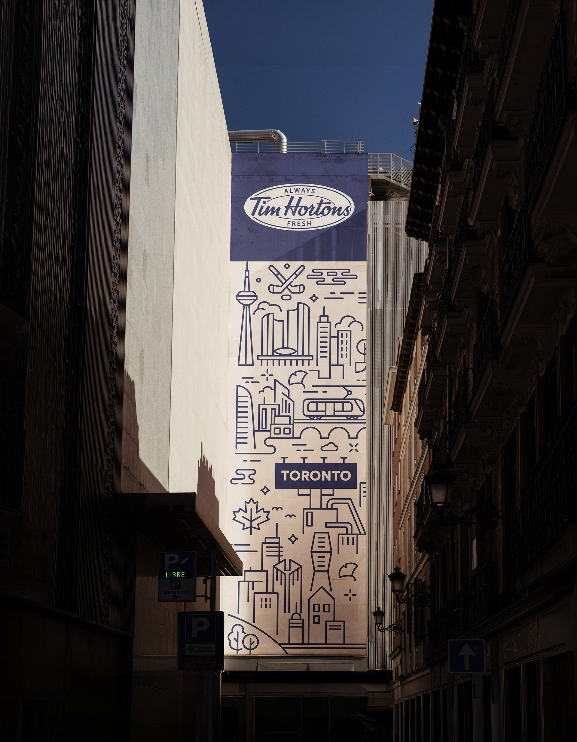
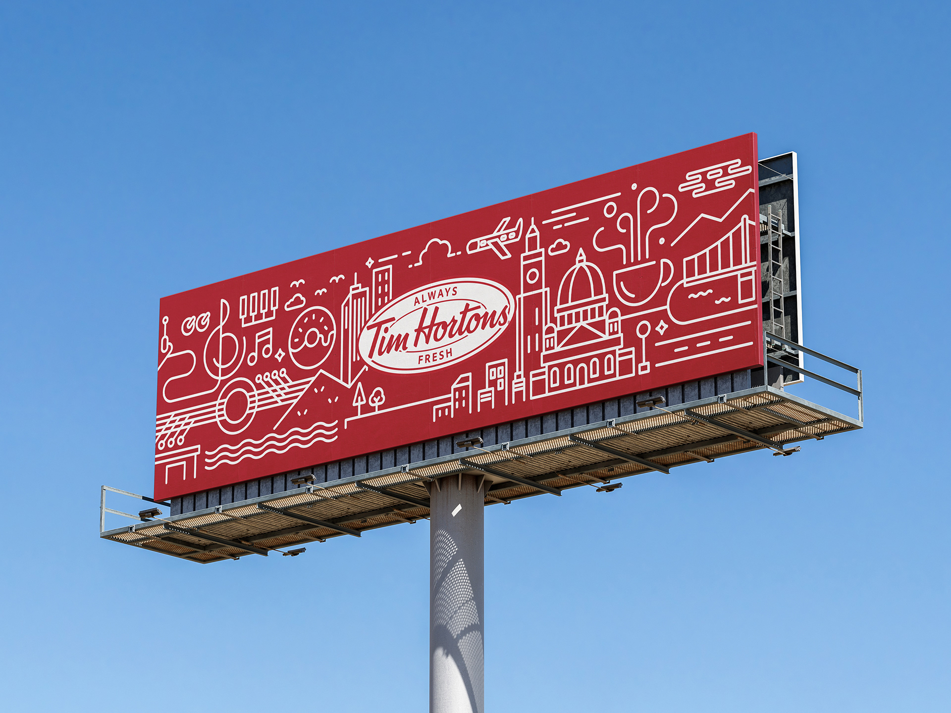
Tim Hortons City Campaign
Founded in 1964 in Ontario, Canada, Tim Horton has grown with a simple yet clear philosophy of
"Simply, Quality Coffee."
For over 60 years, the philosophy didn’t just stay as a brand's value, and has naturally been established as Canadian coffee culture in everyday life.
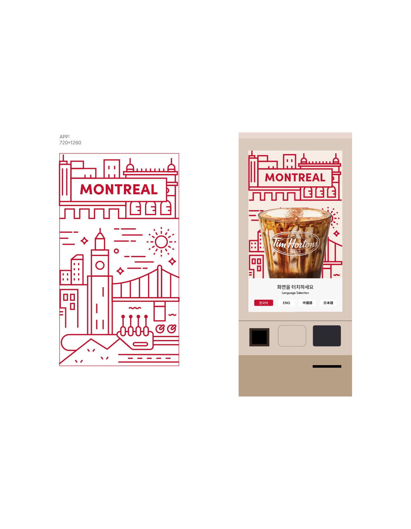
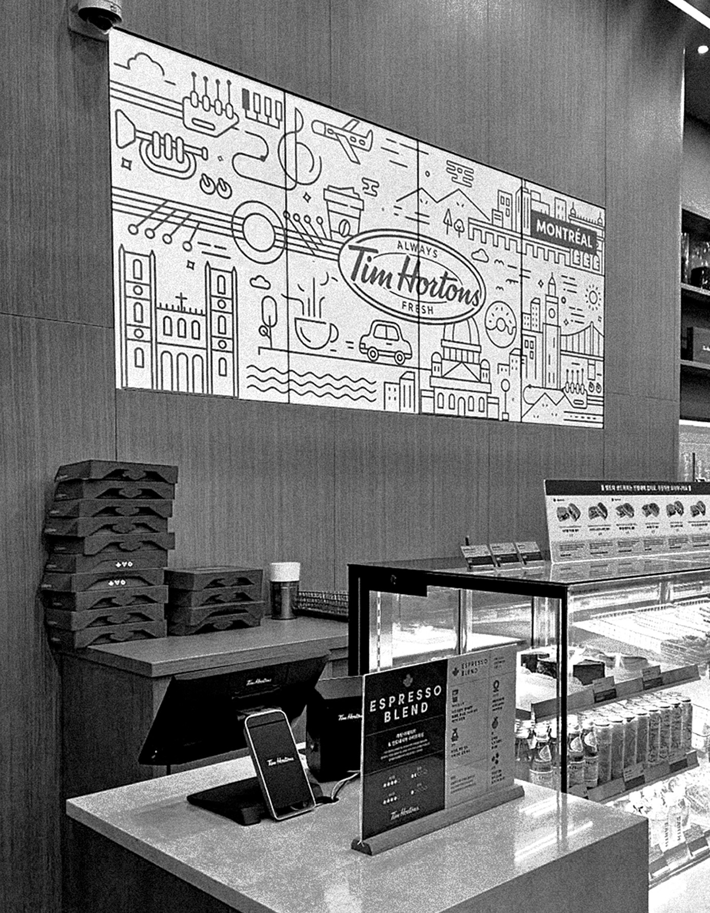
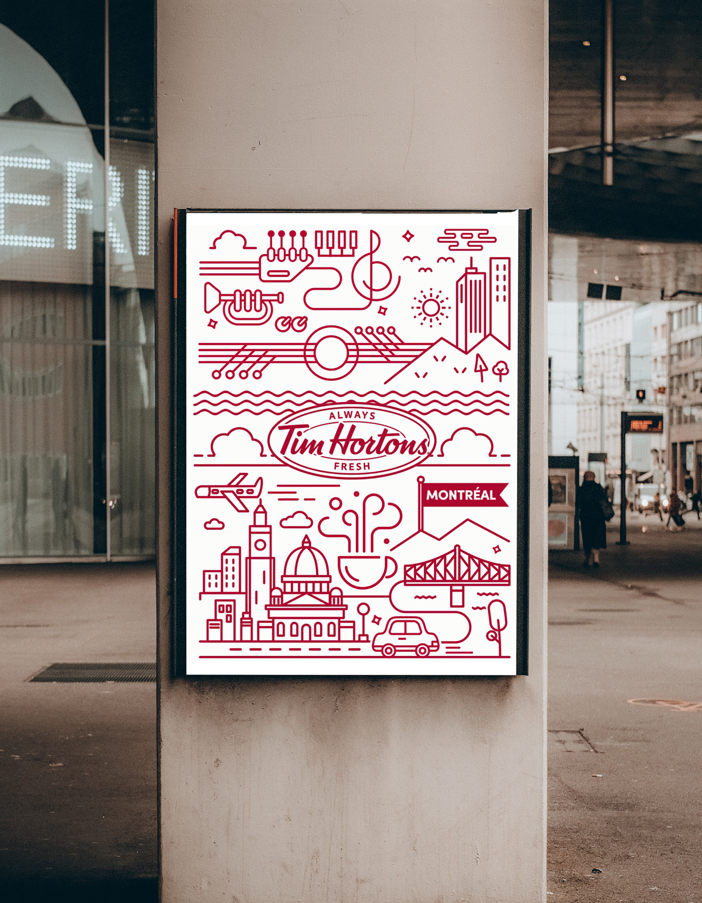
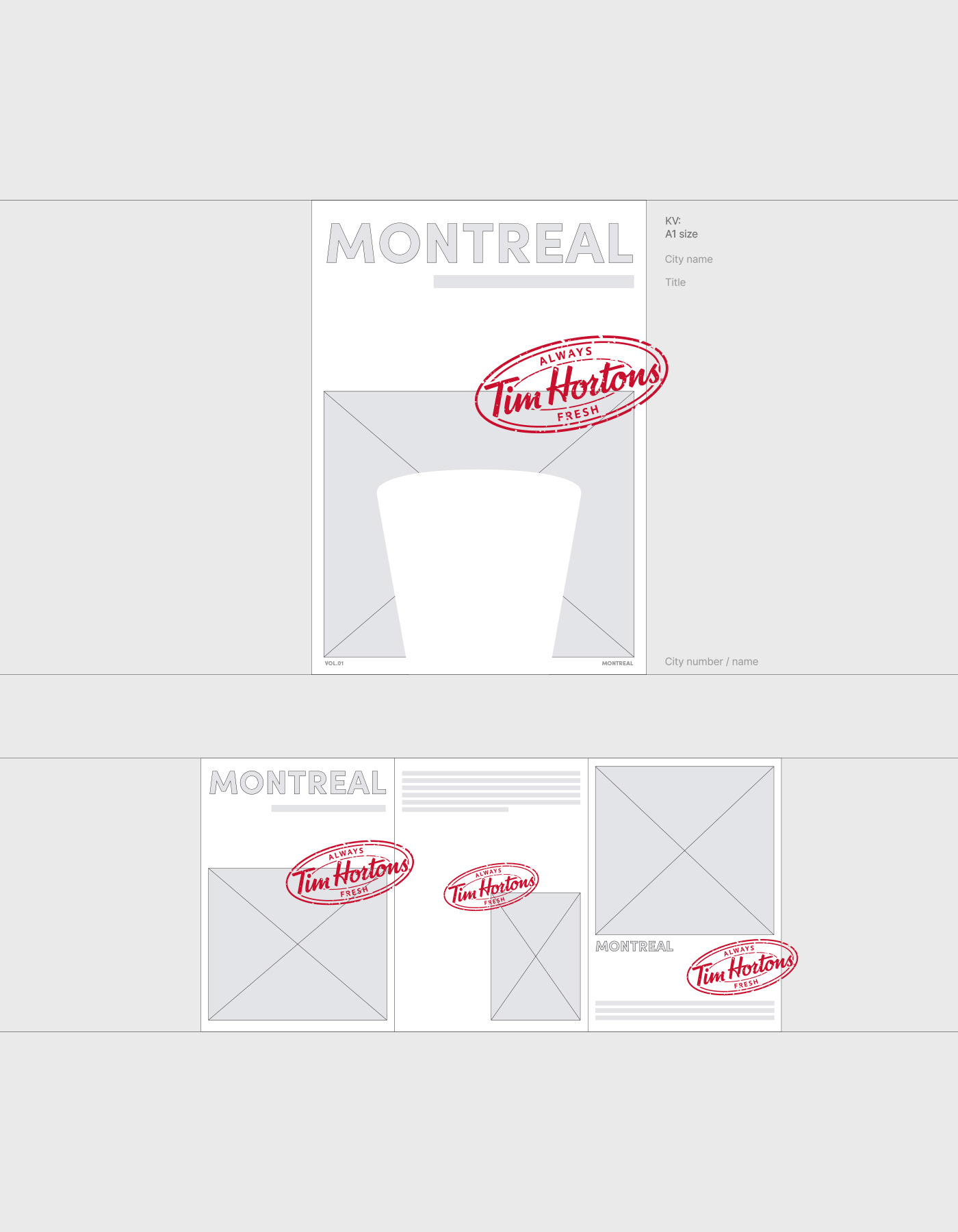
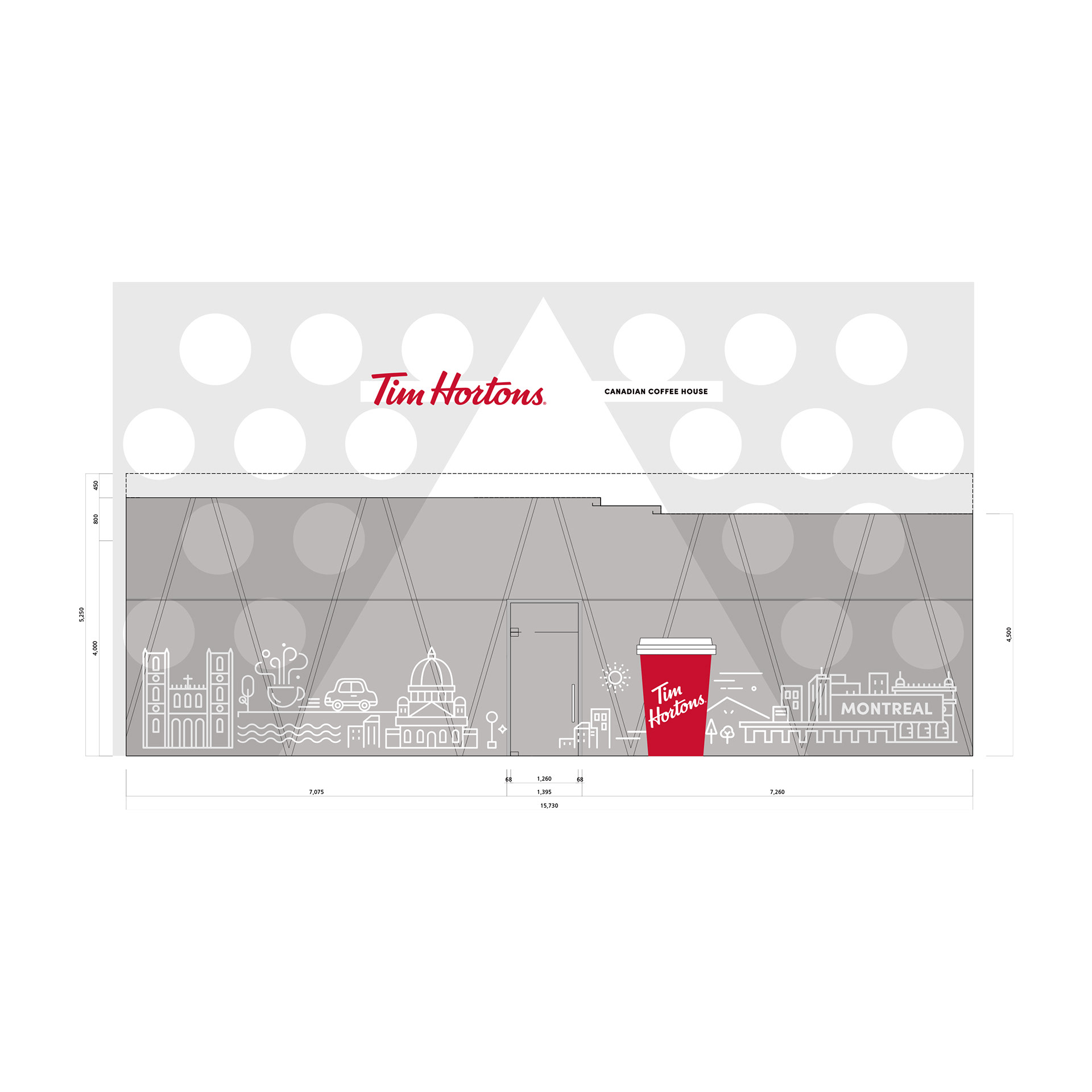
Based on the brand philosophy, the City Campaign is a project designed to let people experience the unique culture and identity of major Canadian cities through coffee. Inspired by the culture, architecture, and atmosphere of each city, it expands a cup of coffee to become a medium to experience the city.
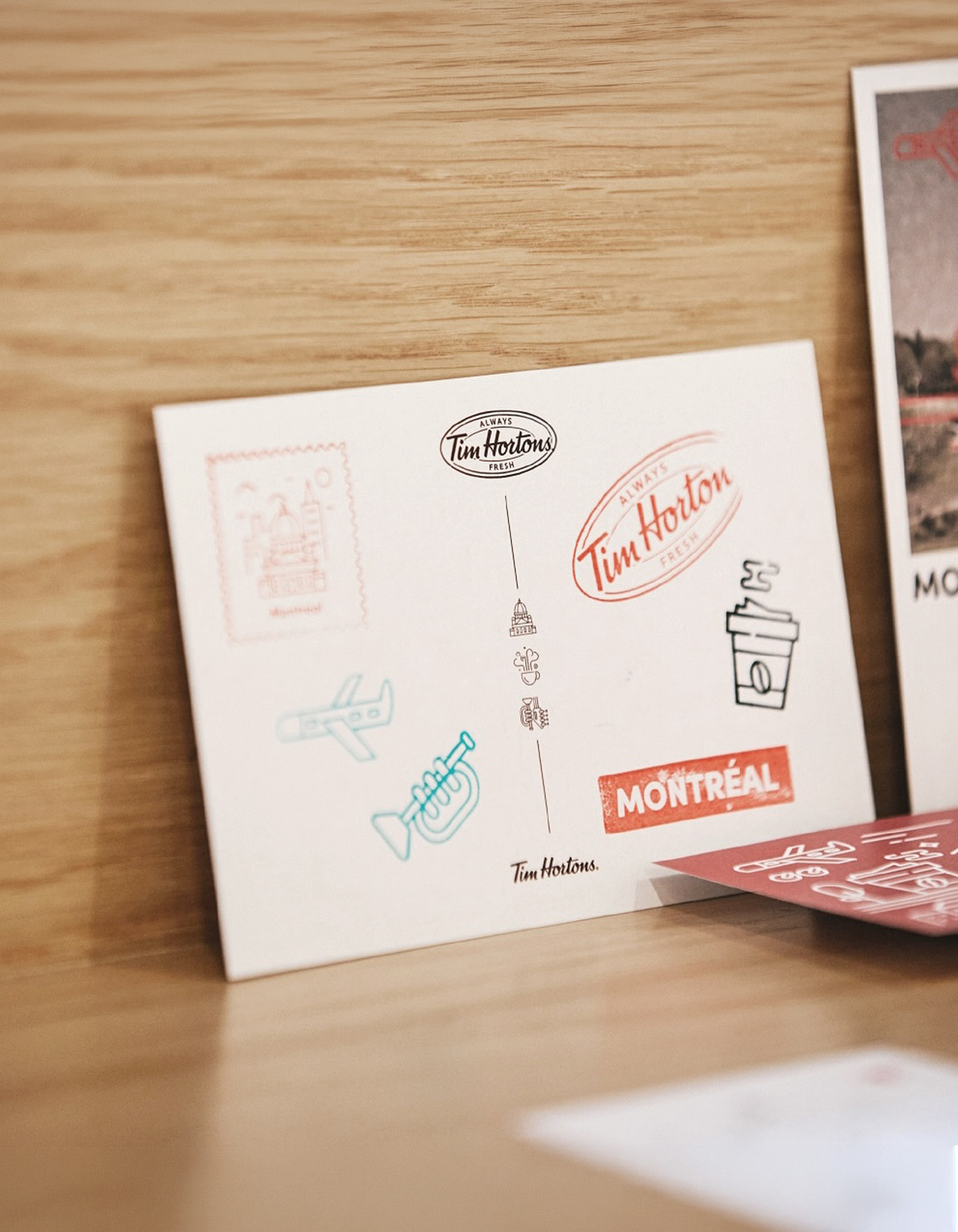
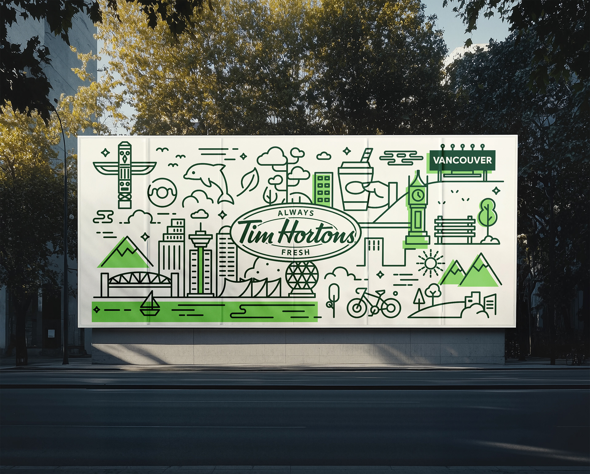
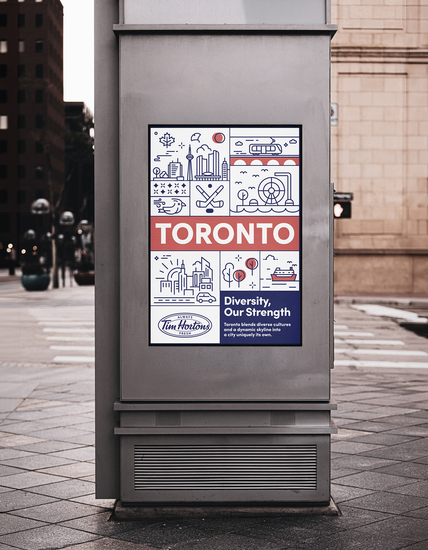
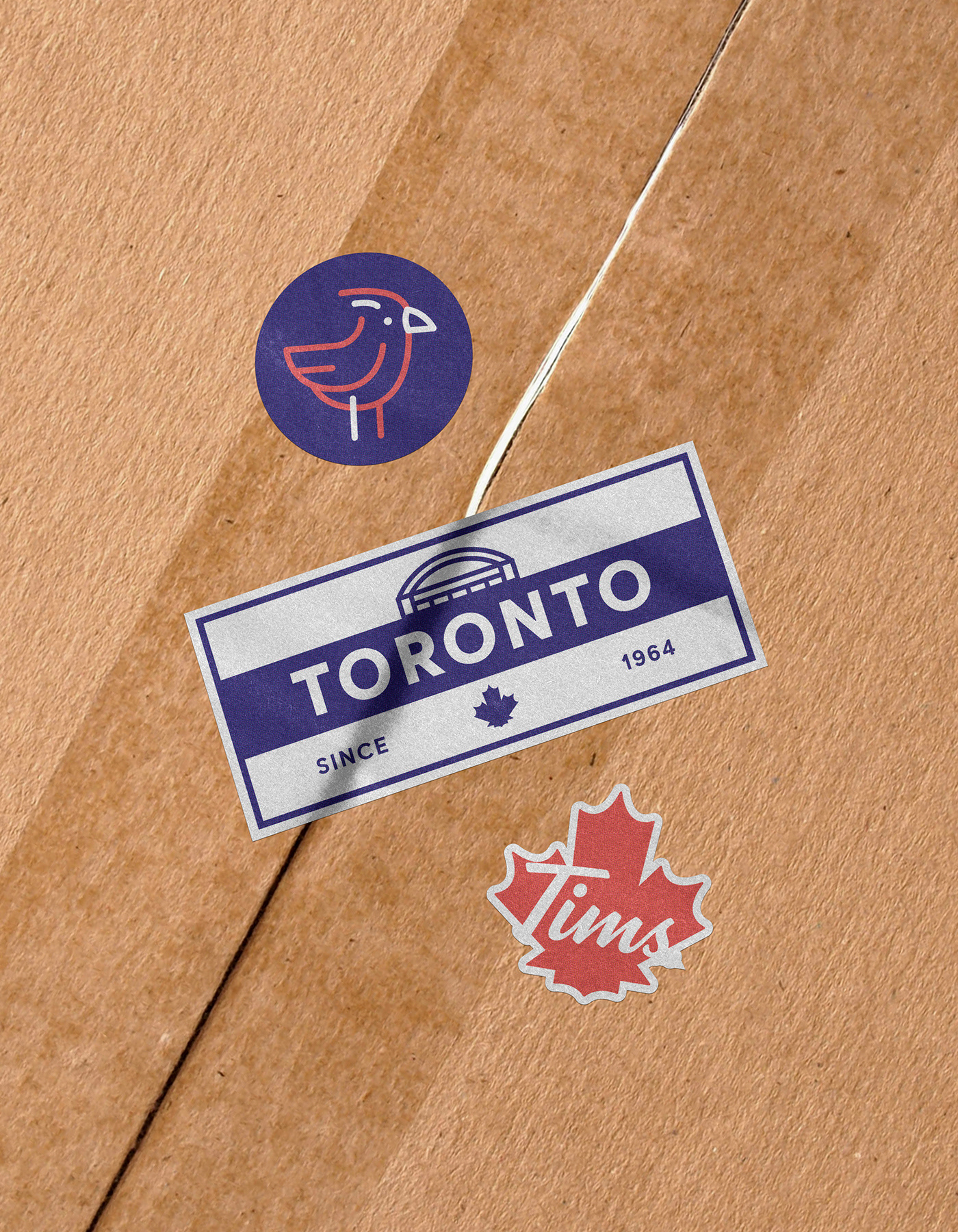
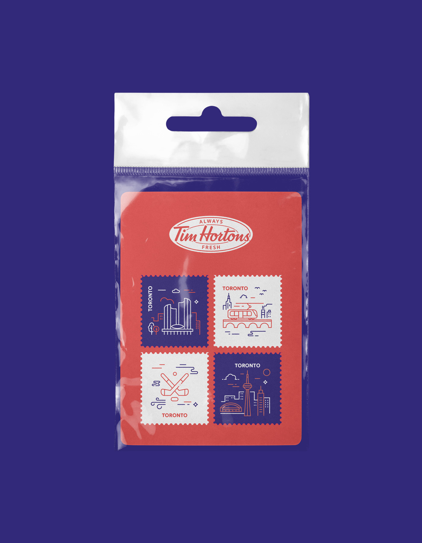
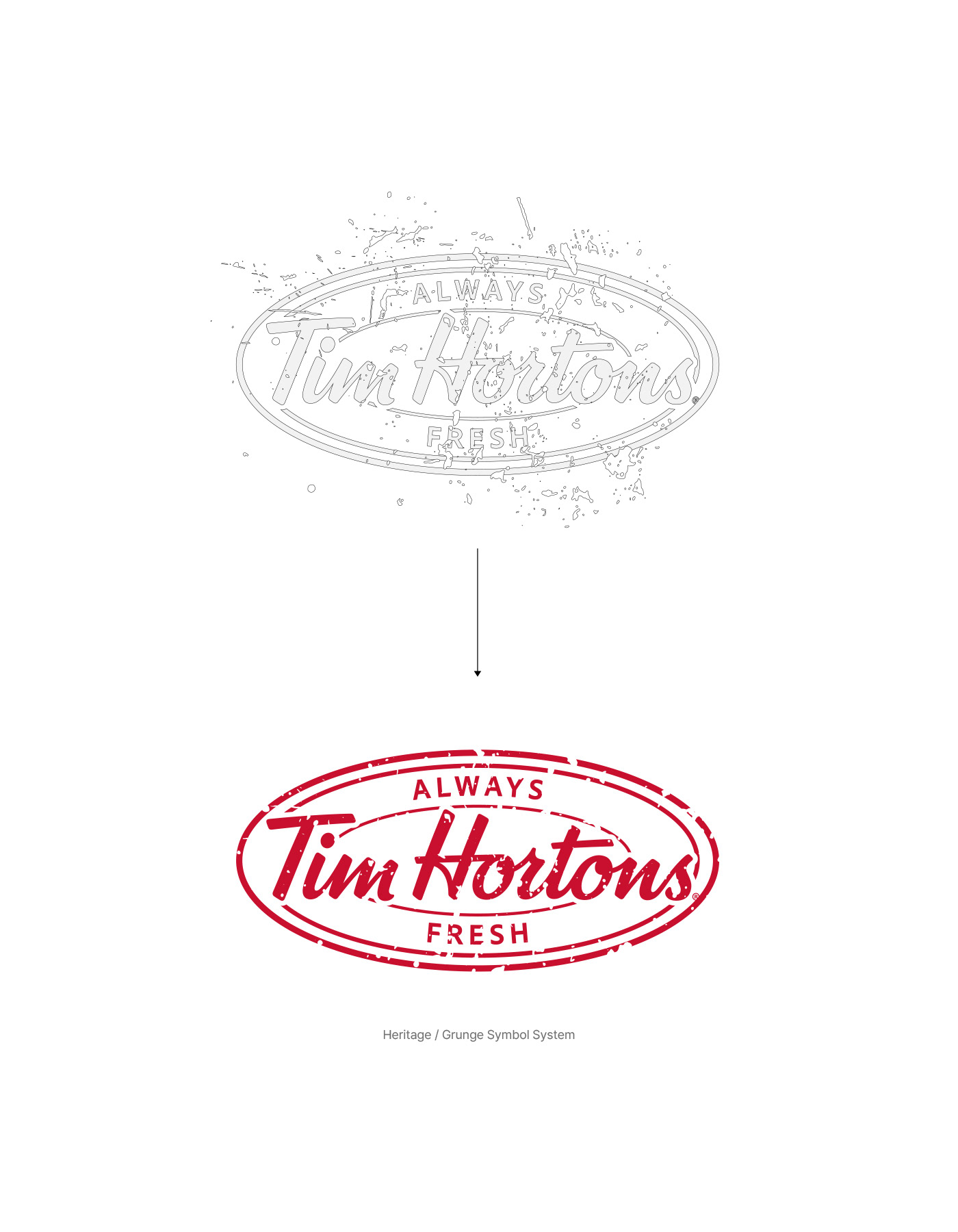
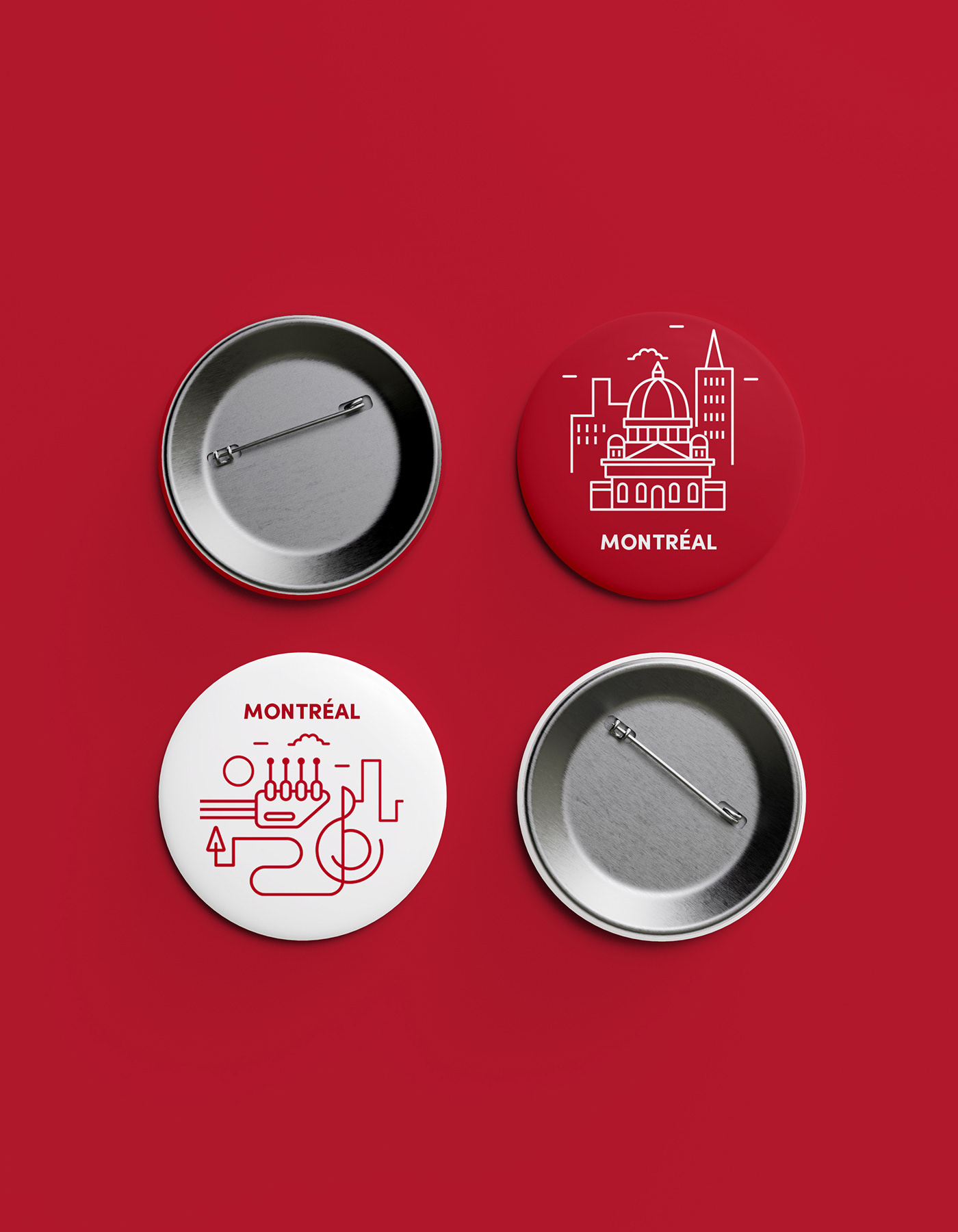
The project began by reinterpreting Tim Horton's heritage. The original circular logo is newly developed as a vintage-style heritage symbol to reinforce the brand's history and authenticity. At the same time, a city-representing symbol asset system for Montreal, Vancouver, and Toronto was established to express the uniqueness of each city in one unified visual language.
Heritage symbol systems, city-representing symbol assets, and campaign key visuals complete a consistent brand experience that connects Tim Horton's brand heritage with the story of Canadian cities.

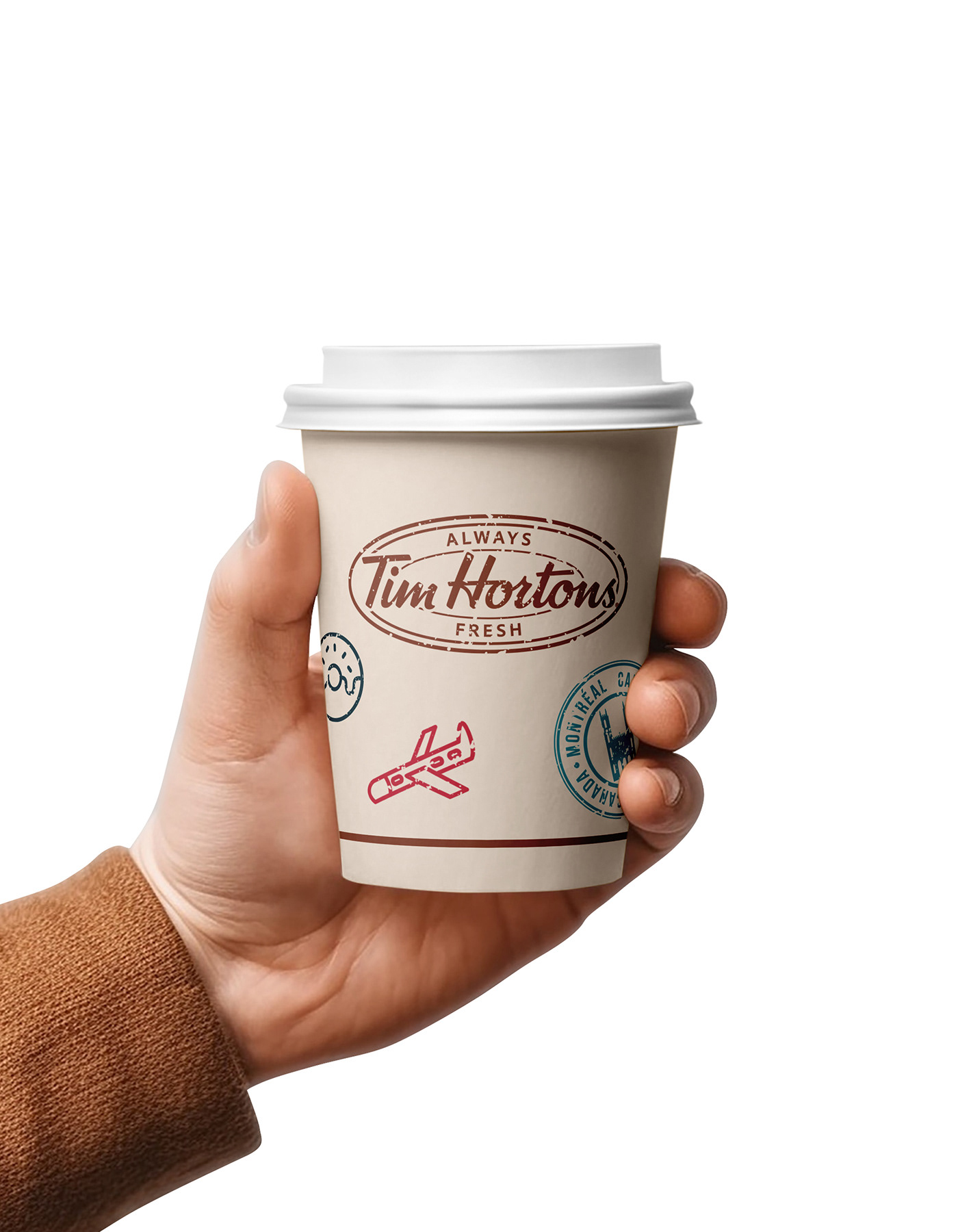

The core of this campaign is to allow the audiences to experience the identity of the city through coffee.
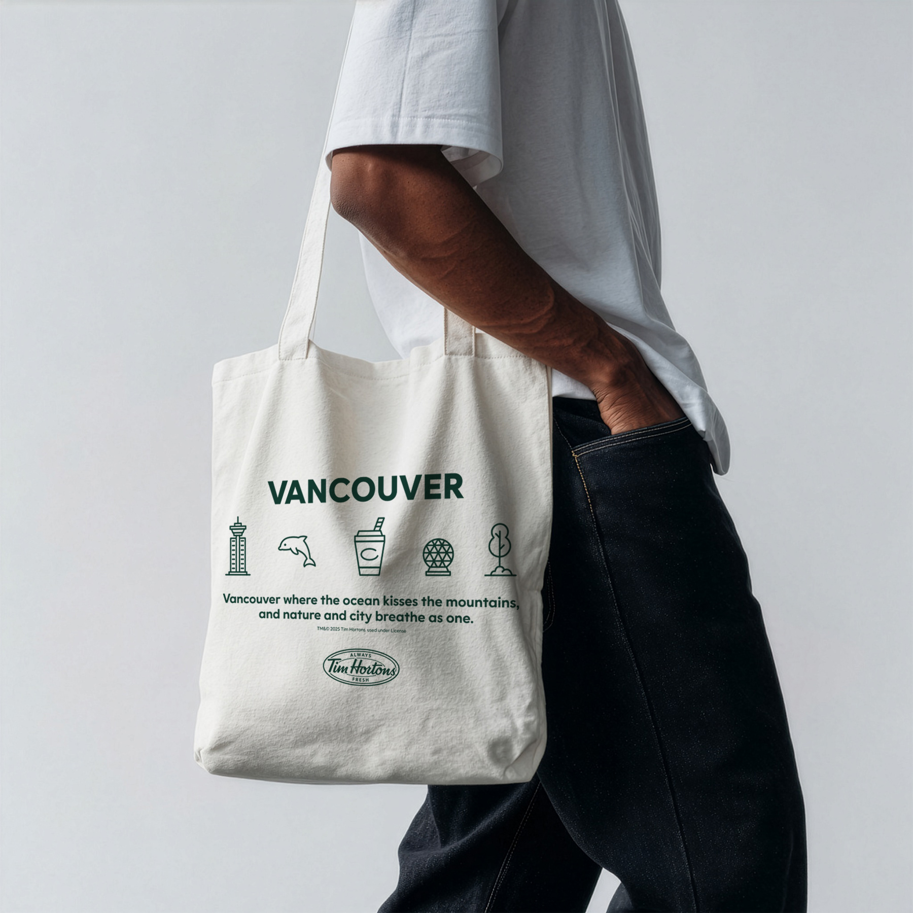
Each drink is designed to symbolize the culture and atmosphere of a specific city by utilizing city-specific symbol assets, and key visual system has been established so that audiences can naturally experience the story of the city through the product.
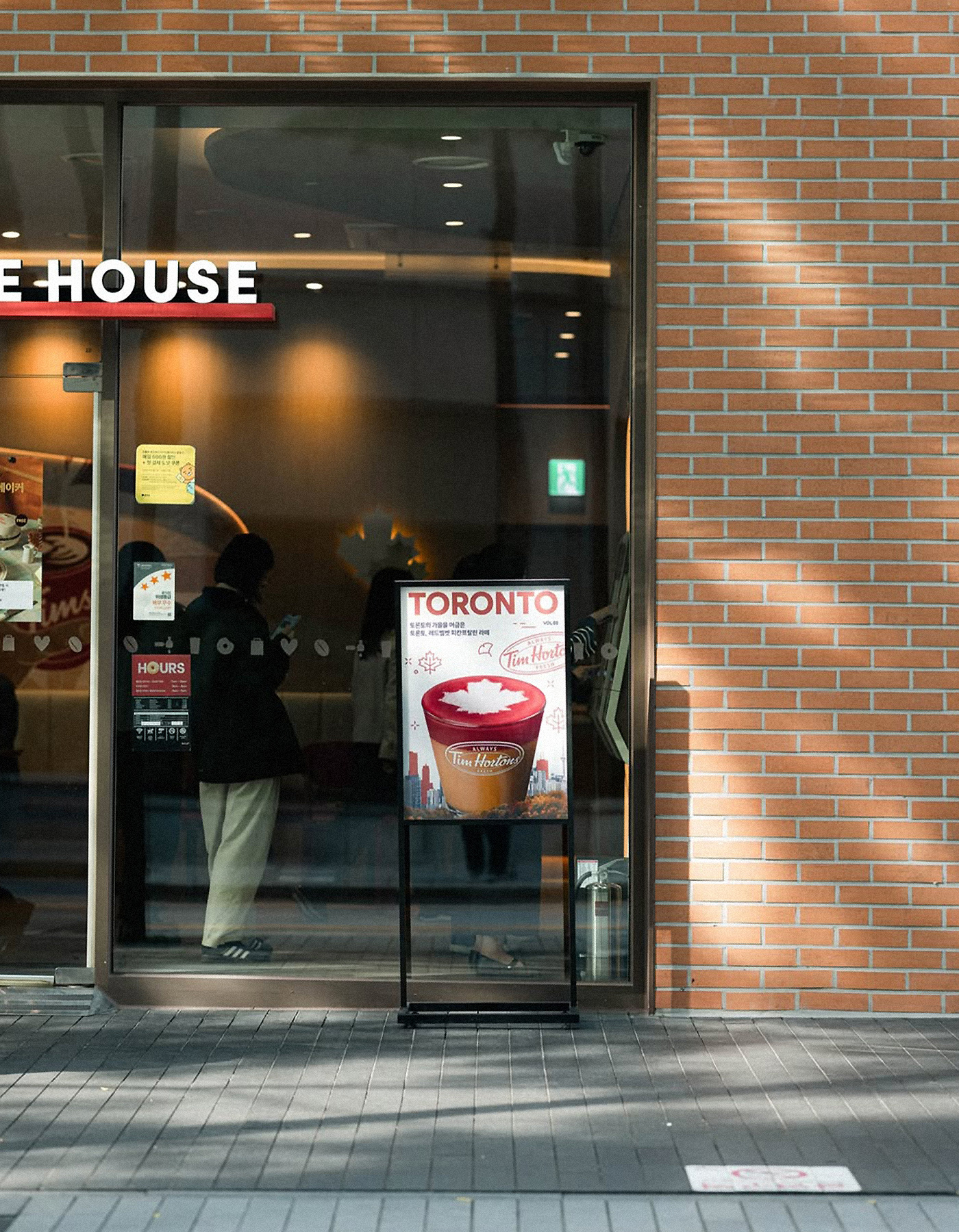
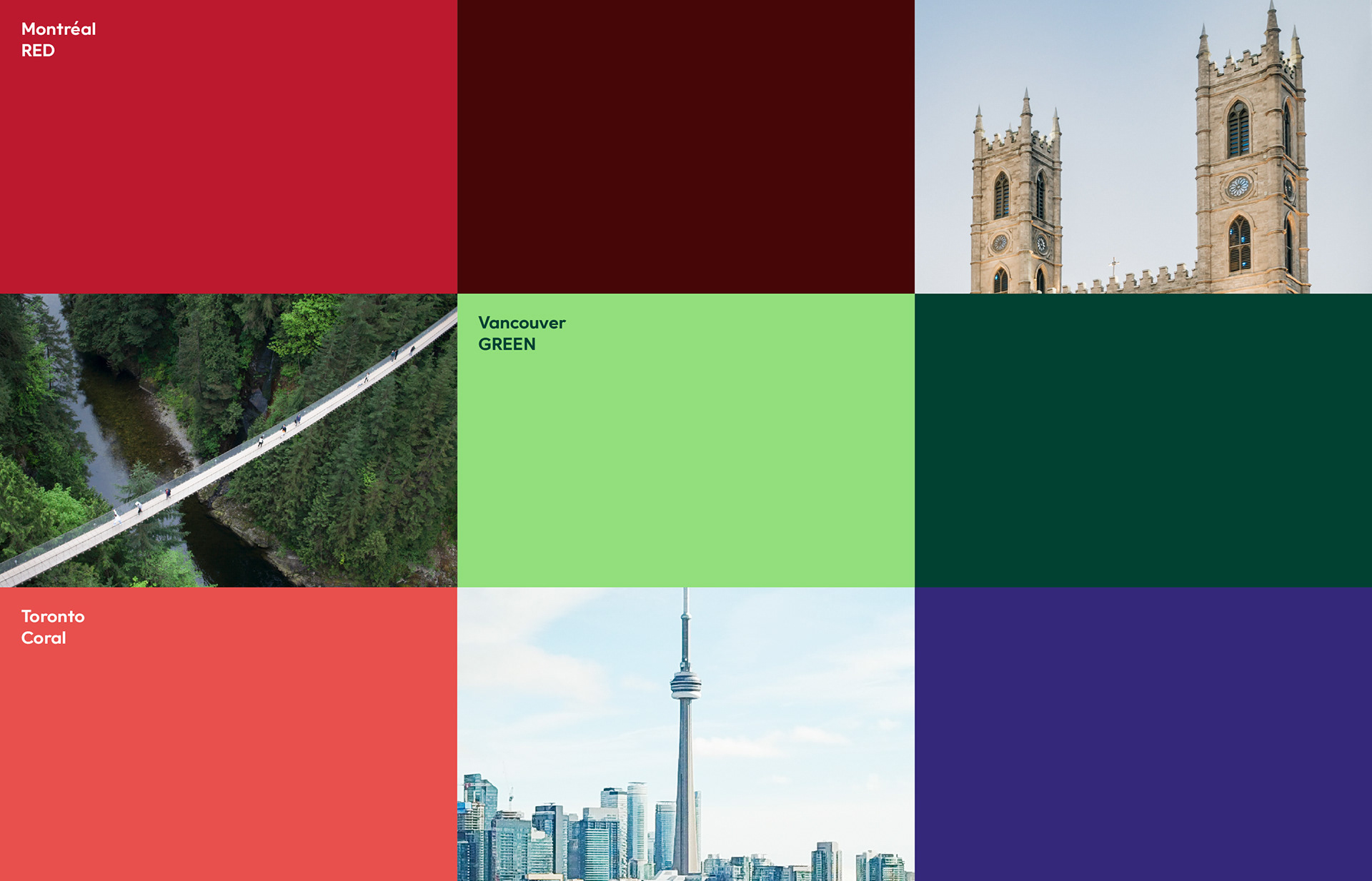
In addition, the visual identity is strengthened by developing a color system that reflects the characteristics of each city. Red is applied to Montreal, which contains historical heritage, Green is applied to Vancouver, which symbolizes ecofriendly urban environment, and Coral is applies to Toronto, which expresses modern and dynamic energy.
This completes integrated campaign experience while clearly conveying the uniqueness of each city.