ALPHA DRIVE ONE
BRAND IDENTITY DESIGN
BRAND IDENTITY DESIGN
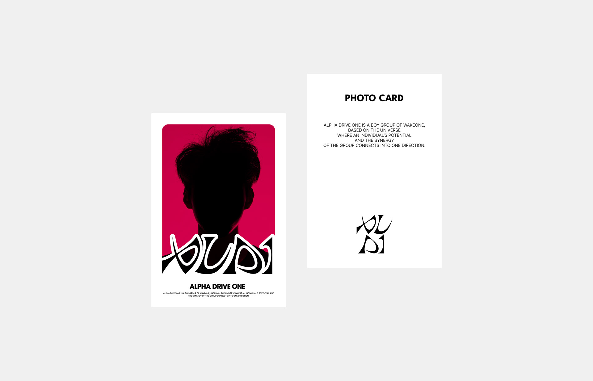
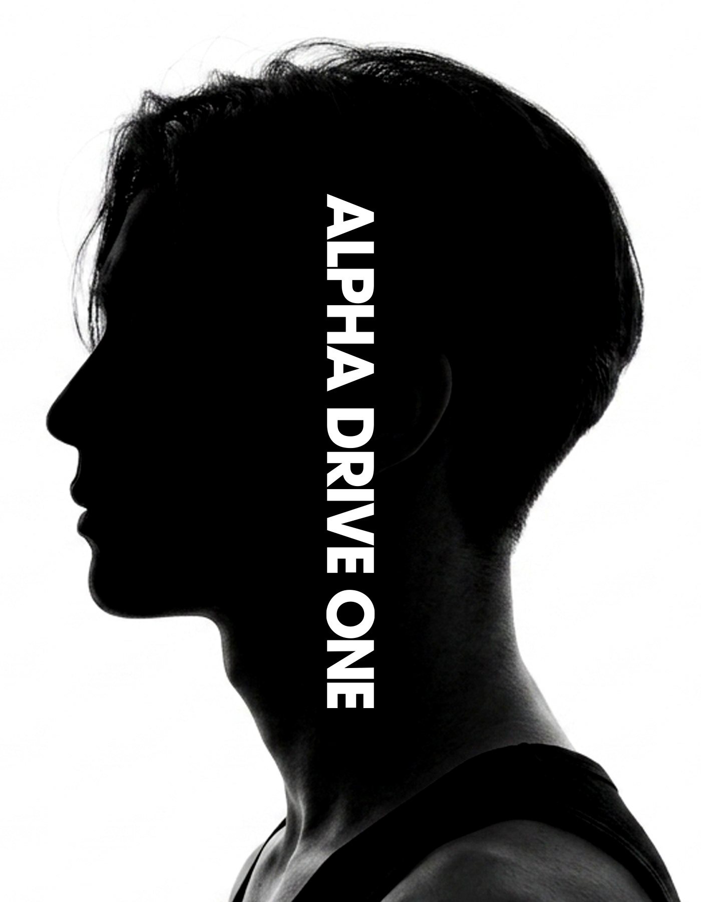
ALPHA DRIVE ONE is a boy group of WAKEONE, based on the universe where an individual’s potential and the synergy of the group connects into one direction.
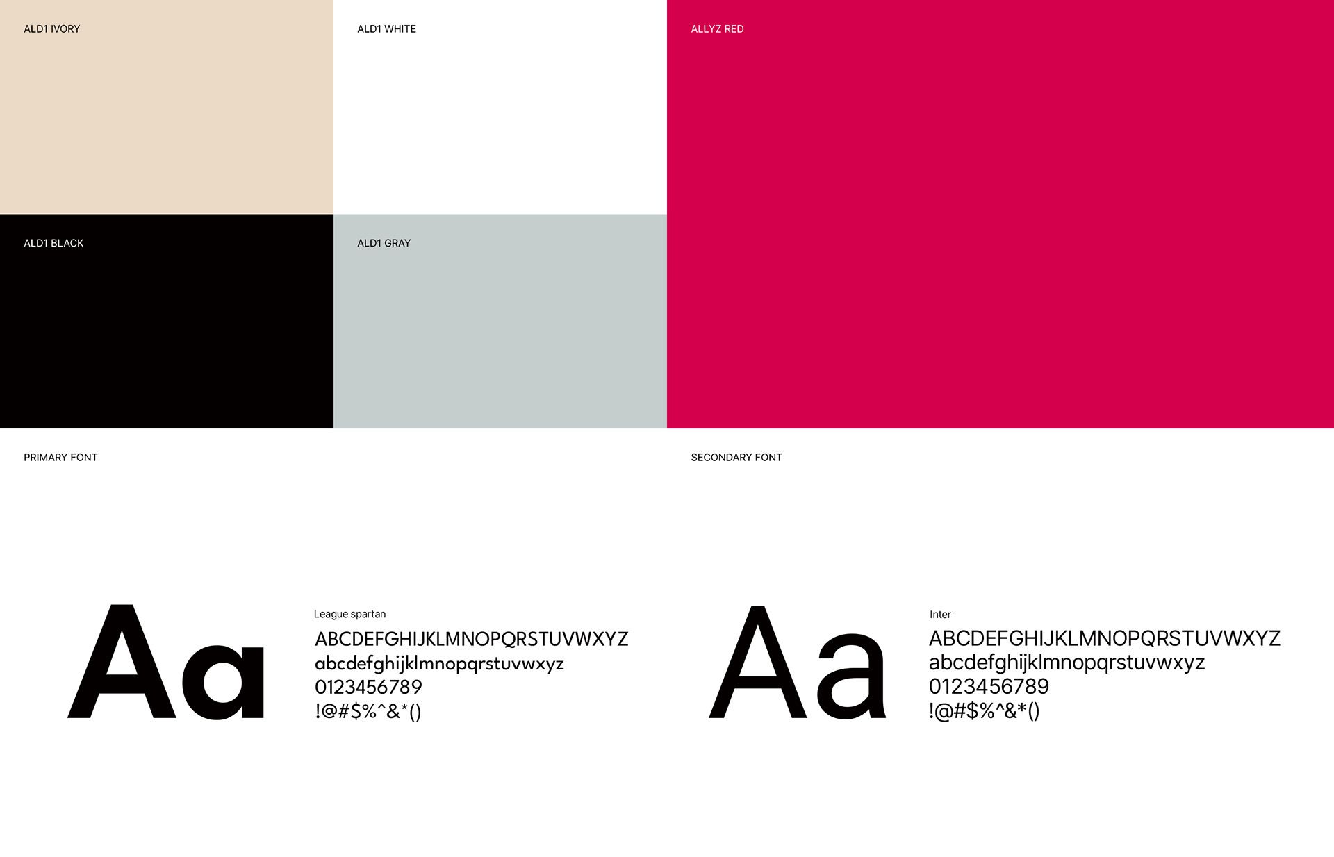
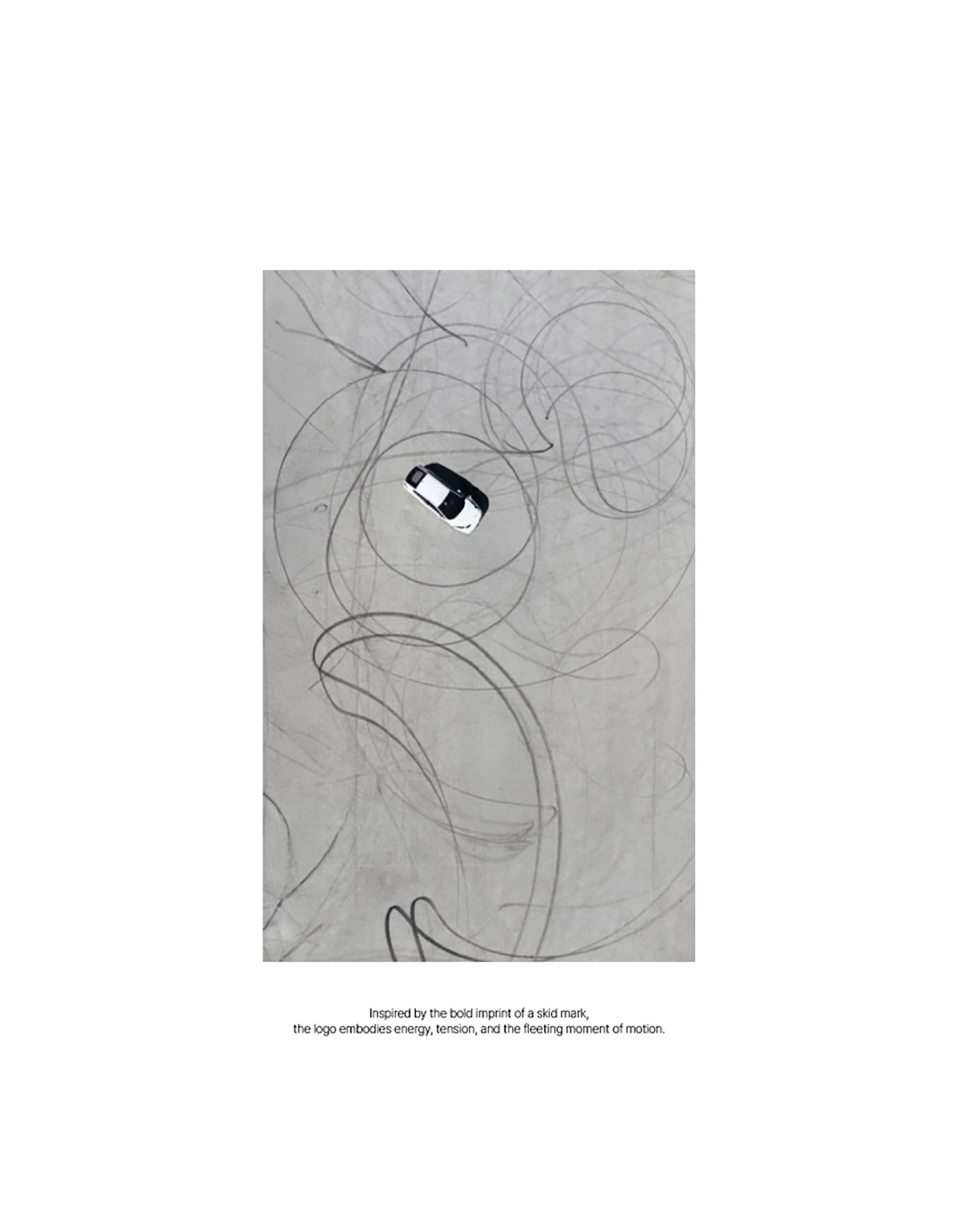
In this project, we focused on building a brand identity and visual system to visually represent group's identity and growing narrative. Based on the core concept of "Drive", it contains the concept of movement, connection, and expansion, and is designed to create a brand experience that can be flexibly applied to various contents and overall promotion.
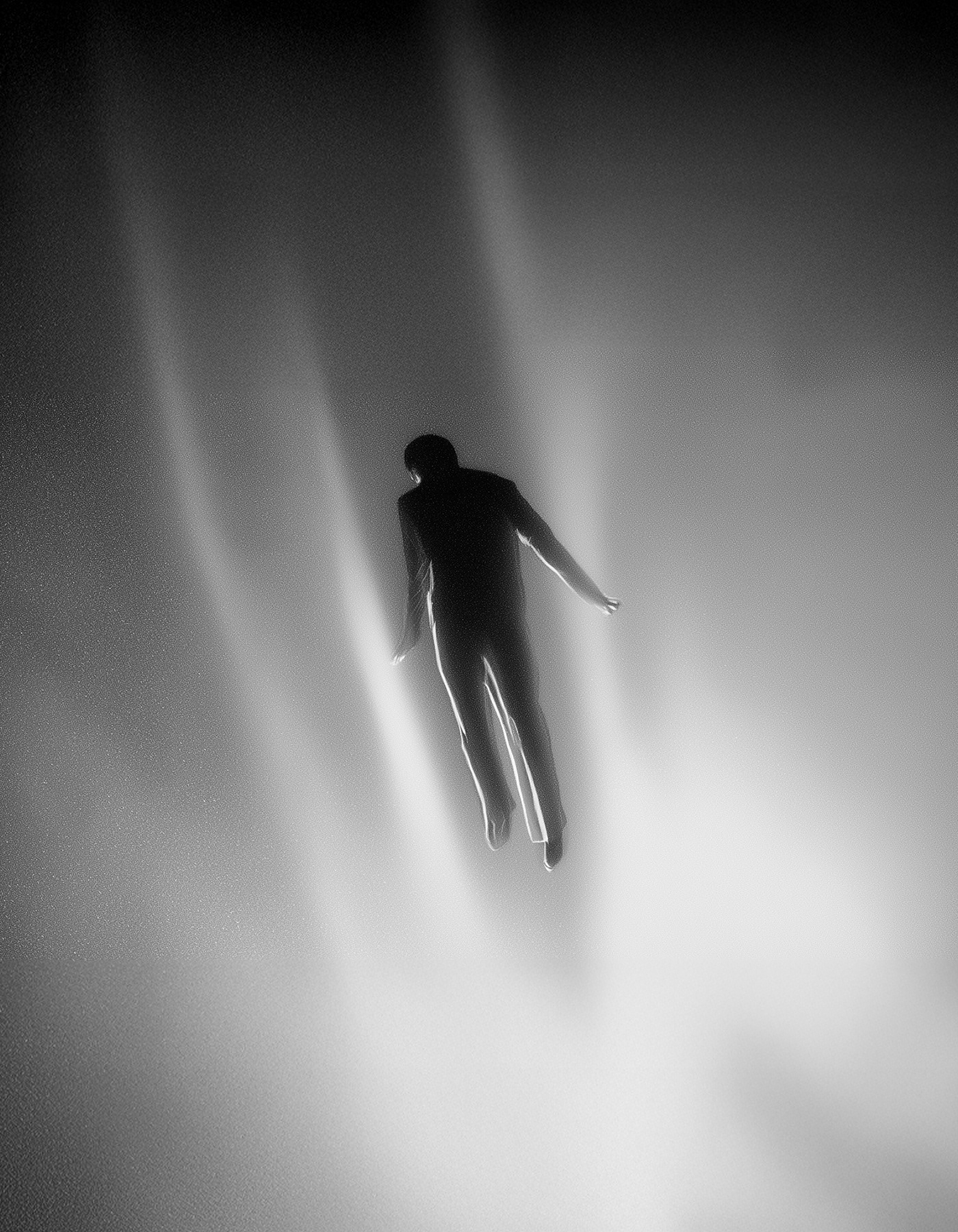
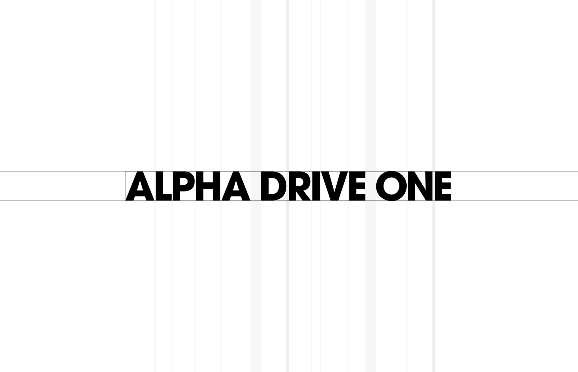
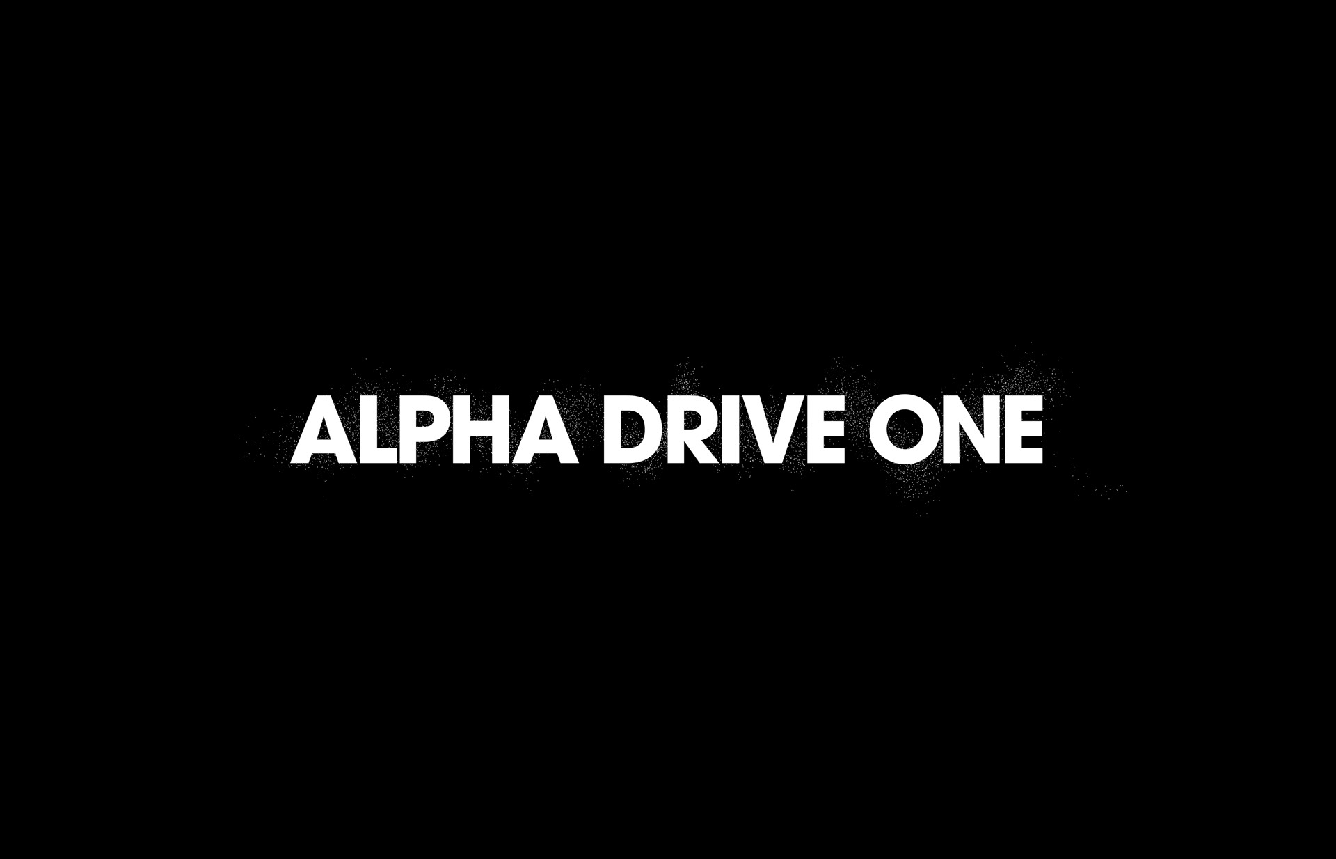
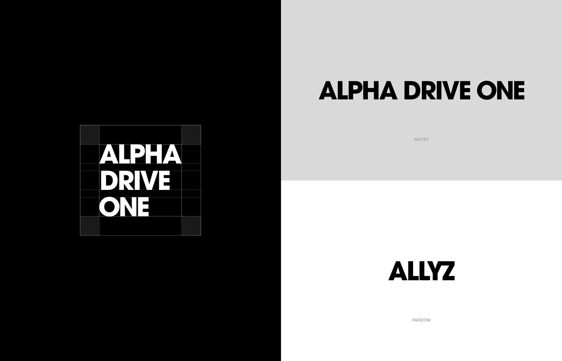
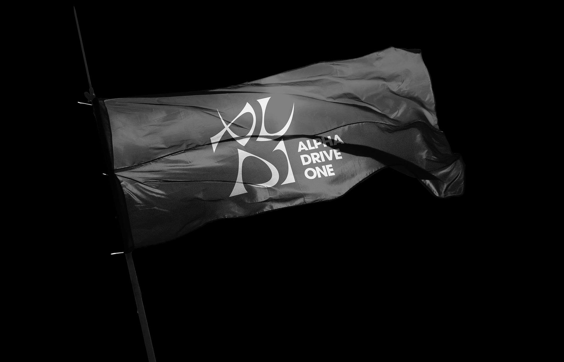
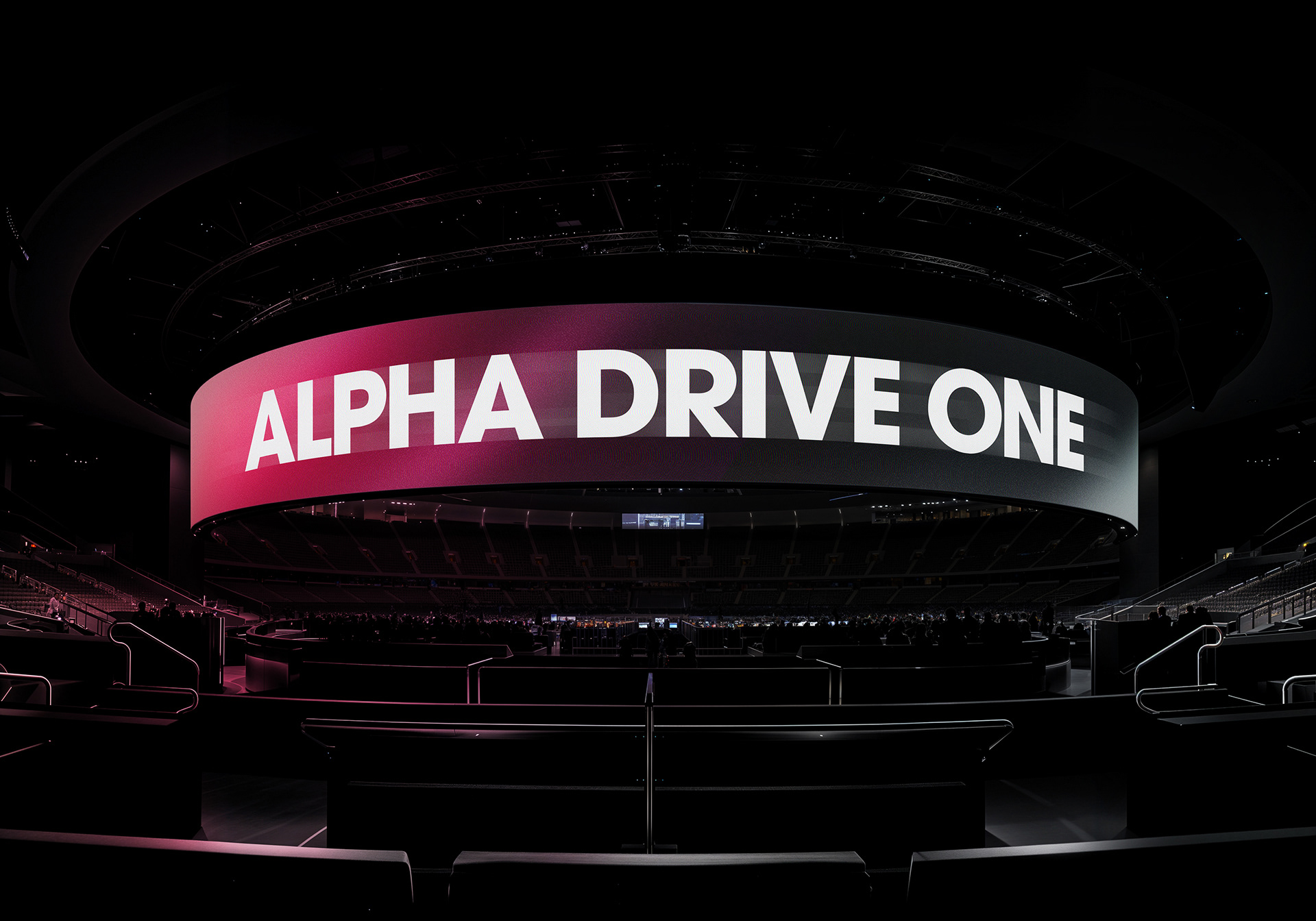
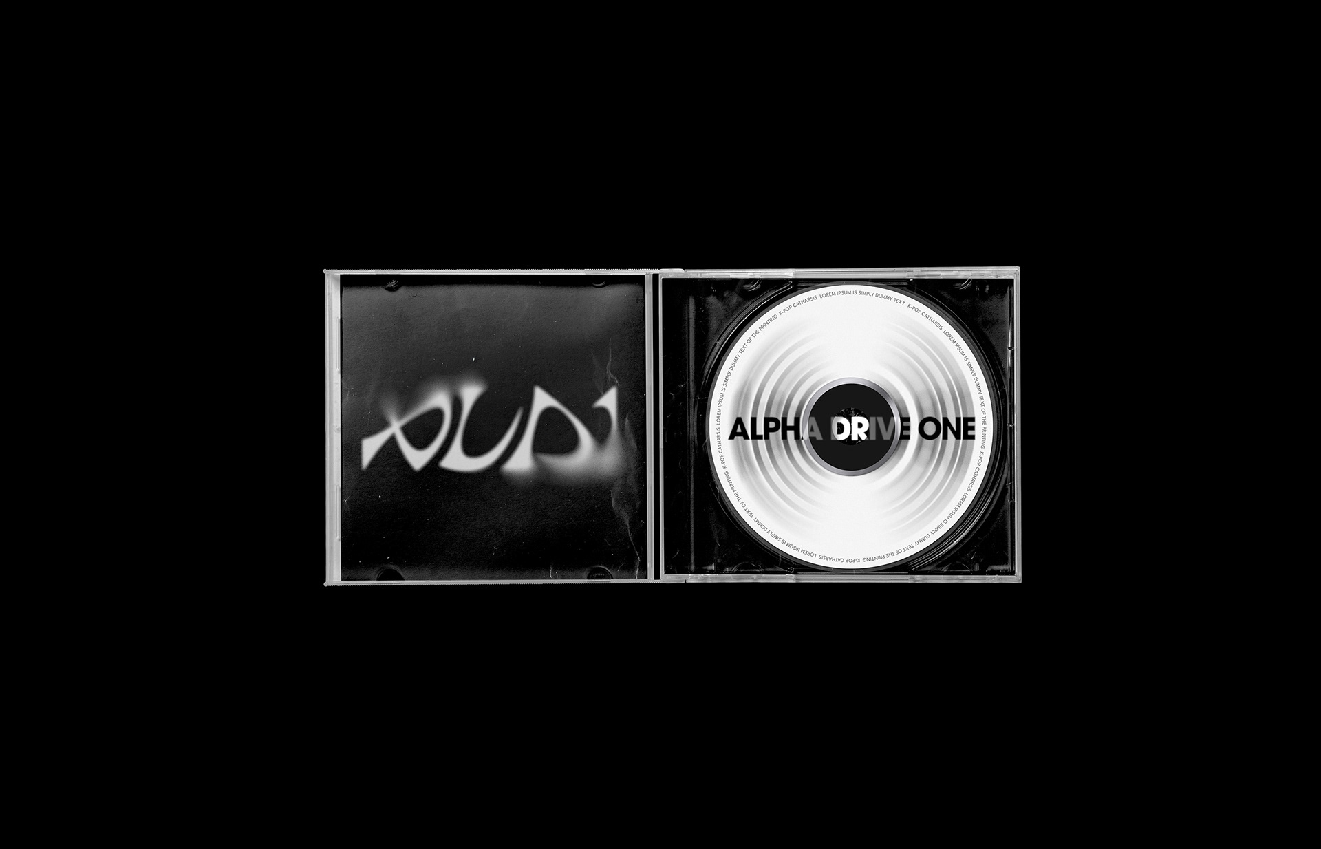
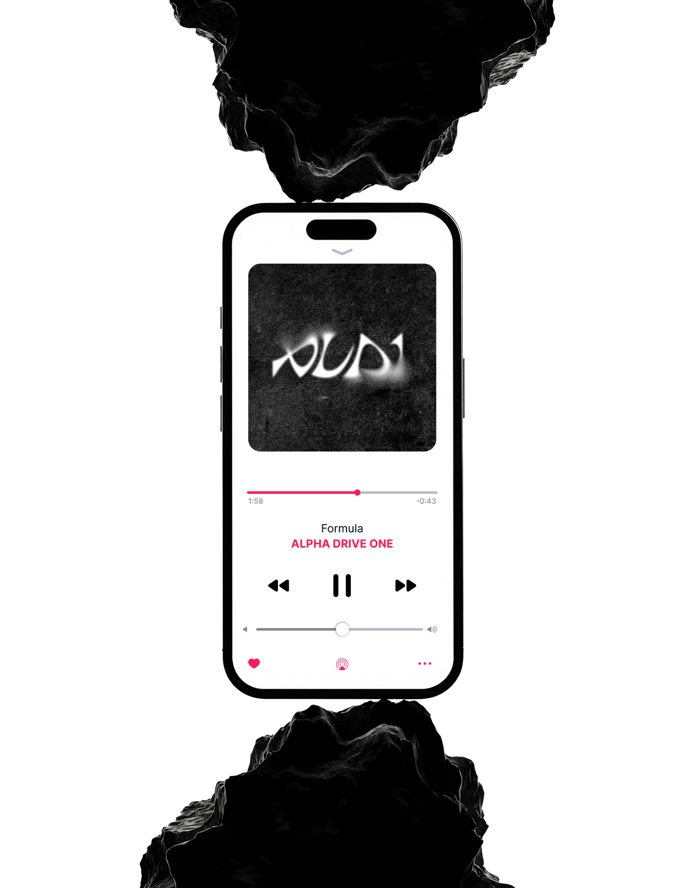
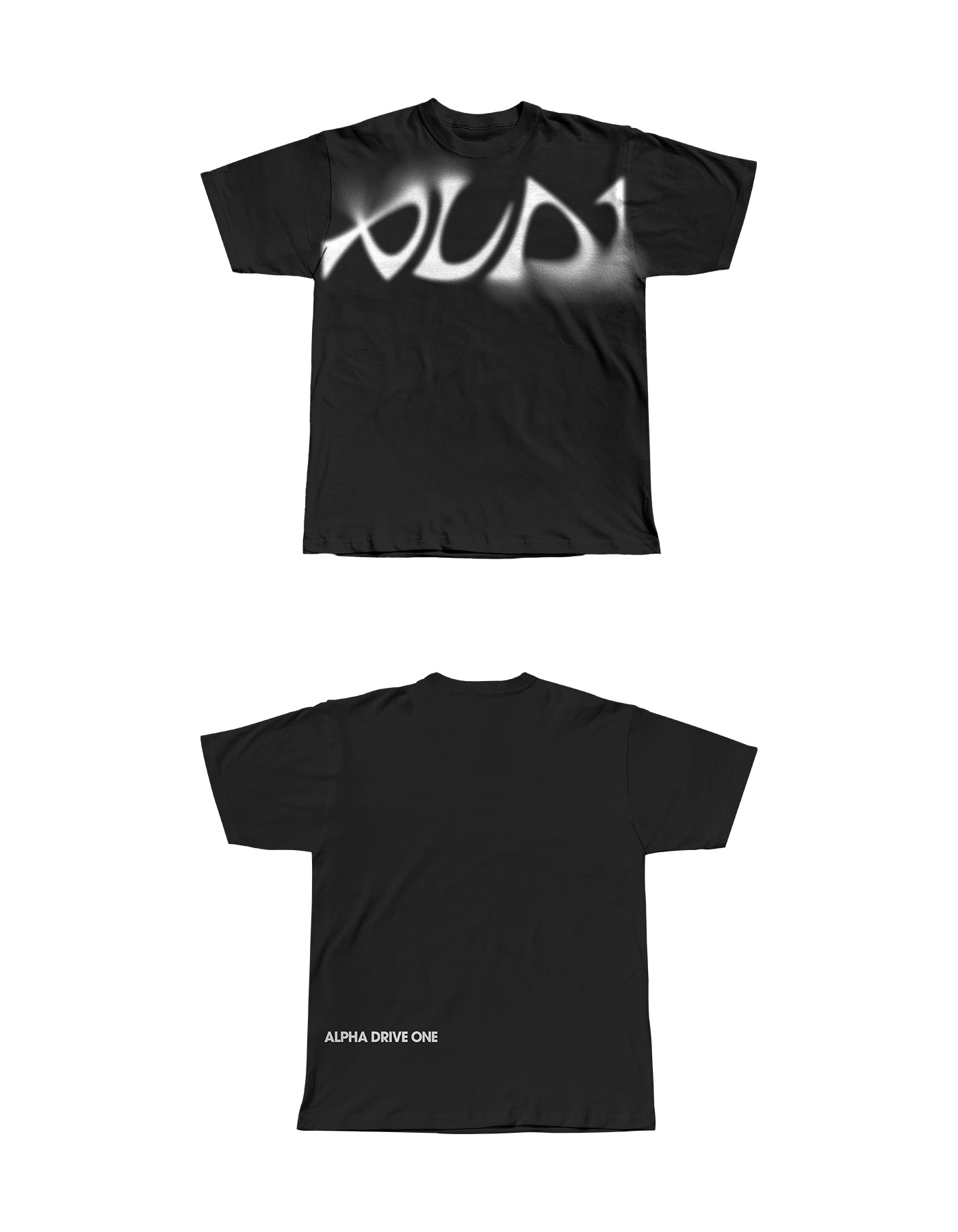
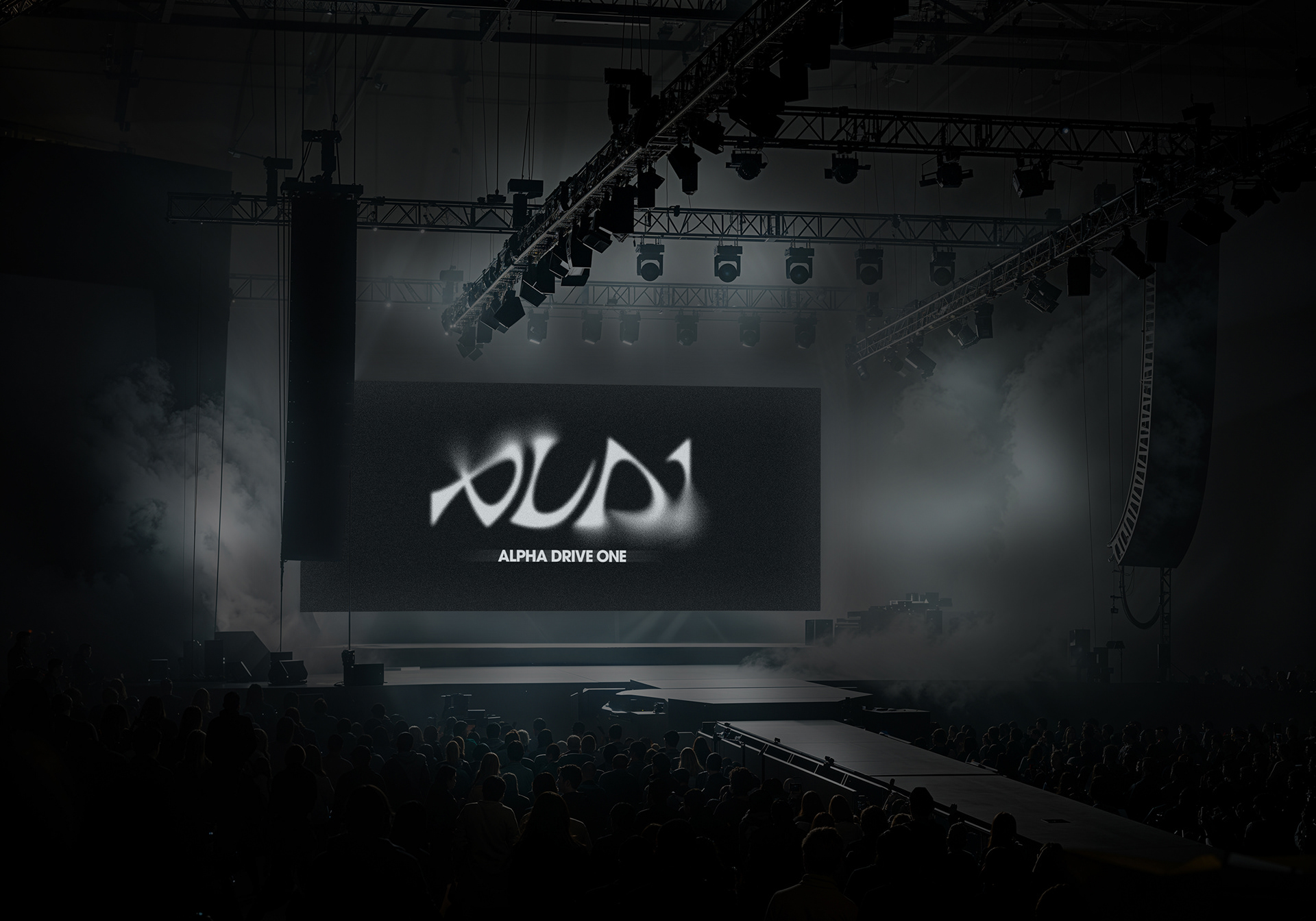
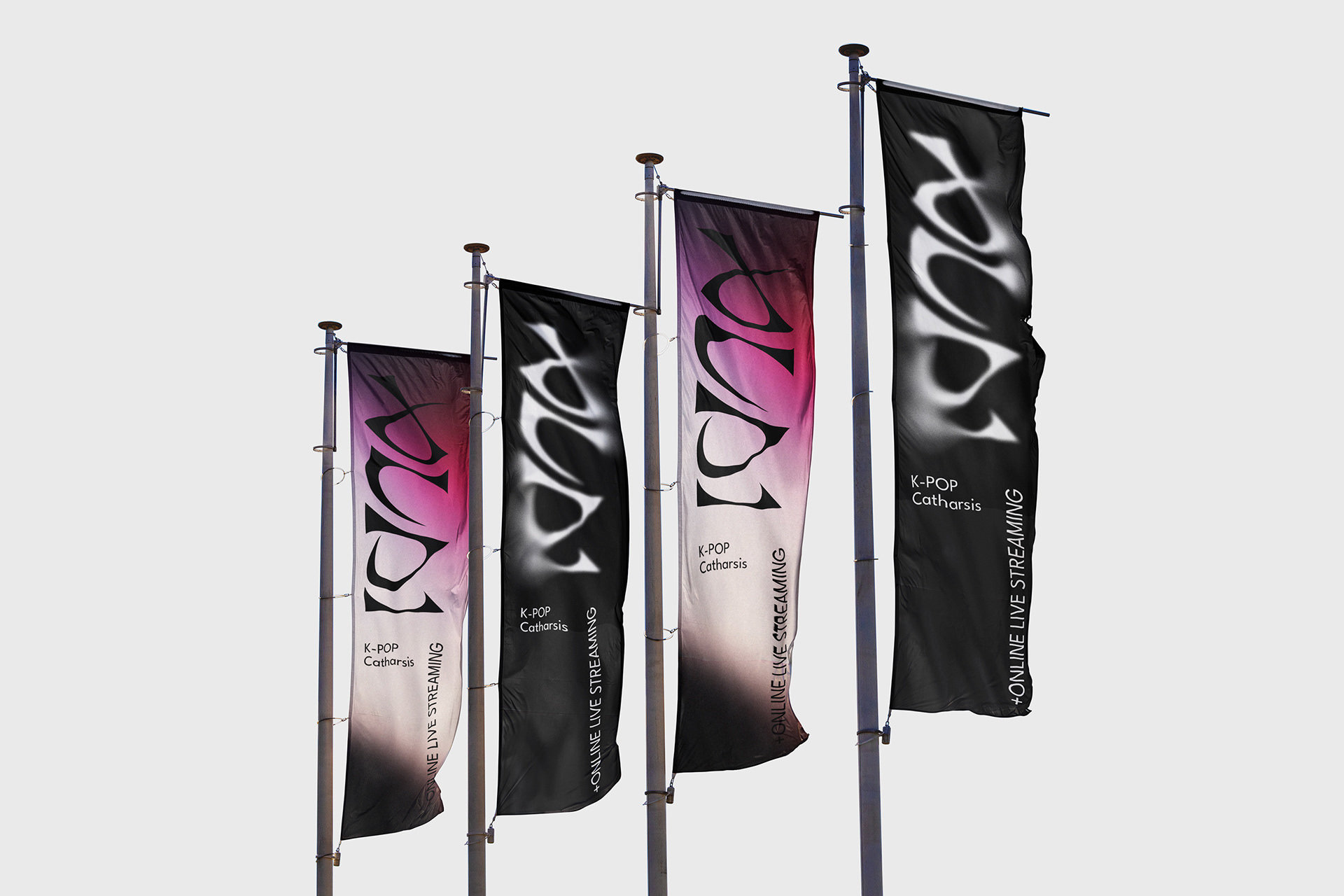
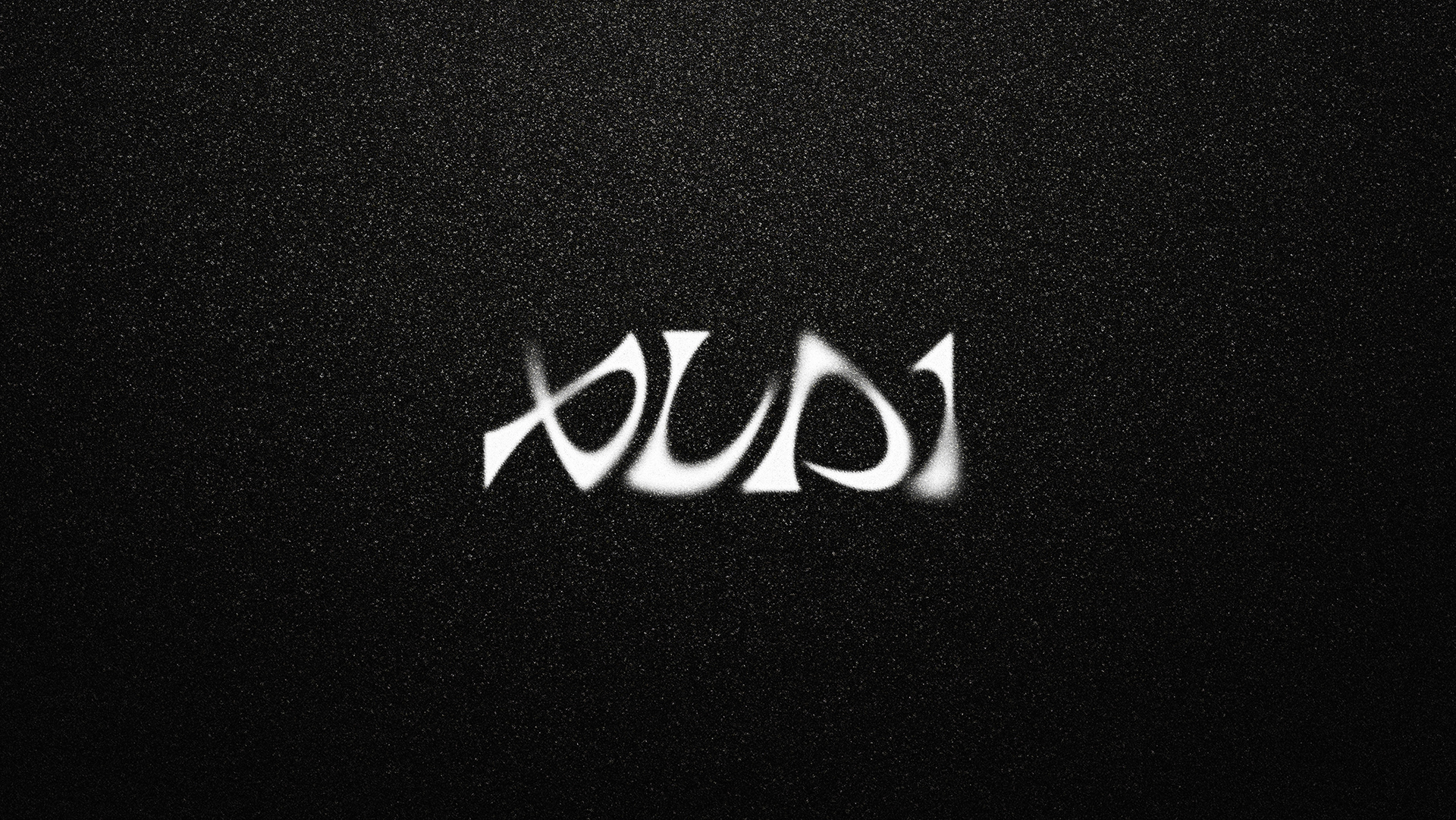
The wordmark of ALPHA DRIVE ONE, developed based on San Serif, is designed to organically connect each character within a single system based on the same proportion, curvature, and repeated formative principles. The contrast between the restrained straight lines and the flowing curves expreses the drive and expandability of the brand, forming a unique visual identity of ALPHA DRIVE ONE.
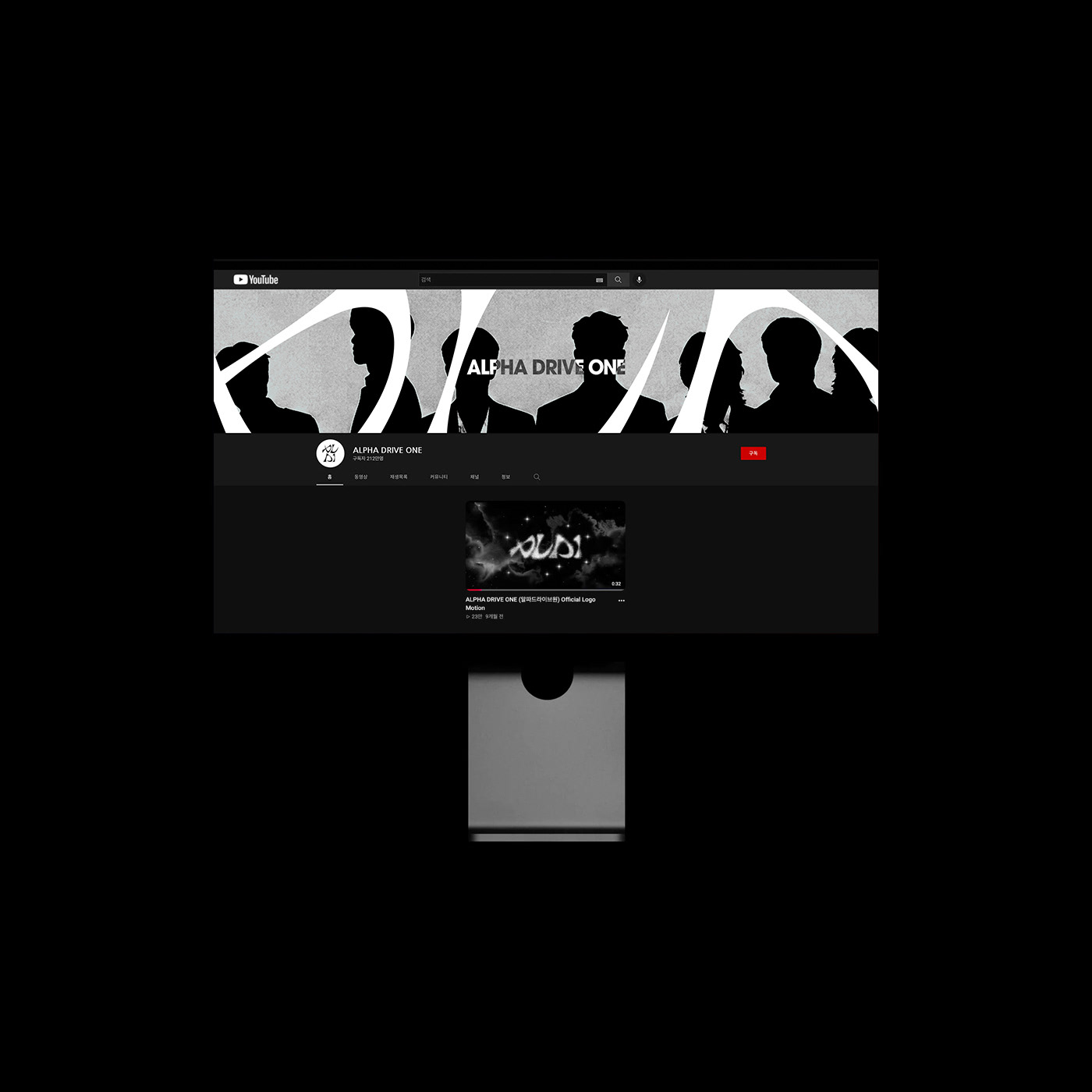
Wordmark is a key element of the brand, it extends across symbols, motions and graphics systems to create a consistent brand experience.
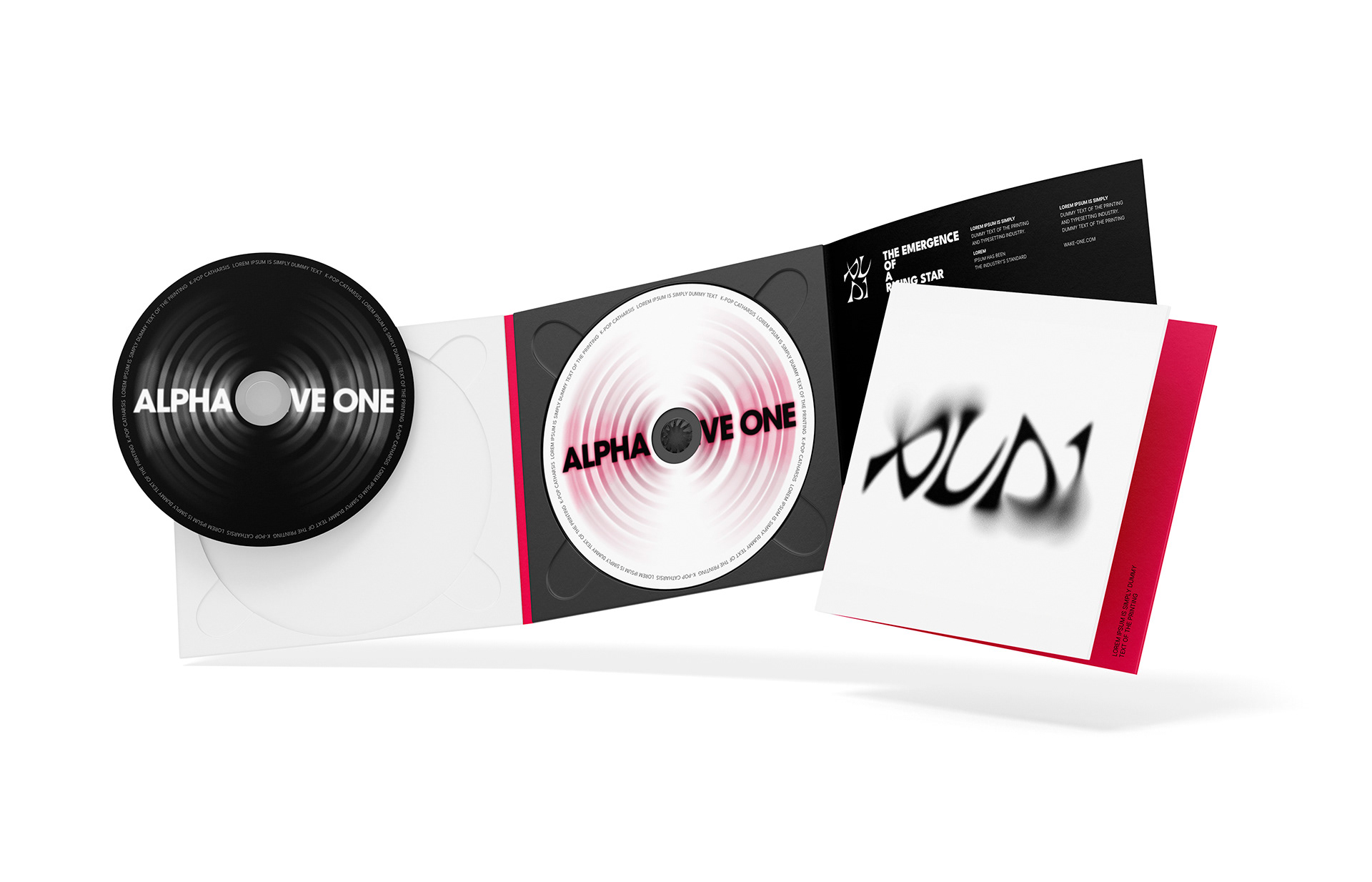
Starting from the concept of 'Drive', the identity visualizes individual movements toward a single destination and the process where the energy is connected in one direction. It is designed as a single brand system so that it can be flexibly expanded to various applications, including music, performances, digital content, and fan experiences.
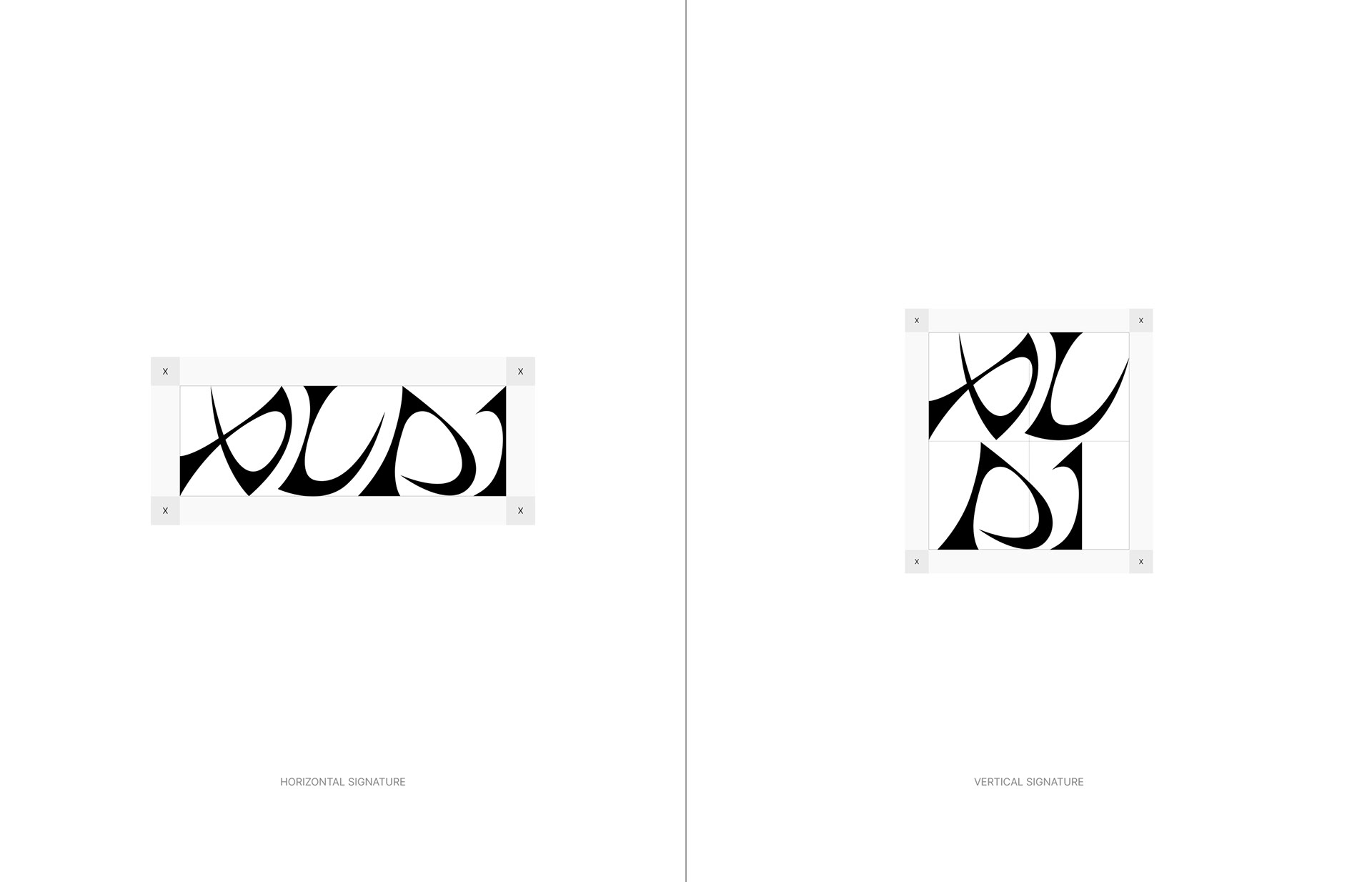
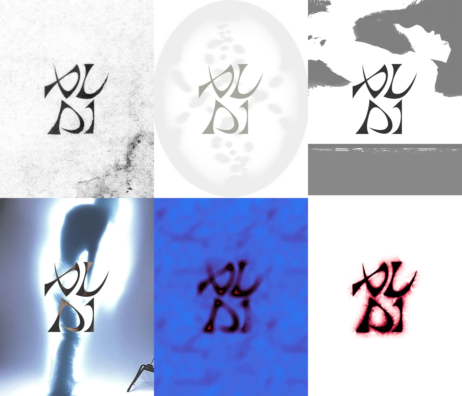
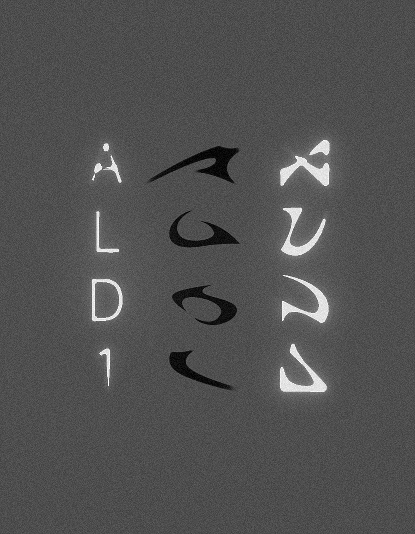
The repeated internal curves and straight strokes in A, L, D, and 1 are the core formative language of the brand. Each letter has a different shape but shares the same formative principle, creating a structure of a brand that connects within a single flow.
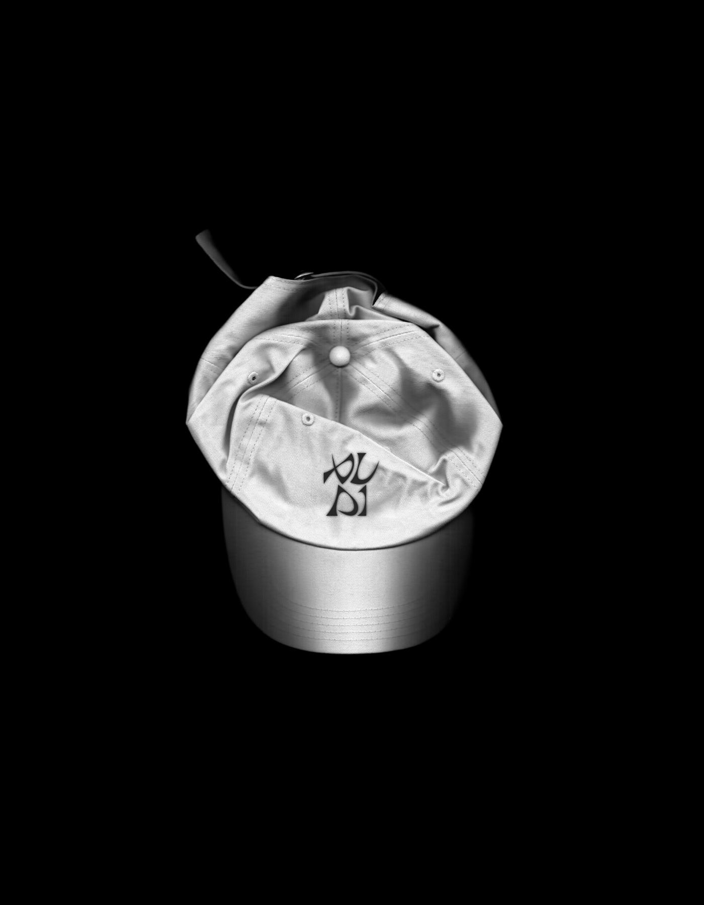
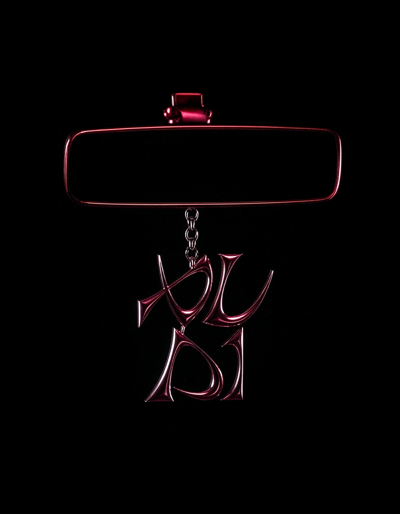
The symbol created by adopting and reconstructing this shared formative element is the most condensed symbol that captures the identity of ALPHA DRIVE ONE. The organic form that converges in one direction and then extends forward once again symbolizes the drive, growth, and constant expandability that Drive implies. At the same time, the structure where several shapes form a single structure visually expresses the universe of ALPHA DRIVE ONE, where different personalities are connected as a team.