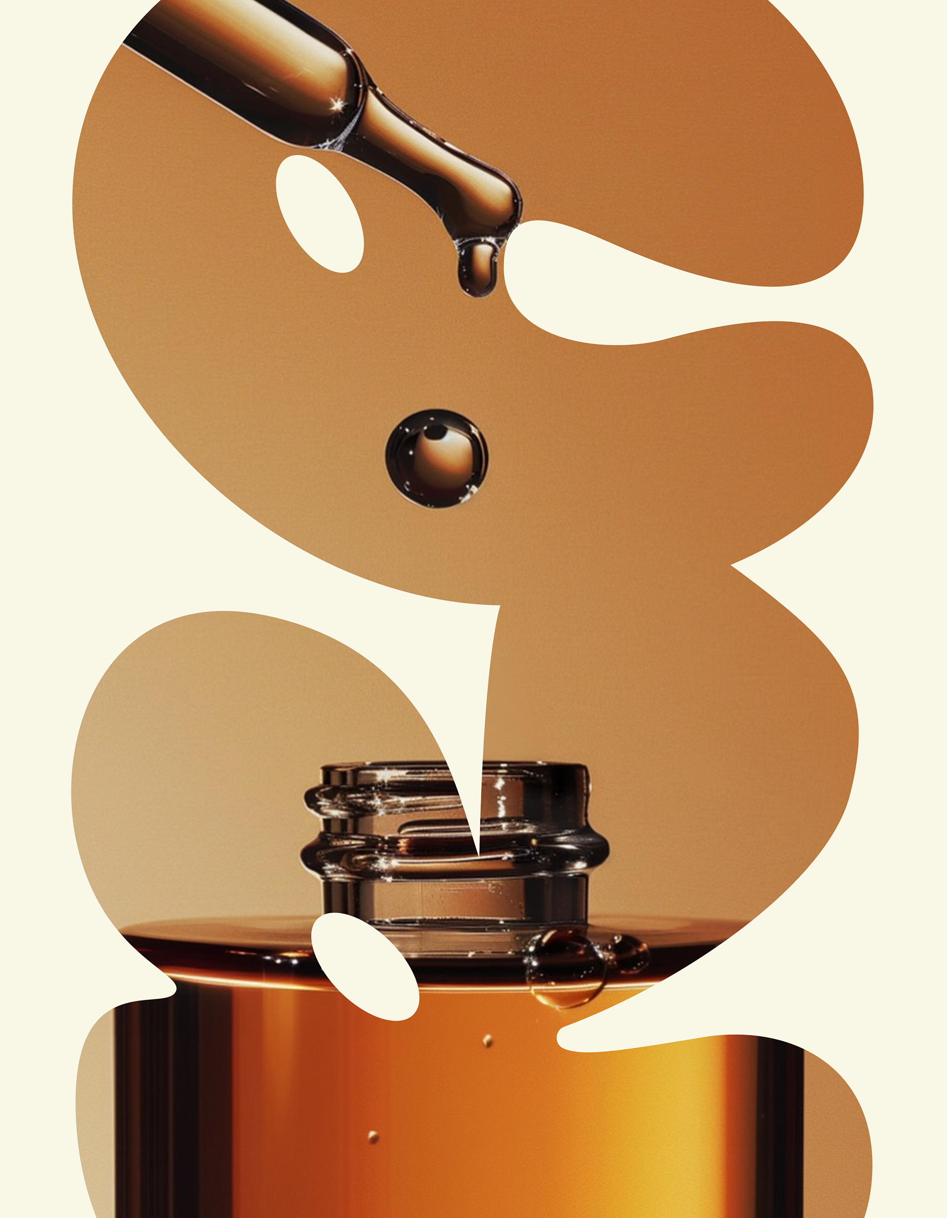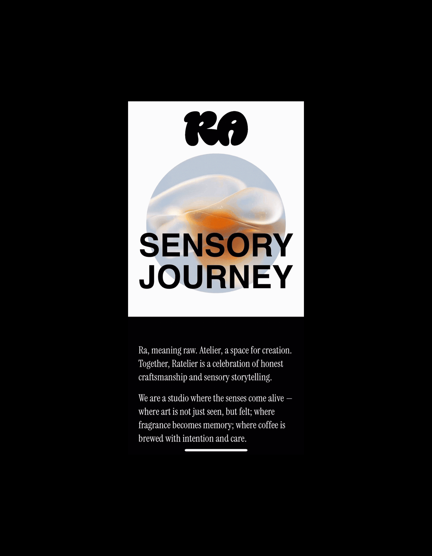
RA, meaning raw. Atelier, a space for creation. Together, Ratelier is a celebration of honest craftsmanship and sensory storytelling.
RA derives from raw — a state of purity, honesty, and unprocessed essence.
Atelier represents a place of creation, experimentation, and craftsmanship.
These two concepts combined, Ratelier embodies a brand philosophy rooted in authenticity and intentional making.
Atelier represents a place of creation, experimentation, and craftsmanship.
These two concepts combined, Ratelier embodies a brand philosophy rooted in authenticity and intentional making.
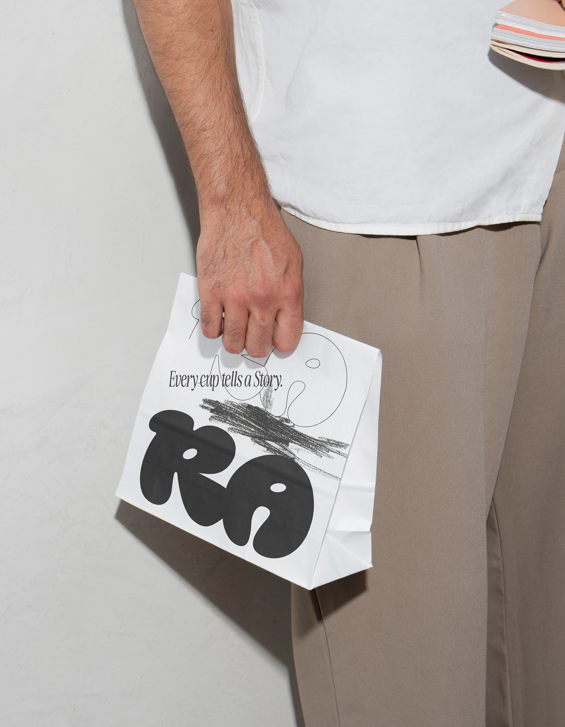
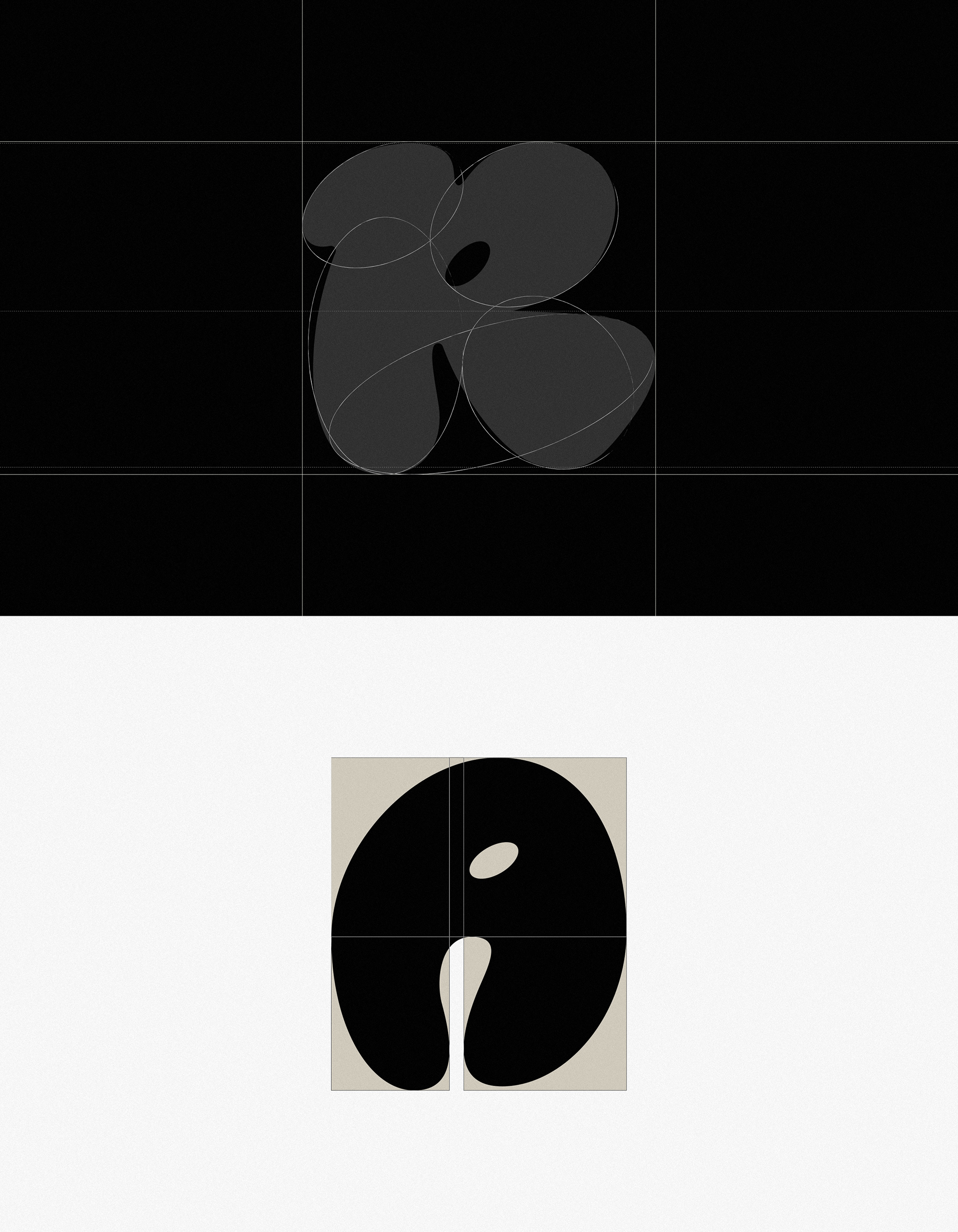
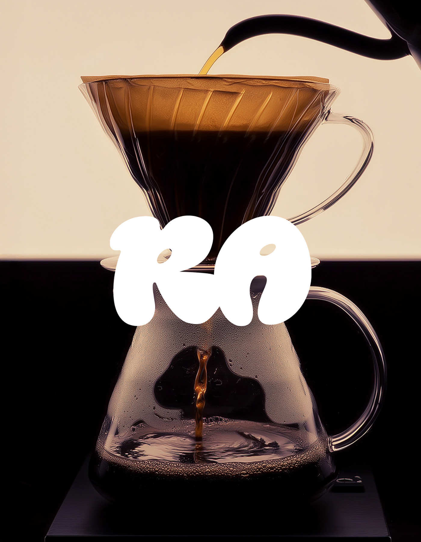
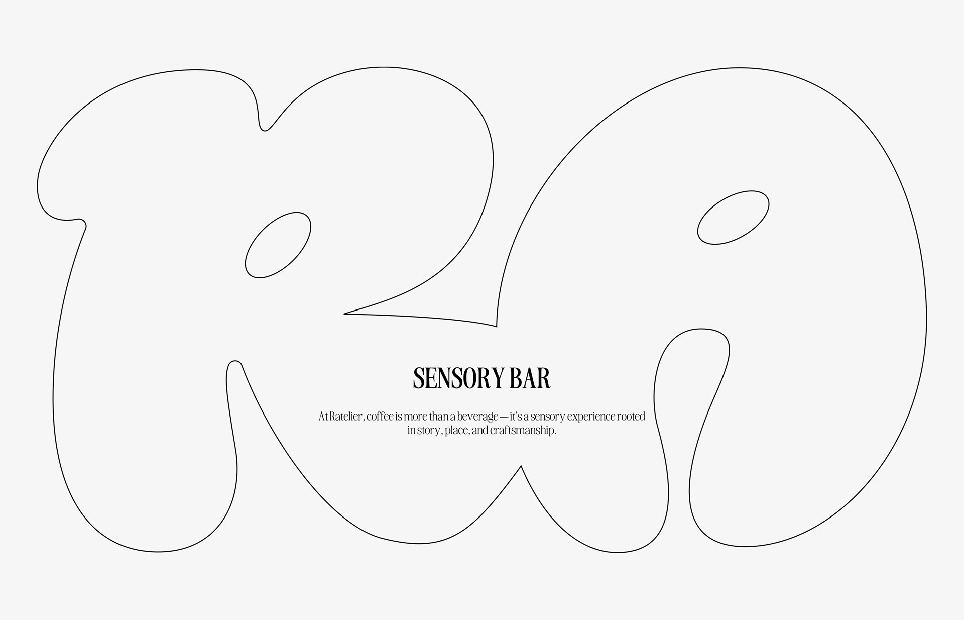
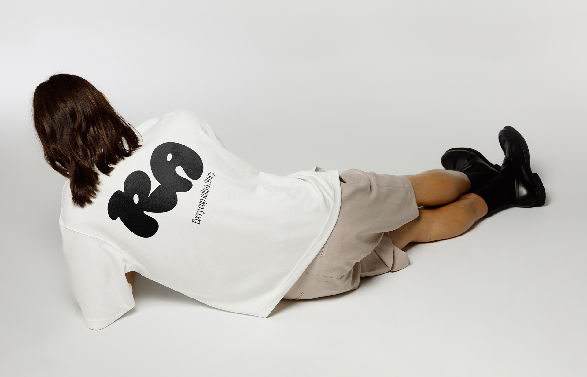
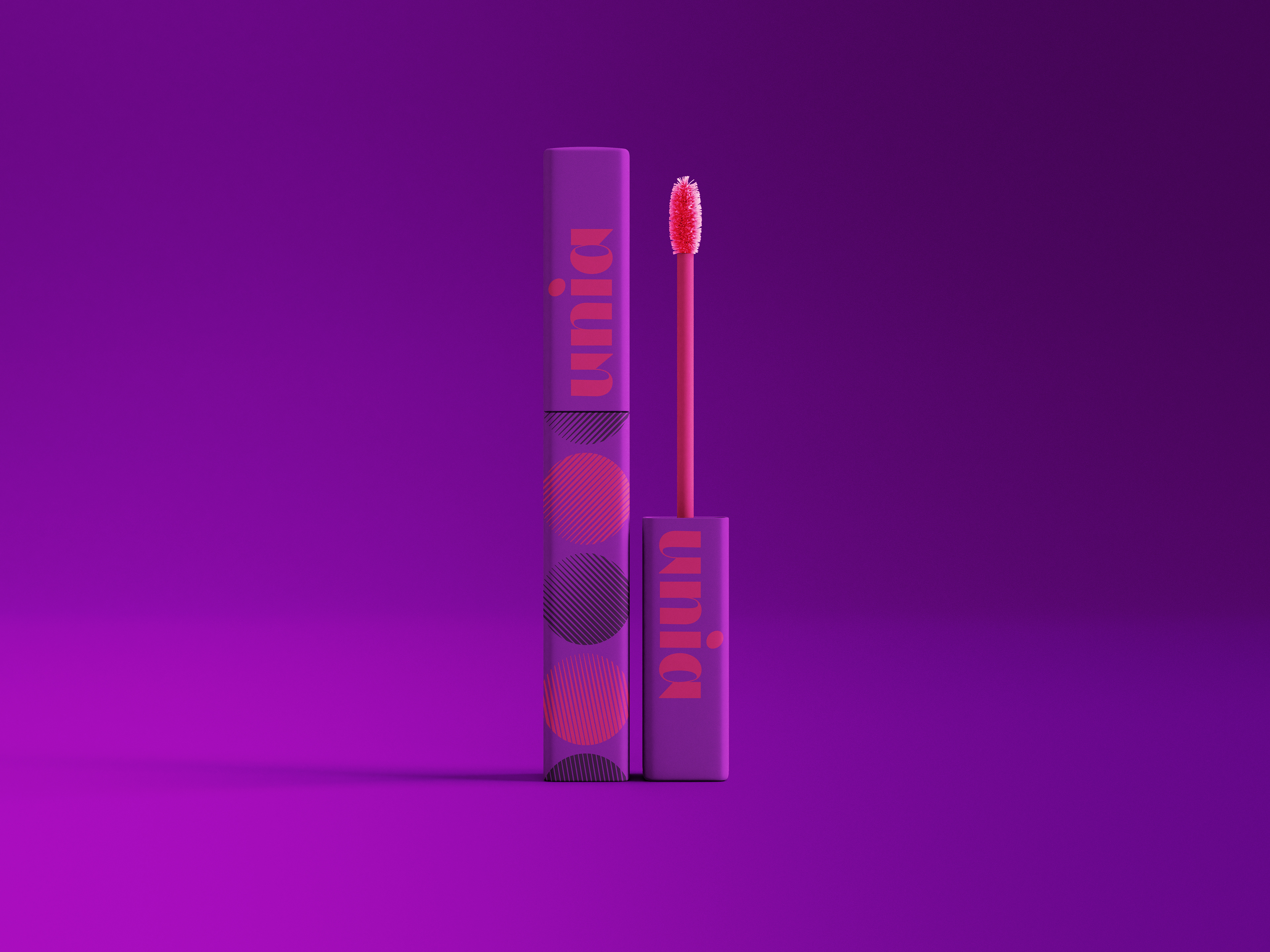
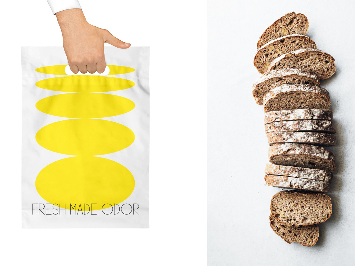
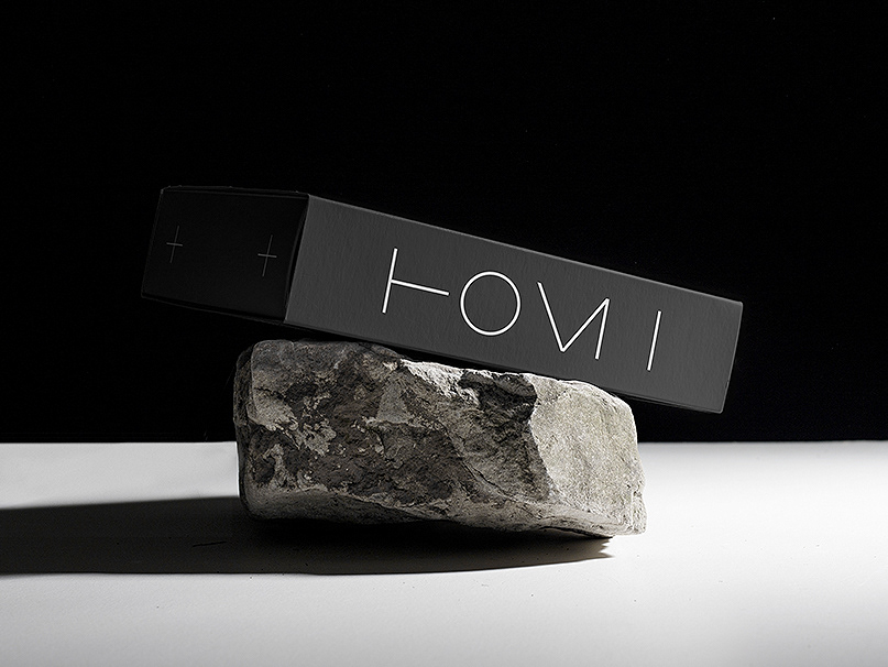
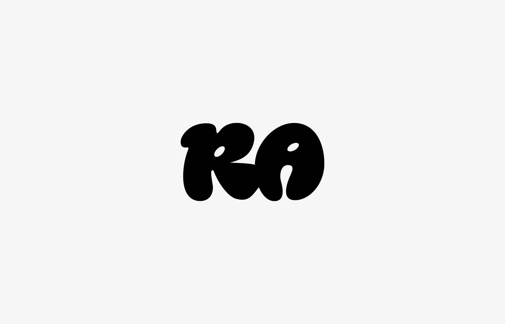
The logotype is designed in a organic word mark to intuitively express the brand philosophy.
Soft, rounded letterforms and fluid connections of structure reflect tactility, warmth, and a human touch — emphasizing process and the touch of a hand over perfection.
Soft, rounded letterforms and fluid connections of structure reflect tactility, warmth, and a human touch — emphasizing process and the touch of a hand over perfection.
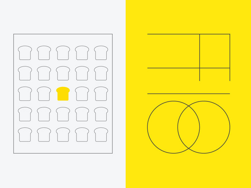
The subtle irregularities within the form are intentional, capturing the natural imperfections found in handcrafted work.
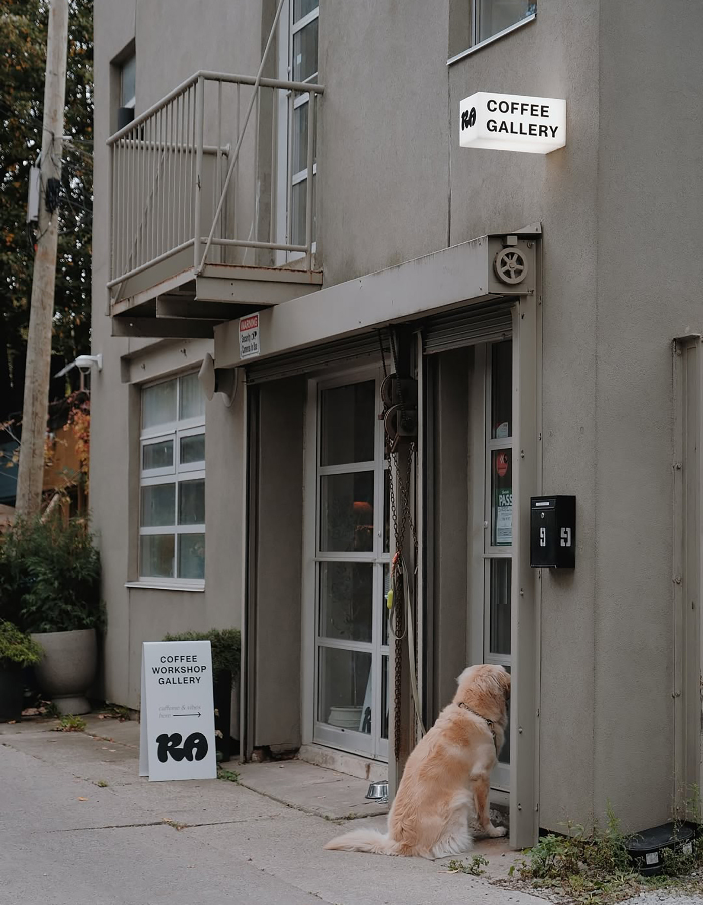
Compact and stable silhouette ensures strong visual presence while not being too excessive.
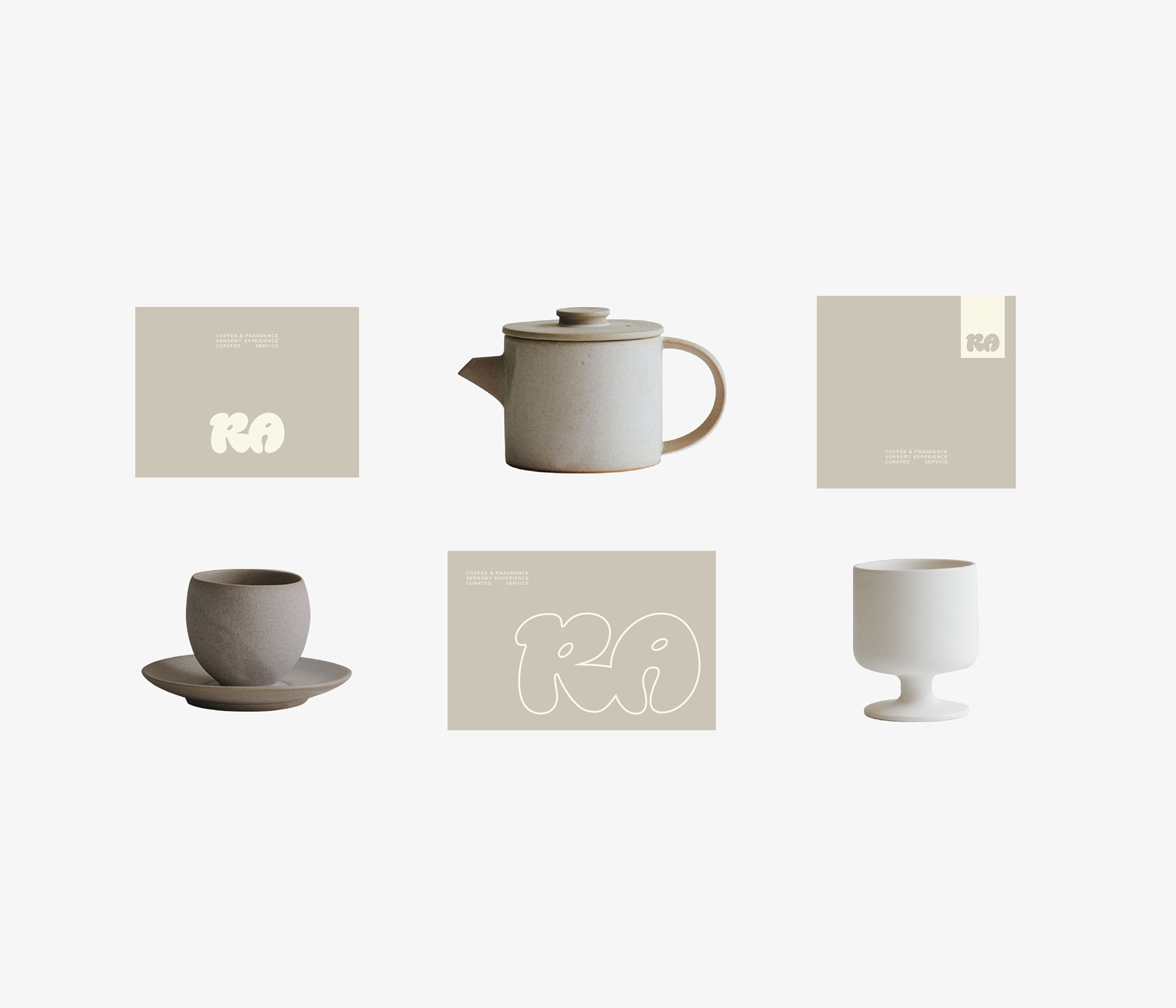
Negative spaces within the letterforms are carefully calibrated to be applied effectively across both physical and digital environment.
Negative spaces within the letterforms are carefully calibrated to be applied effectively across both physical and digital environment.
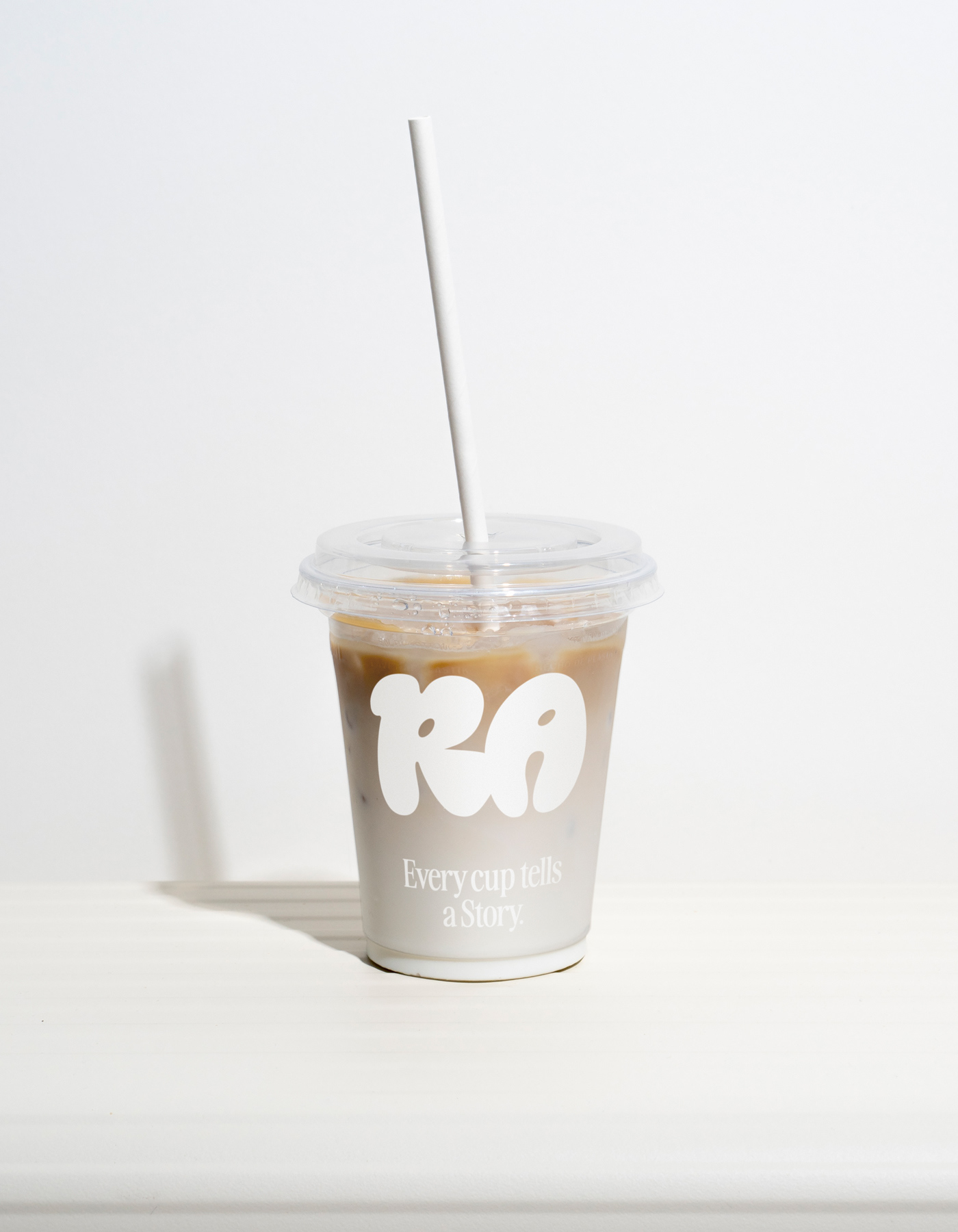
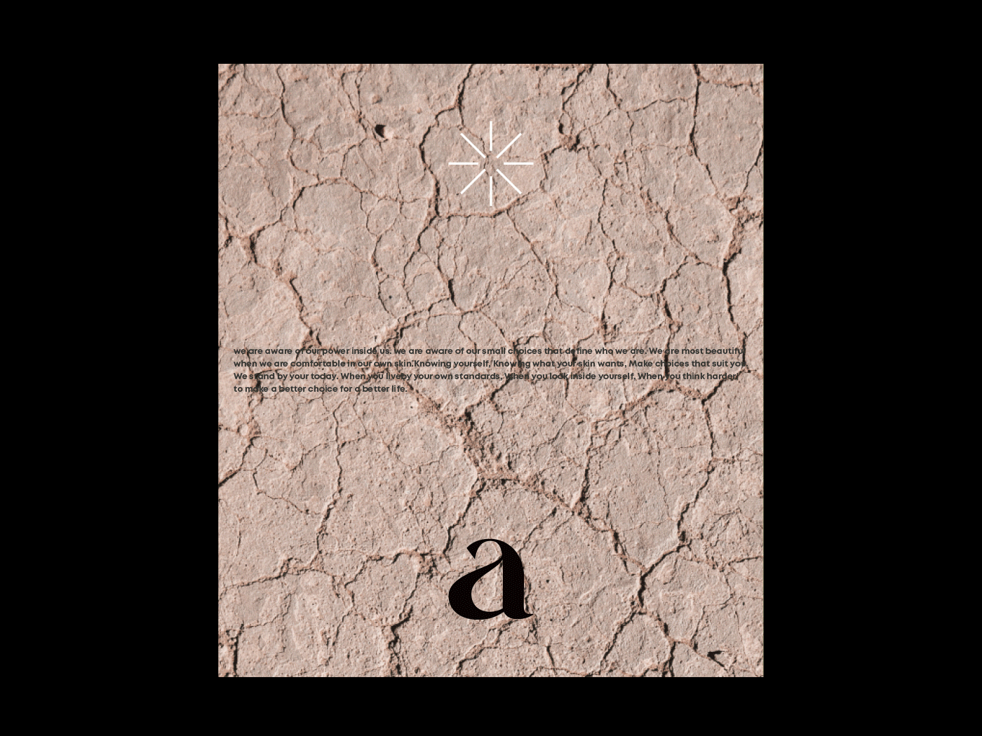
Minimizing the decorative elements, the identity introduces the form itself as the language of the brand.
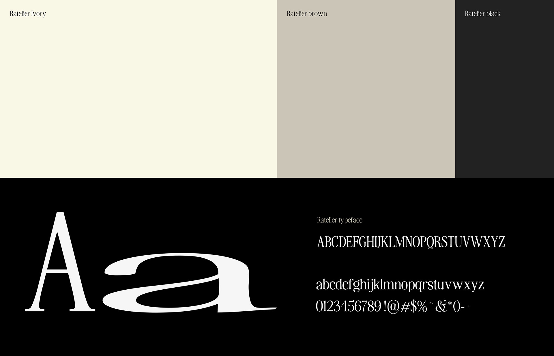
Ratelier’s identity secures timeless structure that isn’t swayed by the trend, and conveys craftsmanship, sincerity, and a sense of depth with simple form.
Ratelier’s identity secures timeless structure that isn’t swayed by the trend, and conveys craftsmanship, sincerity, and a sense of depth with simple form.