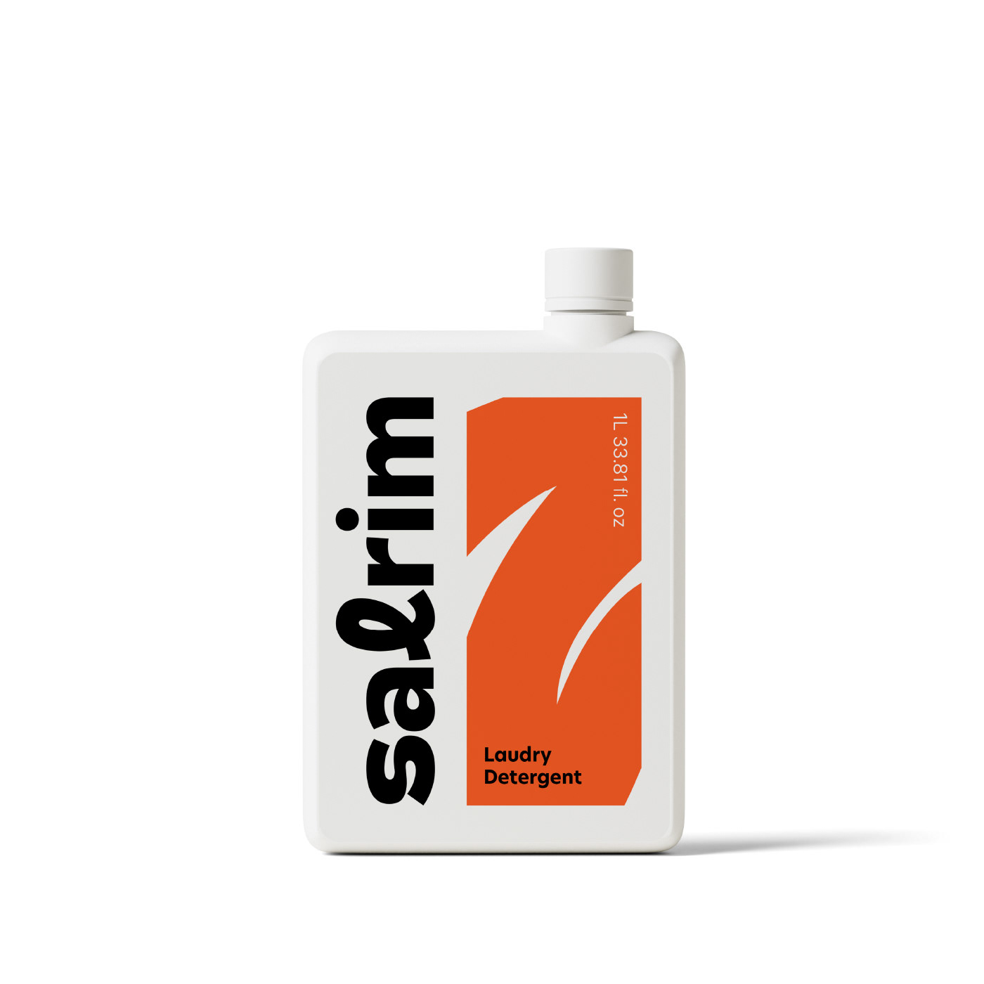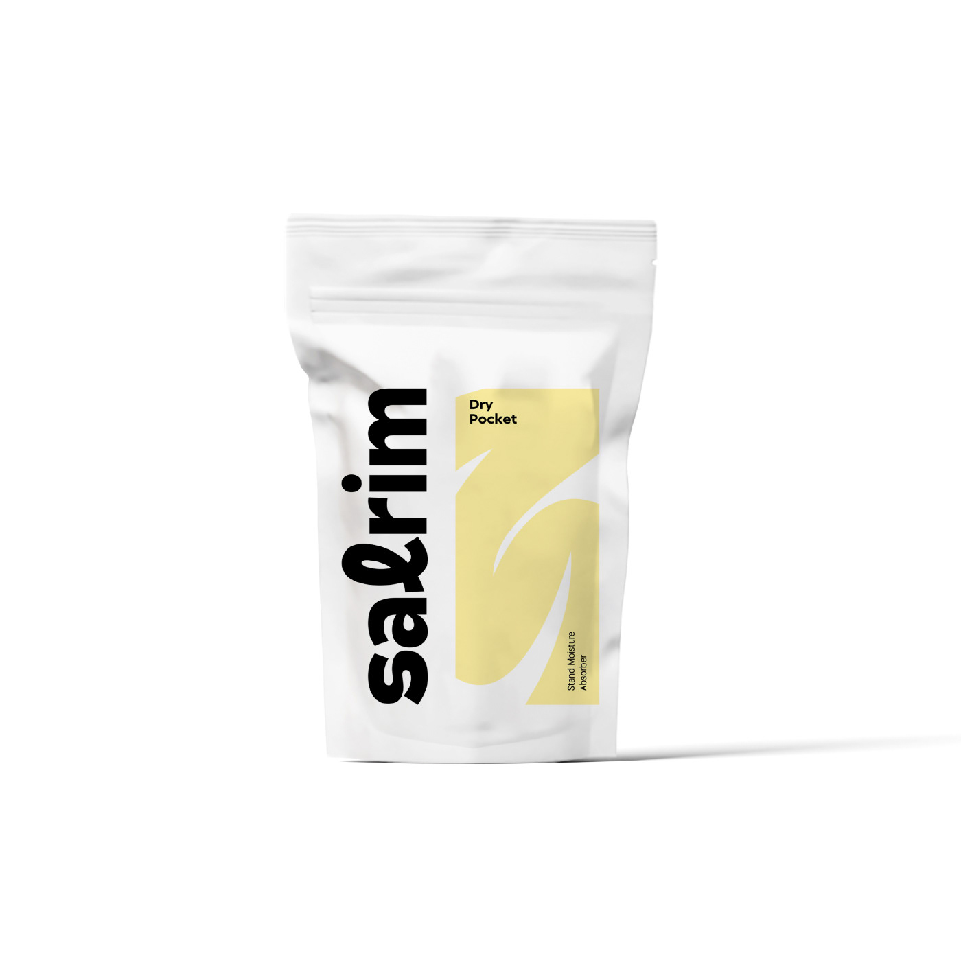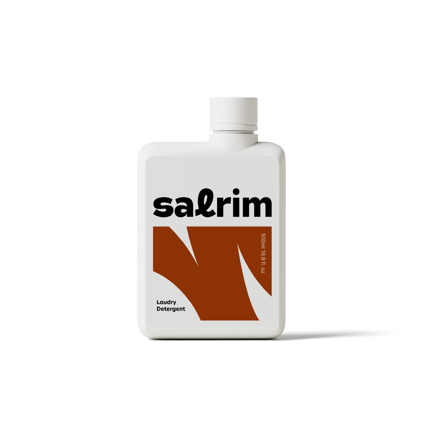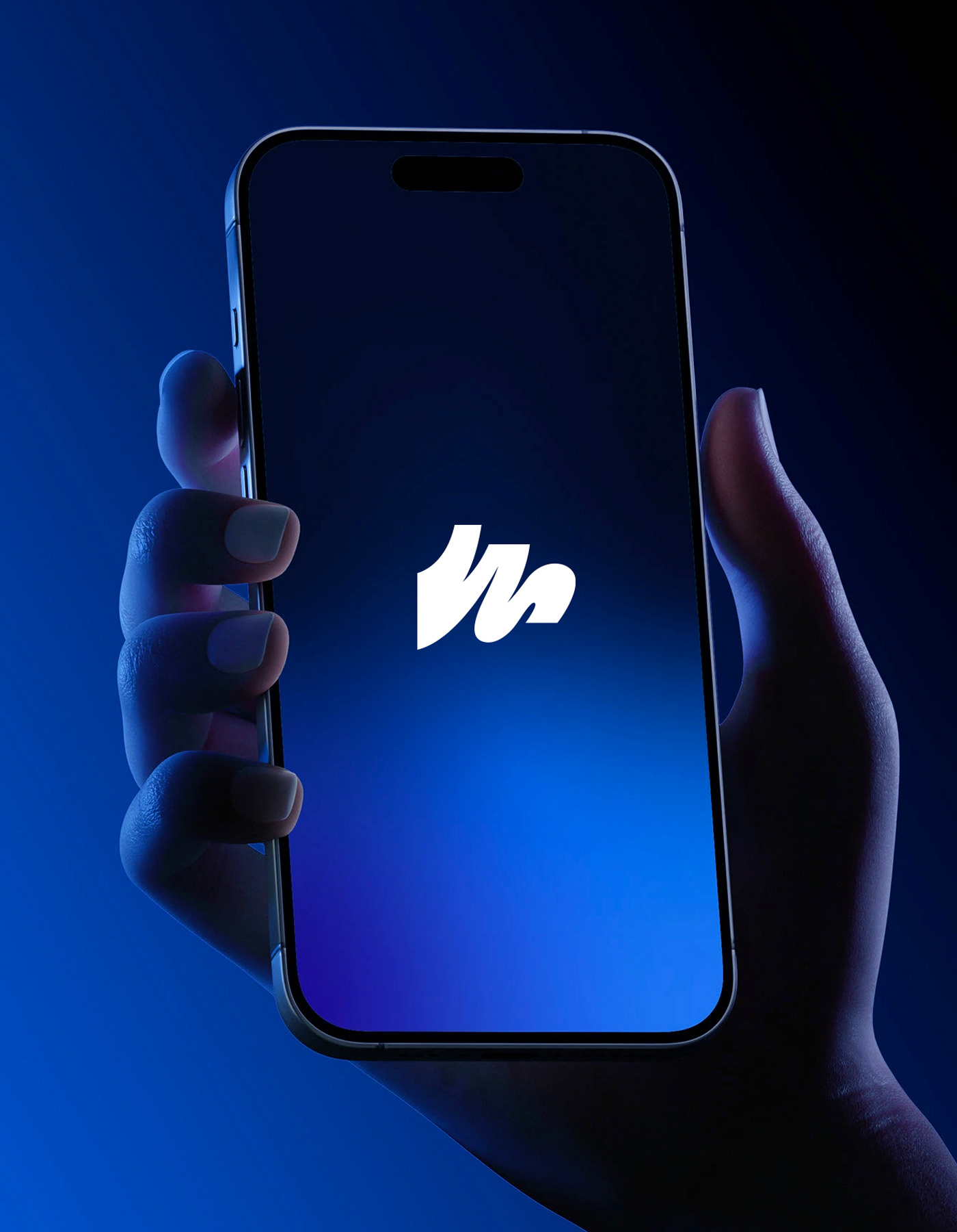

Salrimgisul started as a practical household product brand dedicated to solving everyday inconveniences, has been going with its functionality and efficiency. However, today’s household product market has evolved from just solving functional problems to delivering user experiences and lifestyles that seamlessly integrates into daily living.
Salrimgisul needed to expand its identity from “a brand that simply addresses discomfort" to “the brand that deeply understands the flow of life and designs a better everyday experience.”
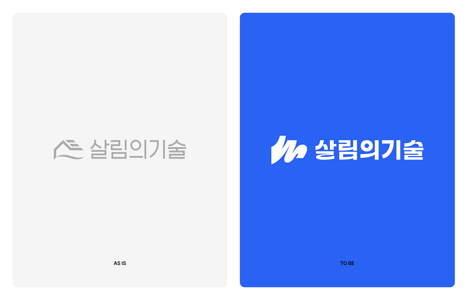
In this rebranding, our primary goal is to establish a new brand identity, expanding beyond a utility-driven household brand to a lifestyle brand that thoughtfully understands user’s movements and lessons unnecessary complexity.
Salrimgisul needed to expand its identity from “a brand that simply addresses discomfort" to “the brand that deeply understands the flow of life and designs a better everyday experience.”
In this rebranding, our primary goal is to establish a new brand identity, expanding beyond a utility-driven household brand to a lifestyle brand that thoughtfully understands user’s movements and lessons unnecessary complexity.

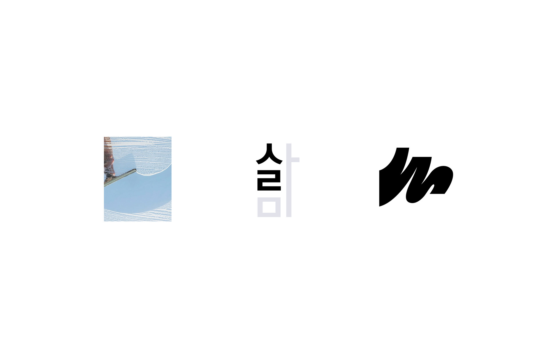
We reinterpreted the convenience that Salrimgisul pursues as ‘The Seamless Flow’, a flow of rhythm in daily life and an aesthetic of tidy order.
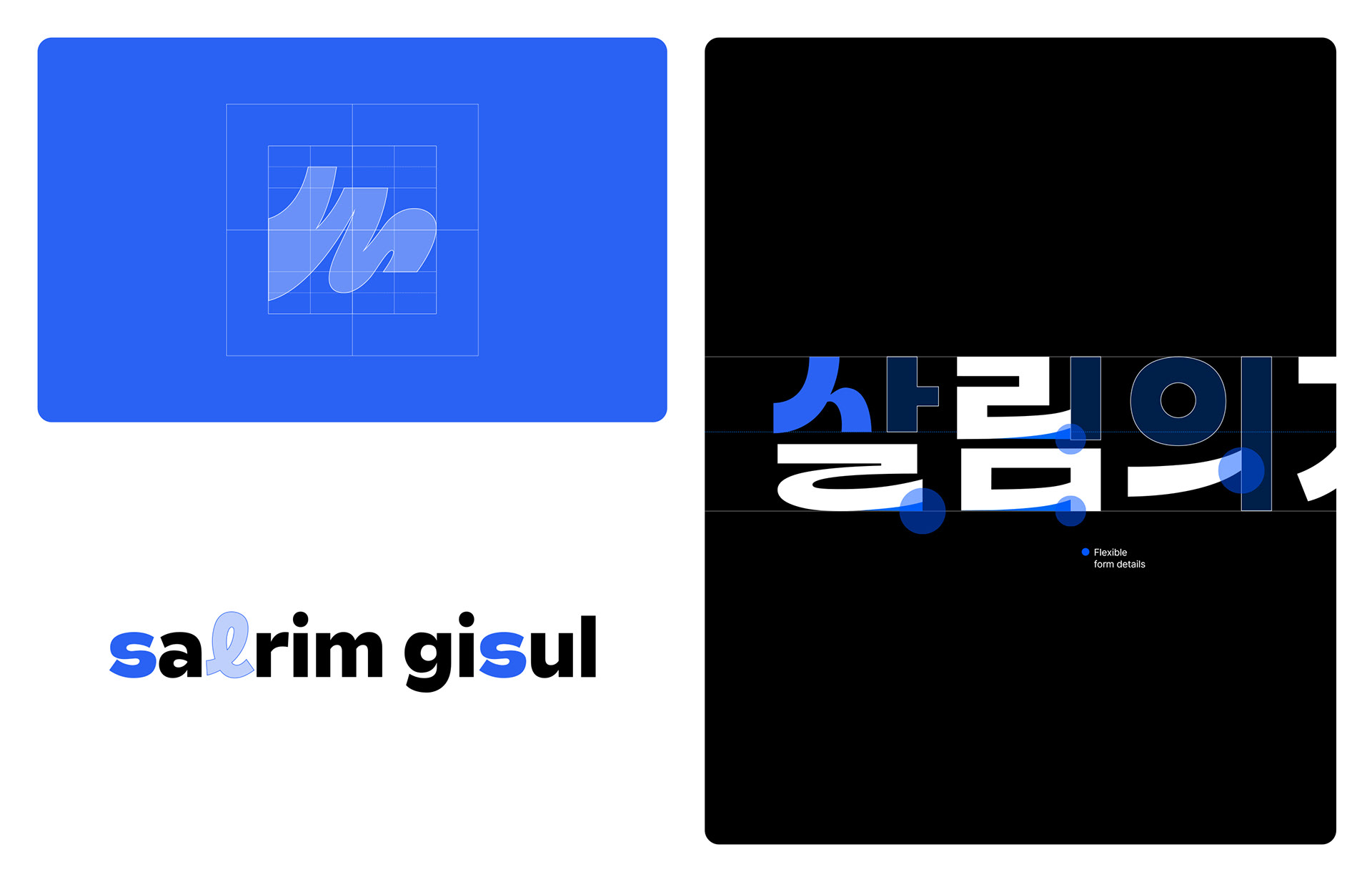
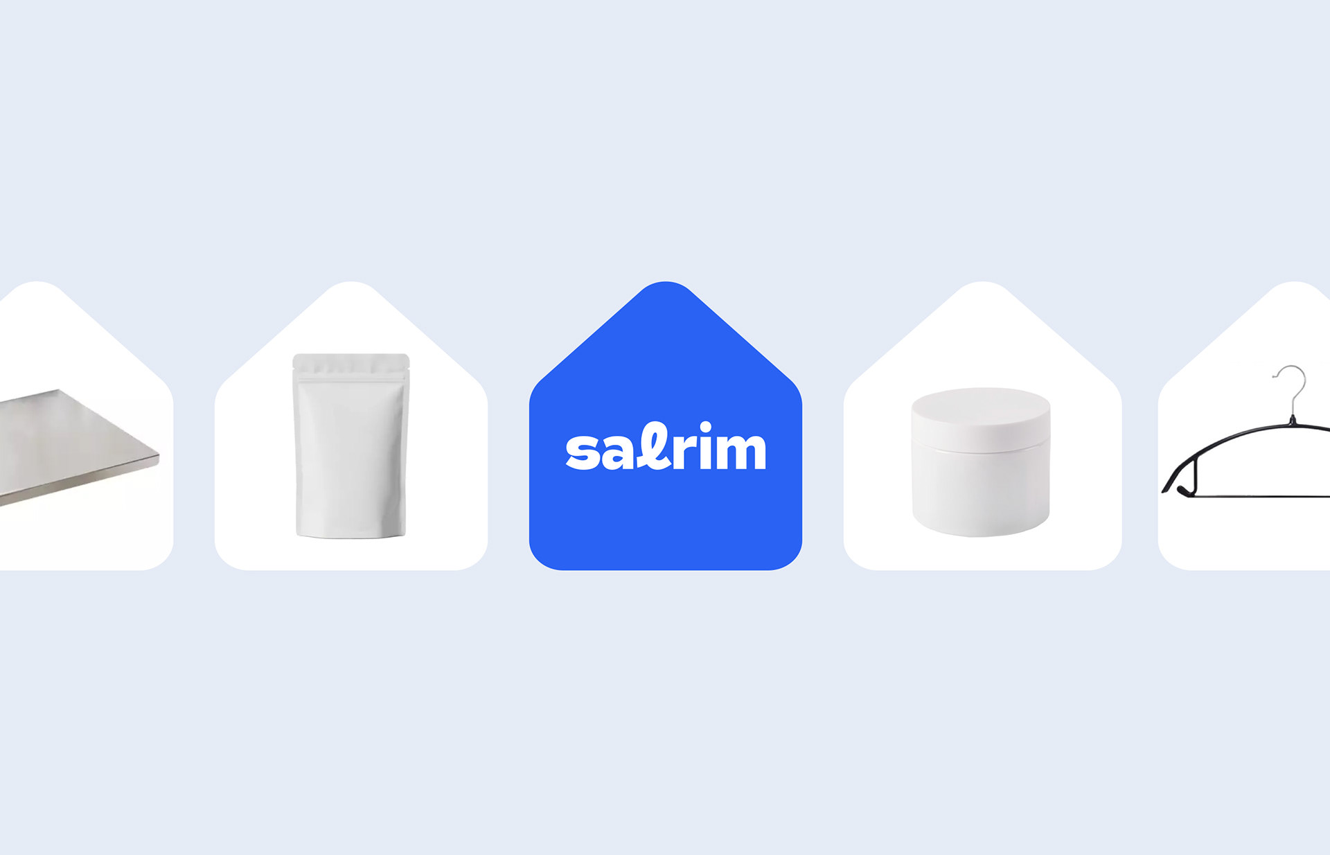
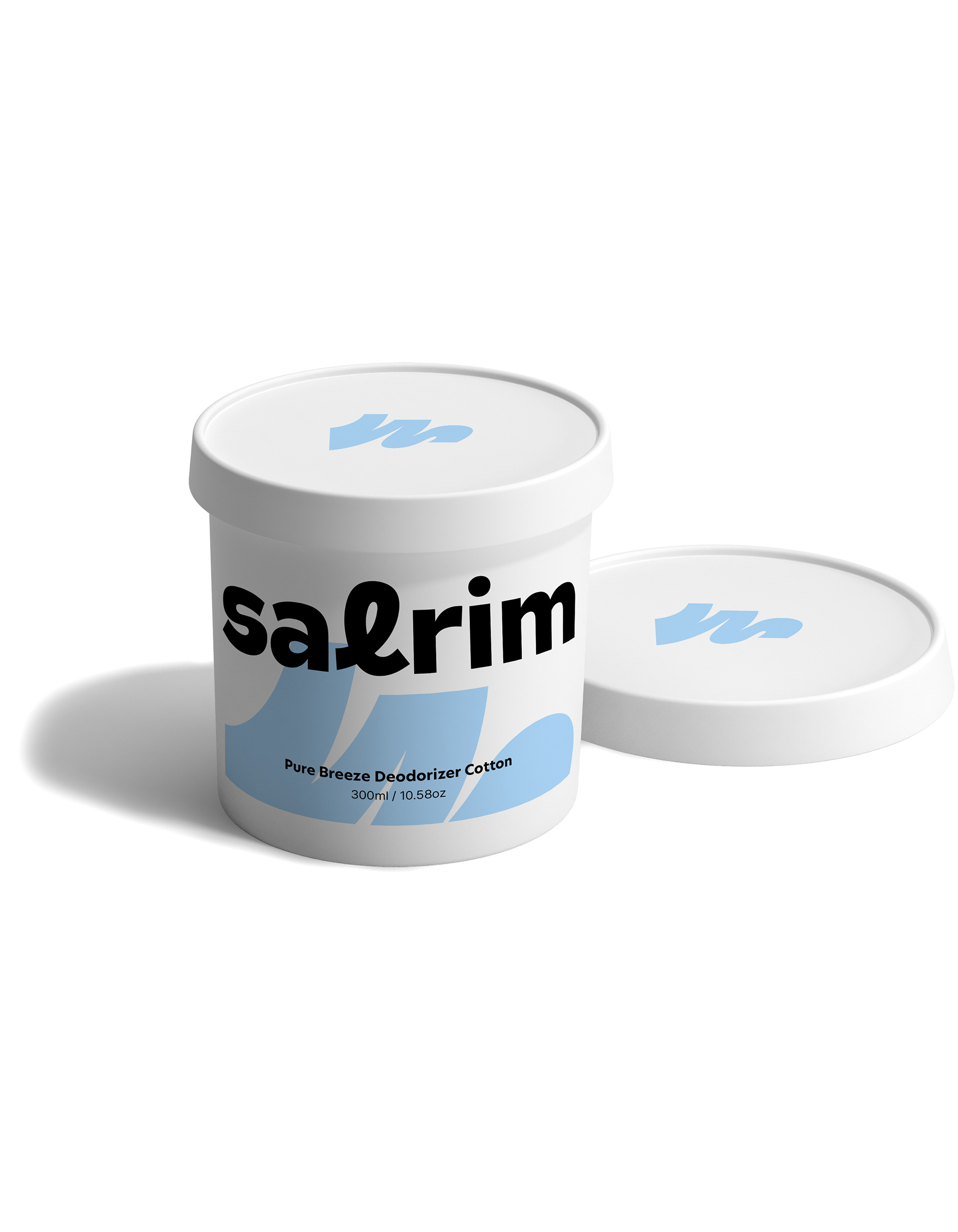
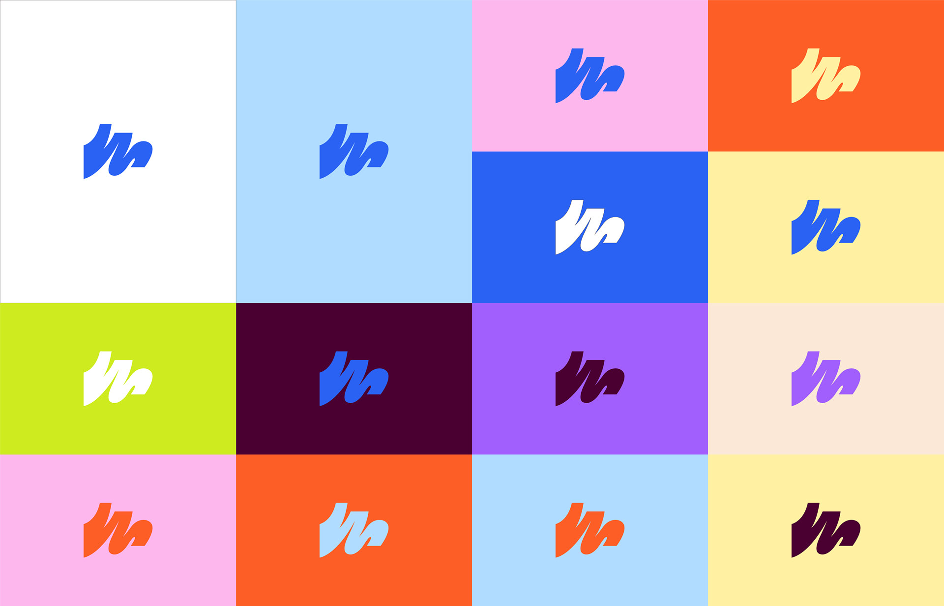
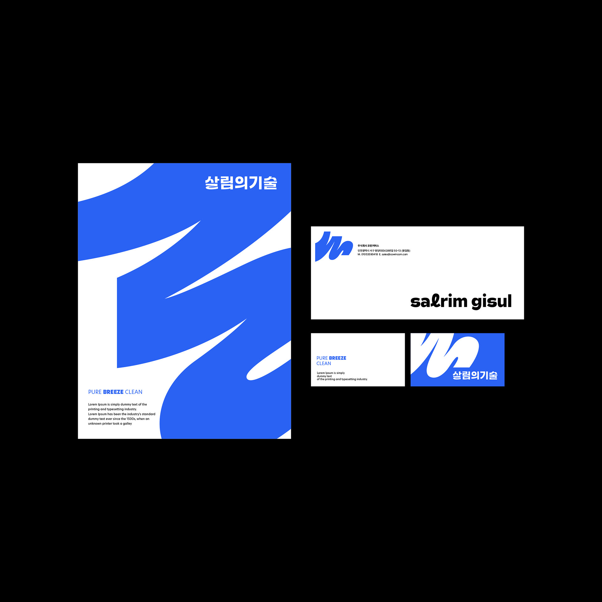
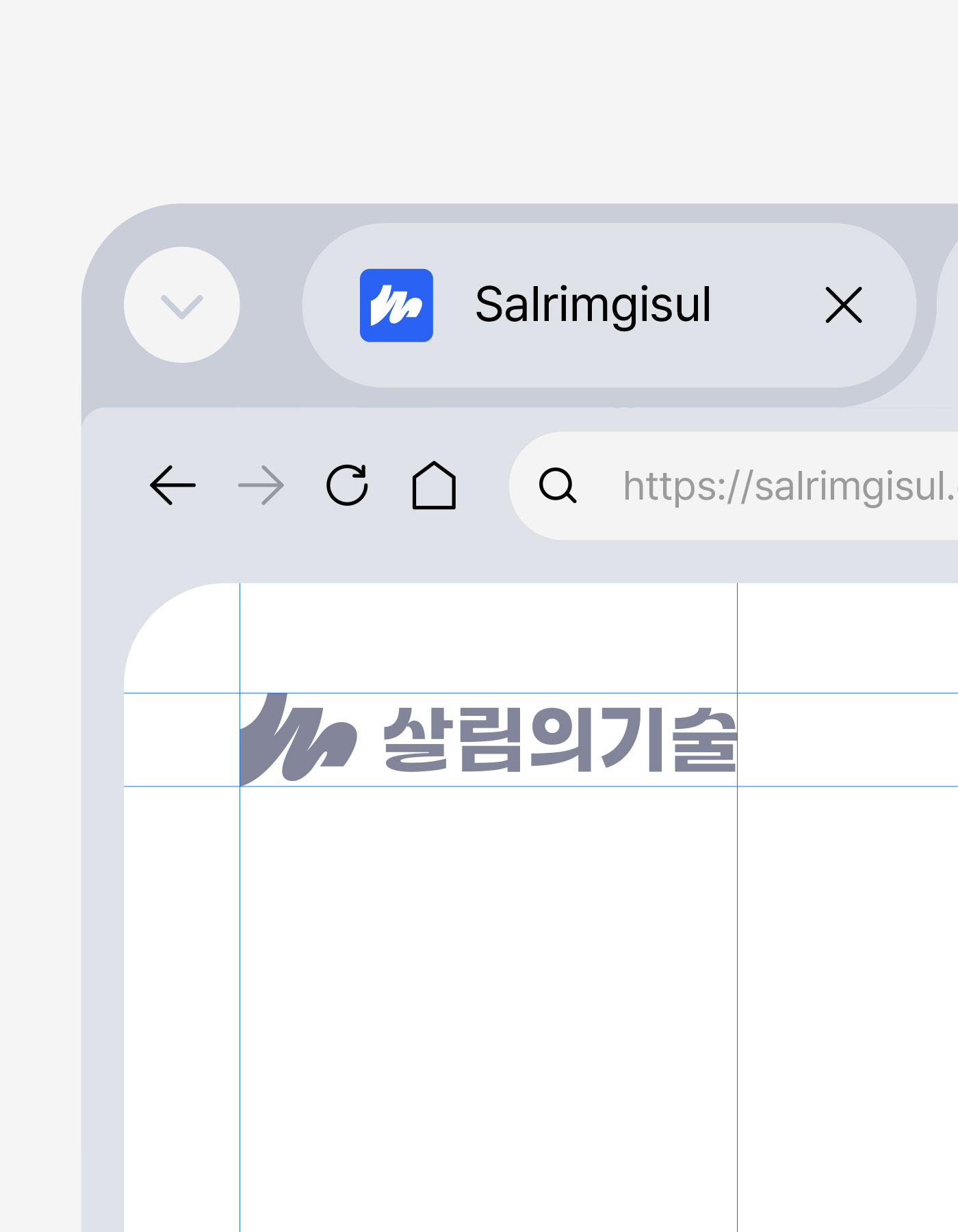
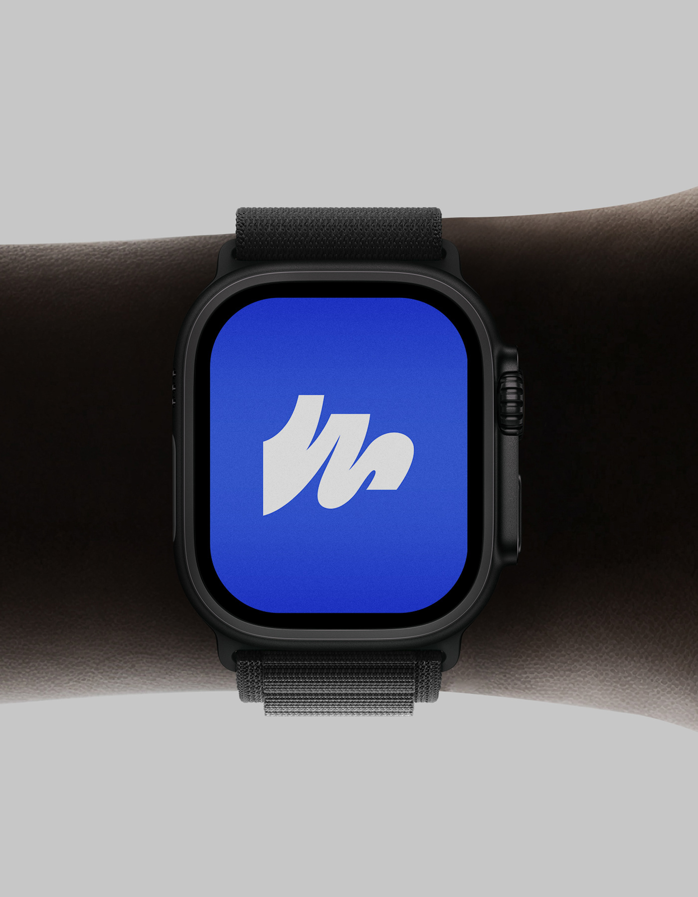
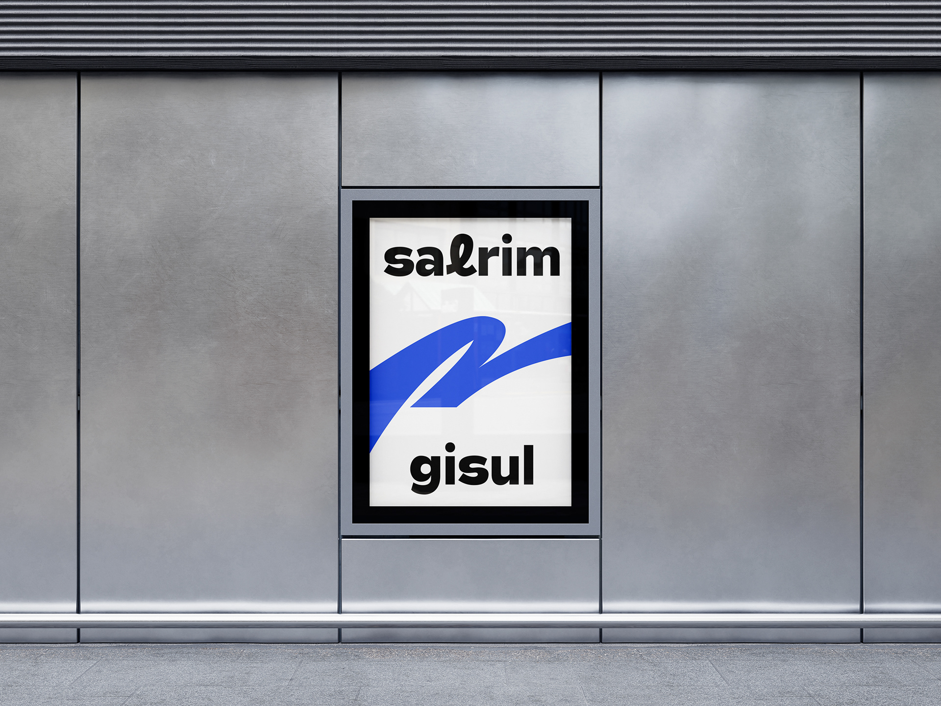
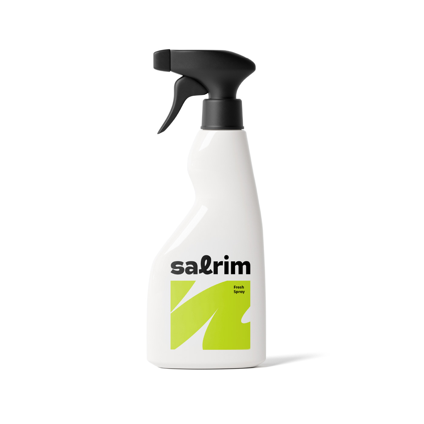
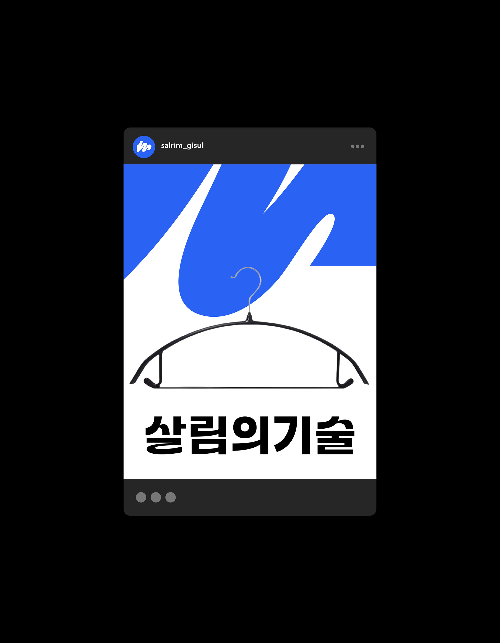
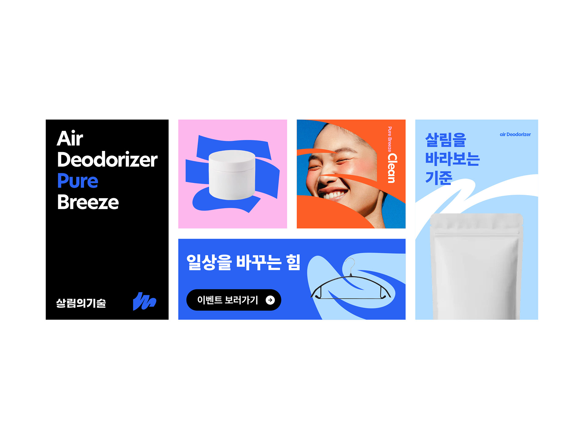
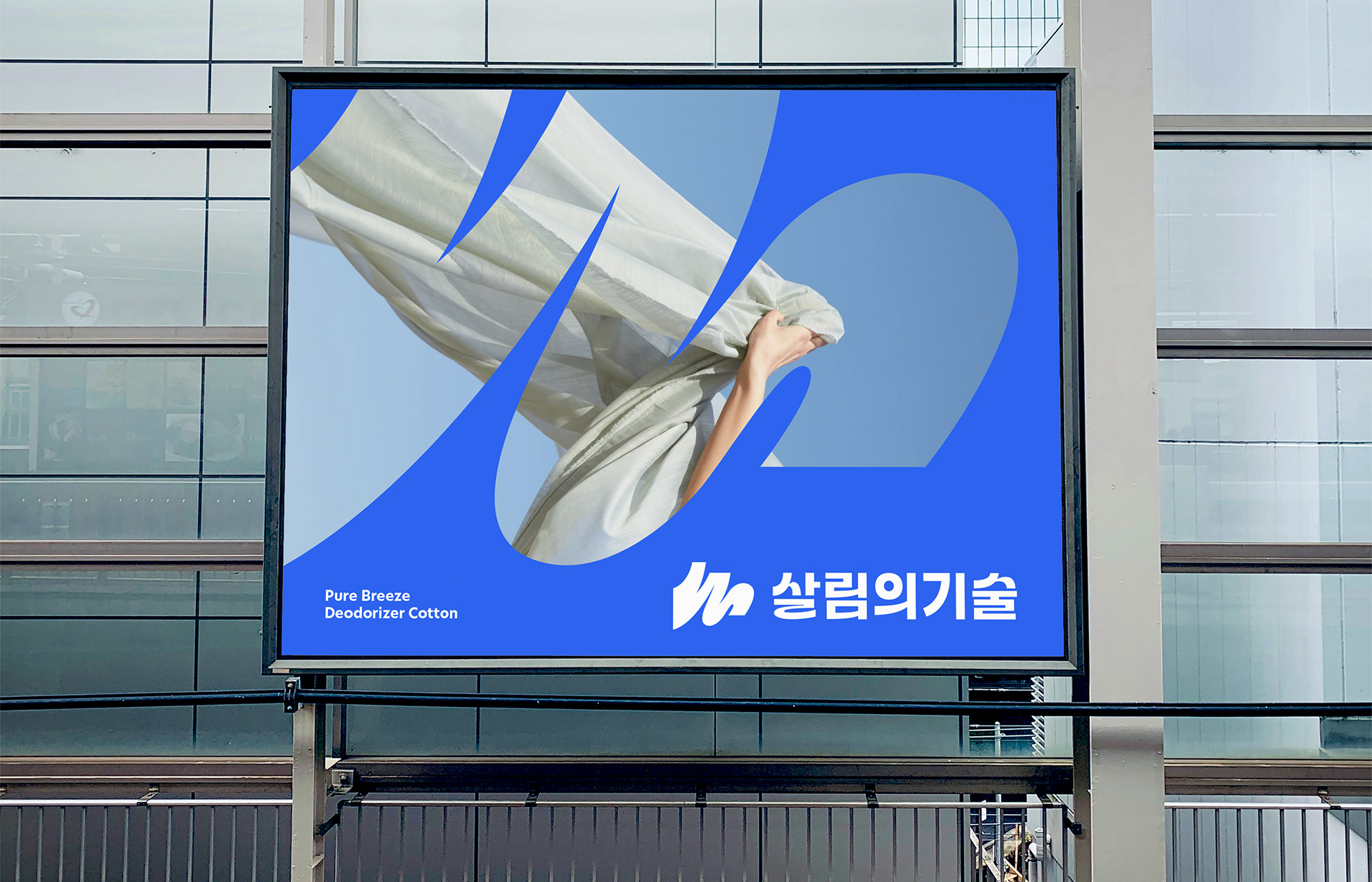
Rather than adding complex features, we focused on experiences that align naturally with user movements and daily life without disruption, and we defined it as the brand’s core visual language. Centered around smooth, continuous curves and organized structure, we expanded our logo and graphic systems to build a flexible brand asset that can be applied consistently across various products and communications.
Through this transformation, we redefined Salrimgisul as "housware that makes daily life flow smoothly,” not as "houseware that complicates life,” completing a contemporary lifestyle brand identity that intuitively delivers convenience in everyday life.
Rather than adding complex features, we focused on experiences that align naturally with user movements and daily life without disruption, and we defined it as the brand’s core visual language. Centered around smooth, continuous curves and organized structure, we expanded our logo and graphic systems to build a flexible brand asset that can be applied consistently across various products and communications.
Through this transformation, we redefined Salrimgisul as "housware that makes daily life flow smoothly,” not as "houseware that complicates life,” completing a contemporary lifestyle brand identity that intuitively delivers convenience in everyday life.