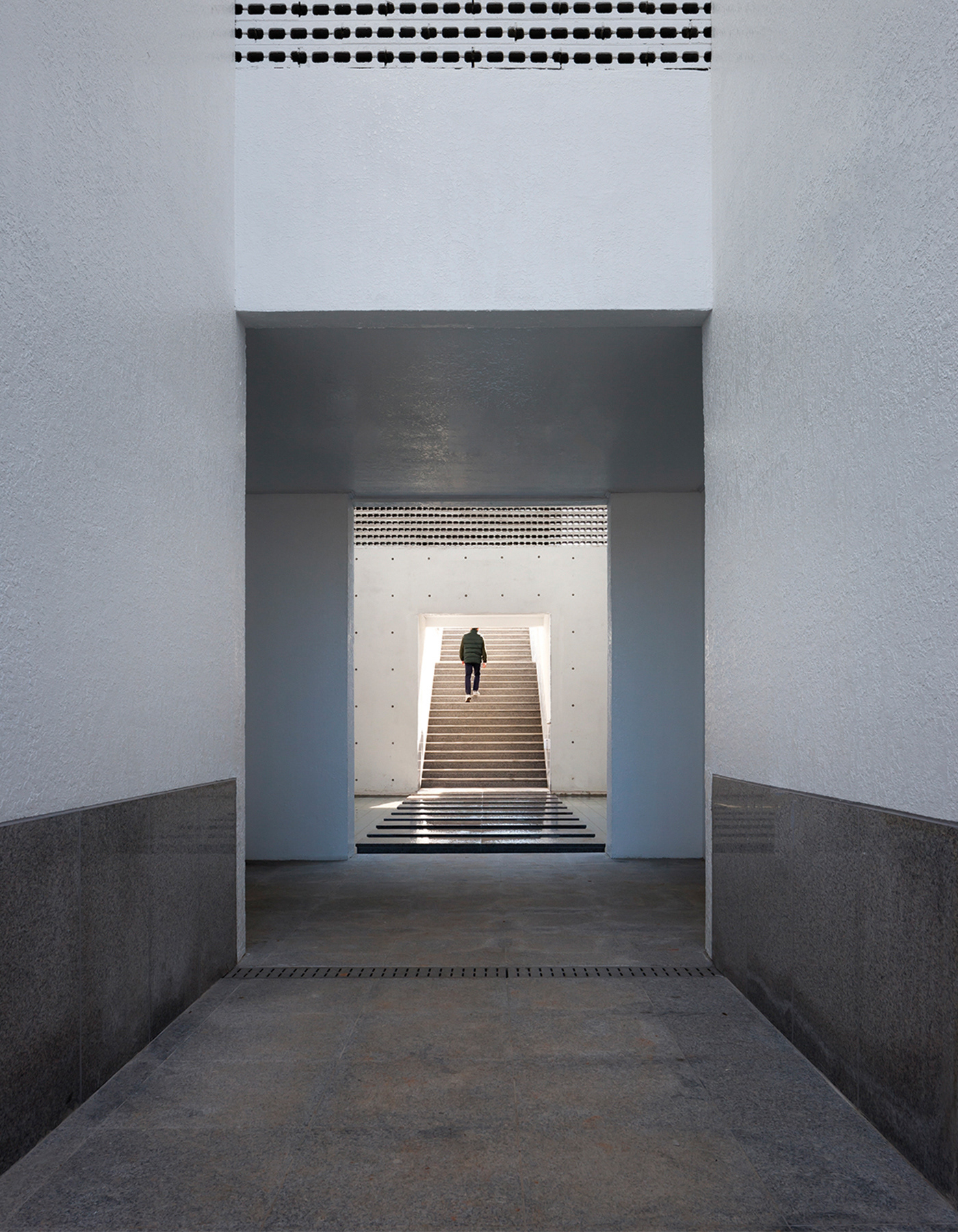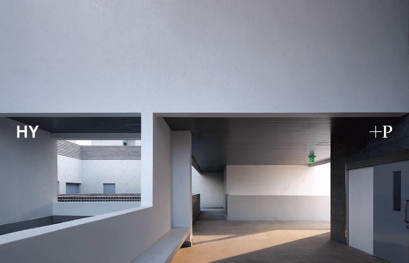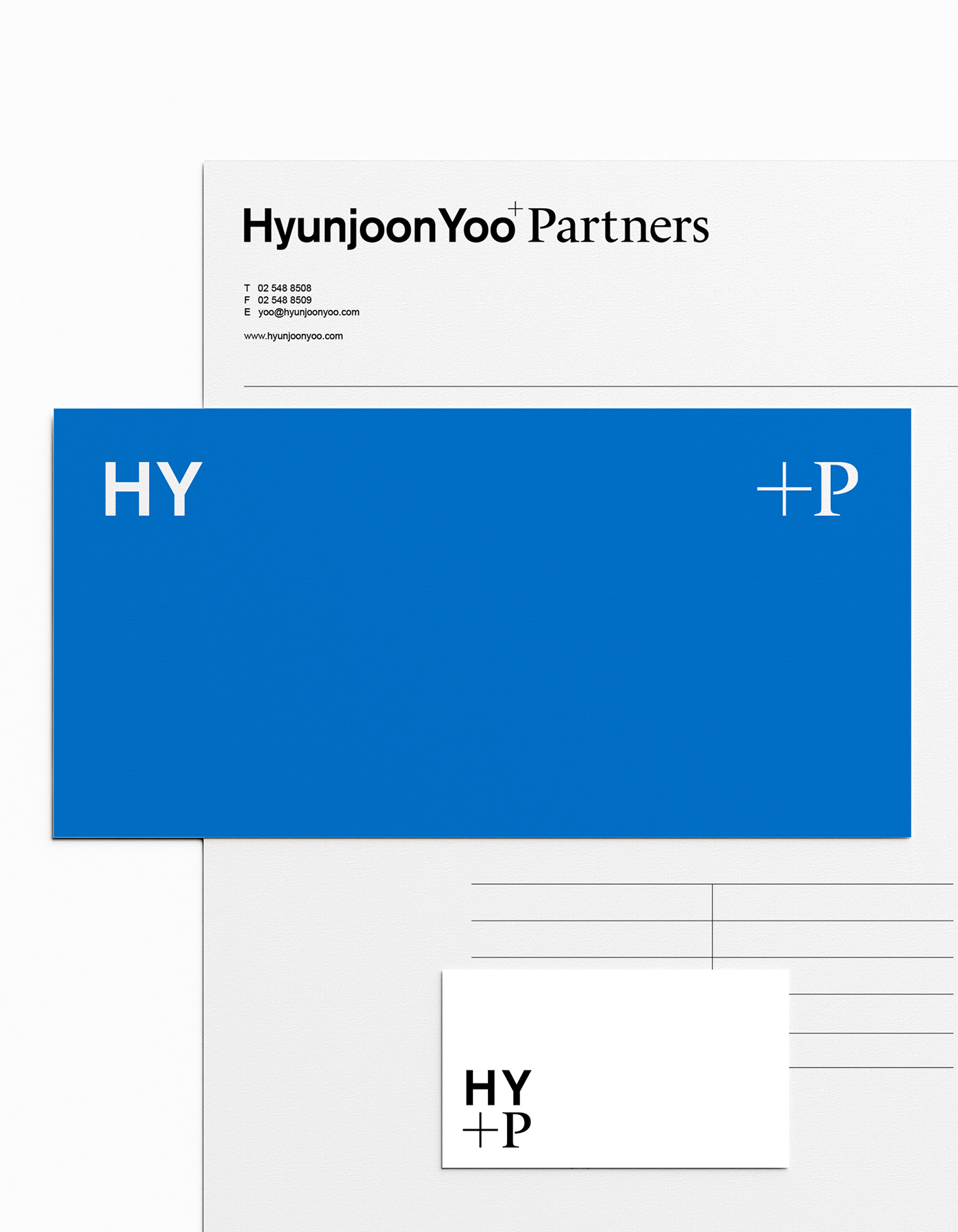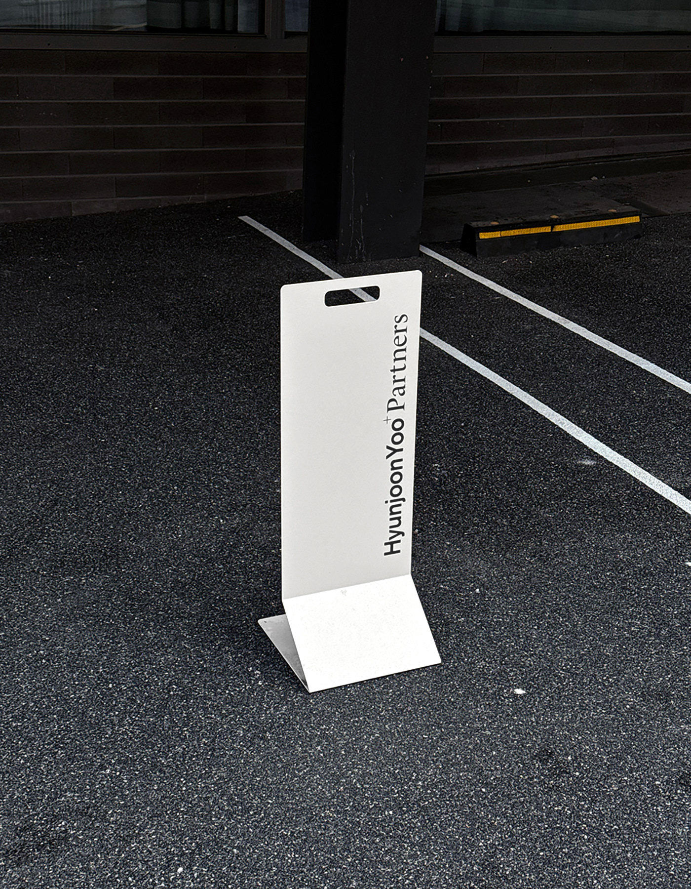
Hyunjoon Yoo & Partners is an architecture firm that explores the relationship between society, city, and people. This brand identity renewal is to redefine the studio’s architectural philosophy into a refined visual language—one that shifts away from rigidity and formality toward openness and flexibility.
This identity renewal is not merely a stylistic update, but a structural visualizing of Hyunjoon Yoo & Partners’ approach and perspective toward architecture. Resembling the architecture itself, the overall system is designed with clarity and order, yet remains open to interpretation, extension.
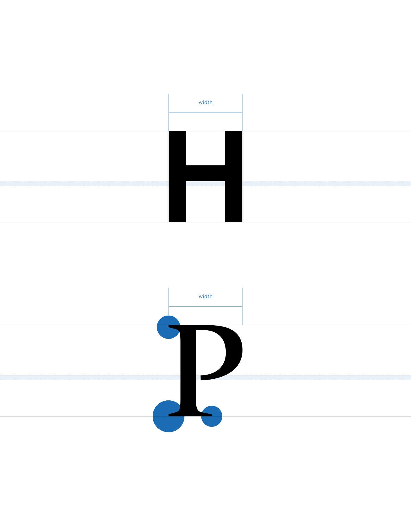
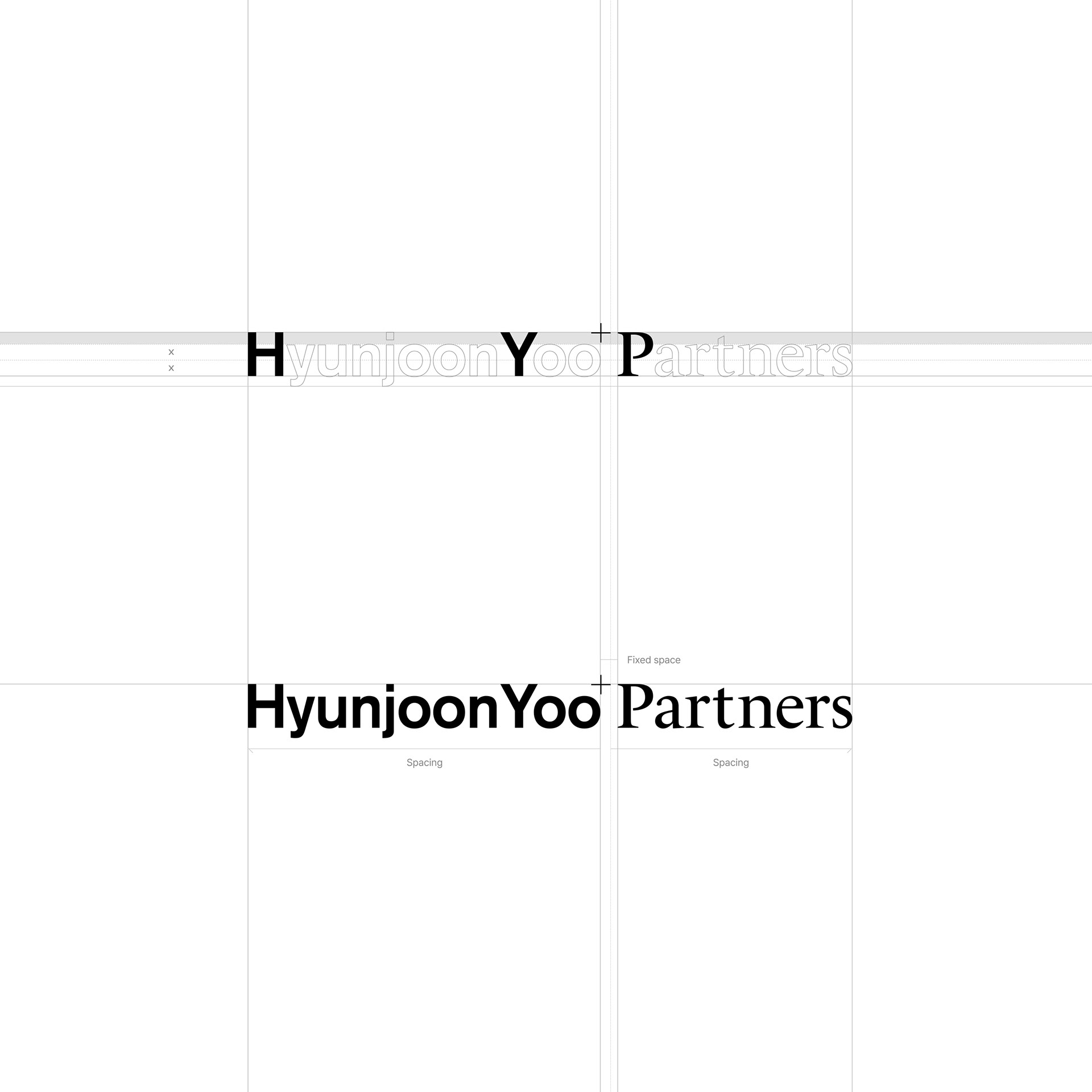
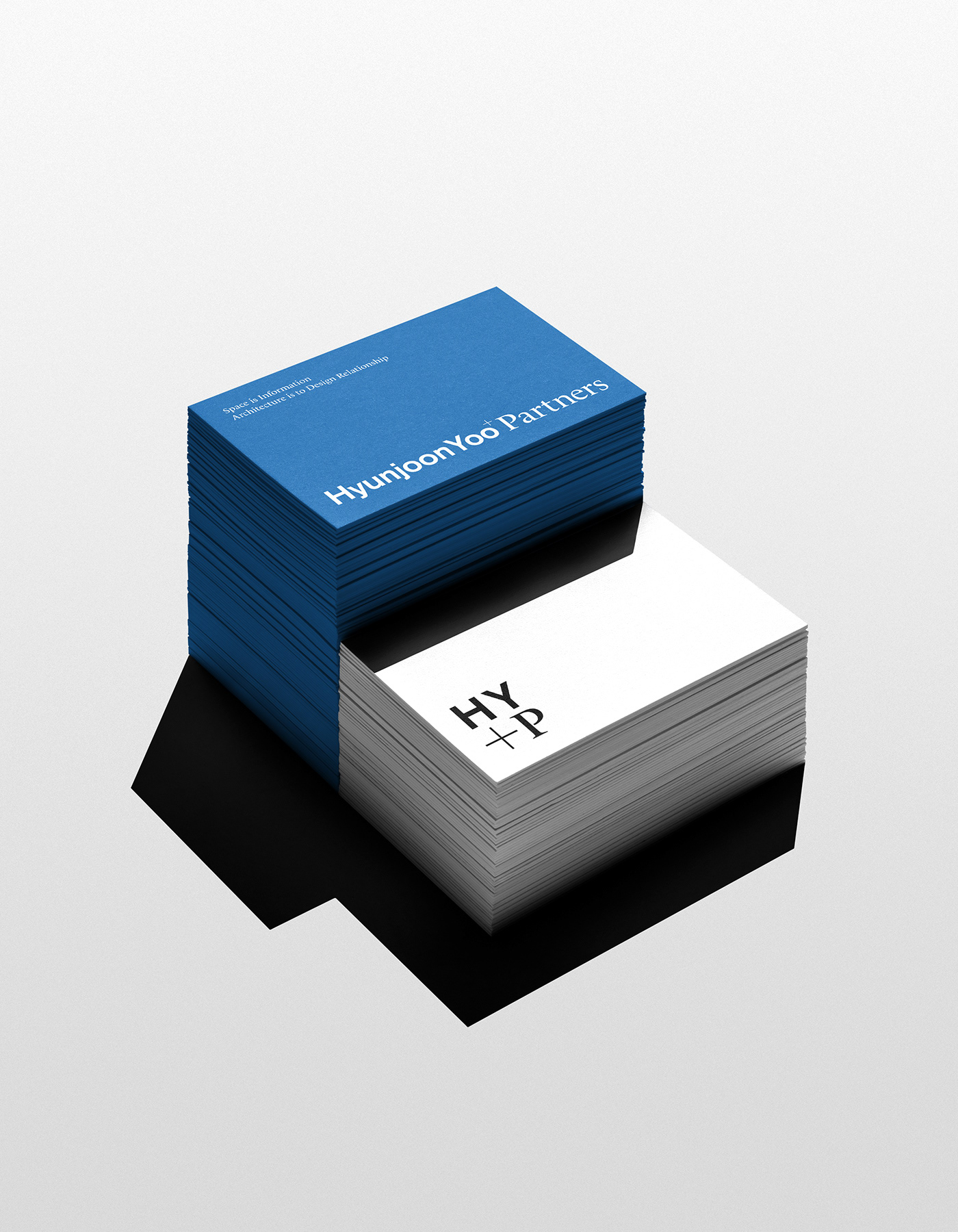
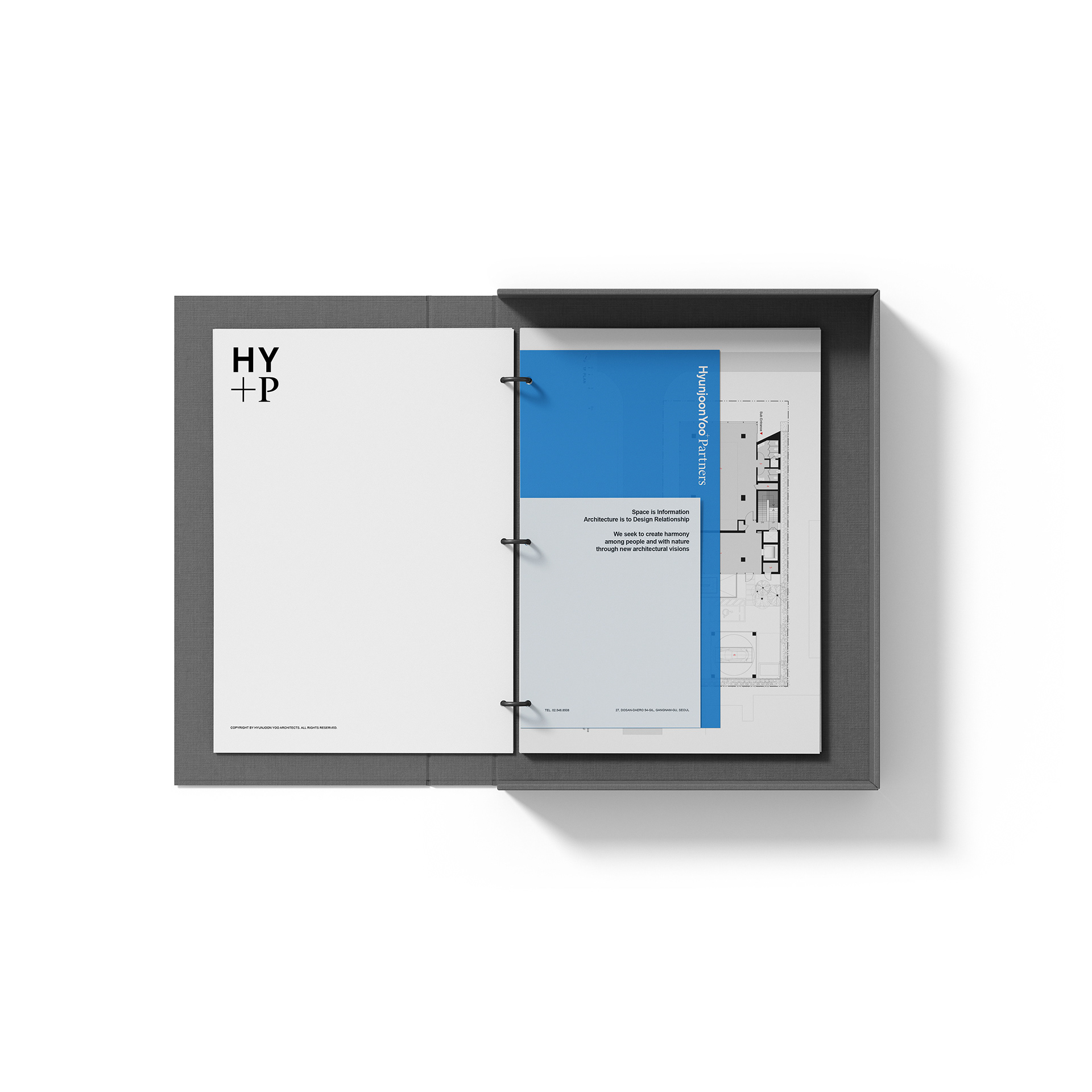
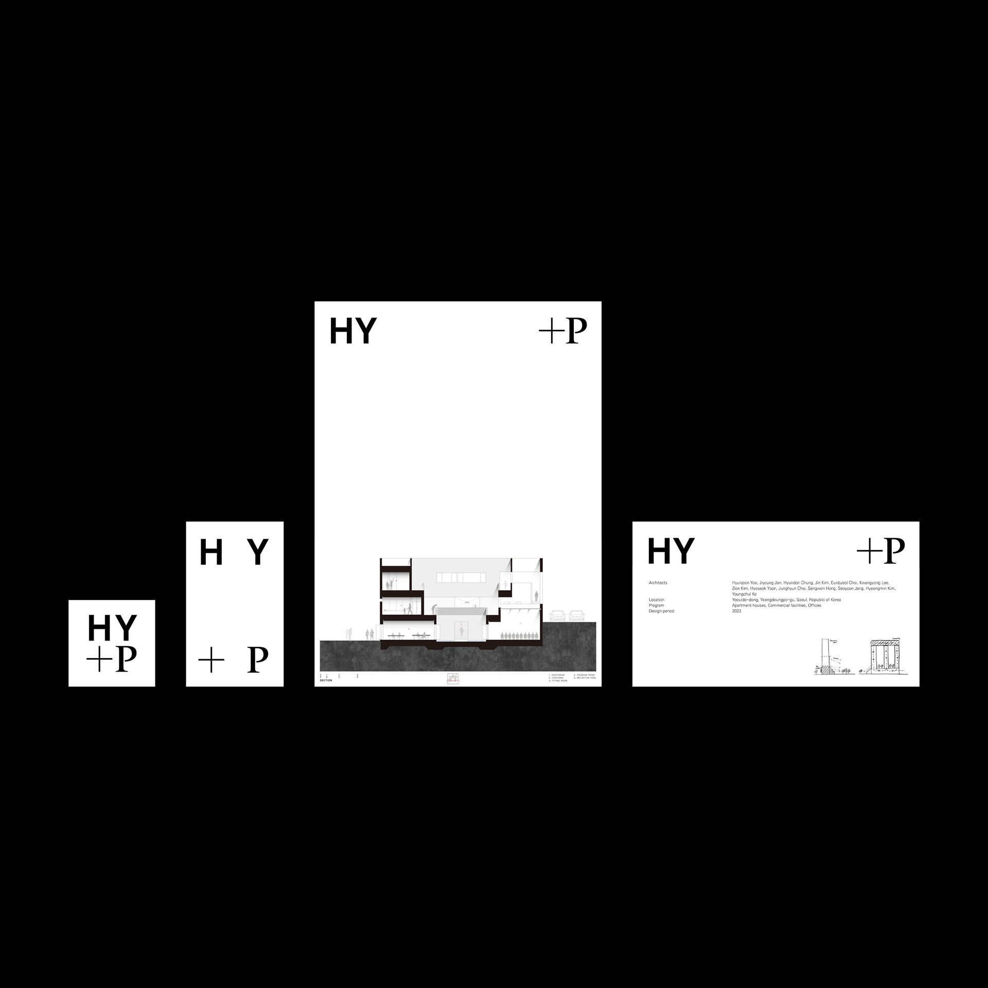
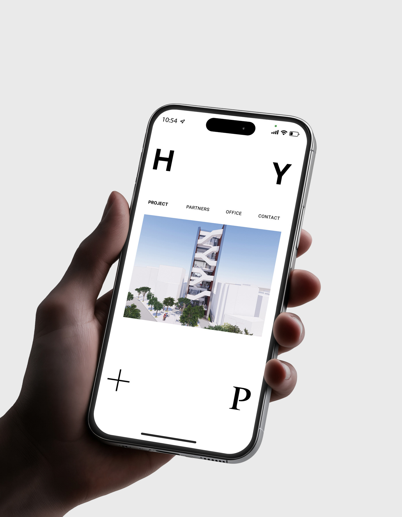
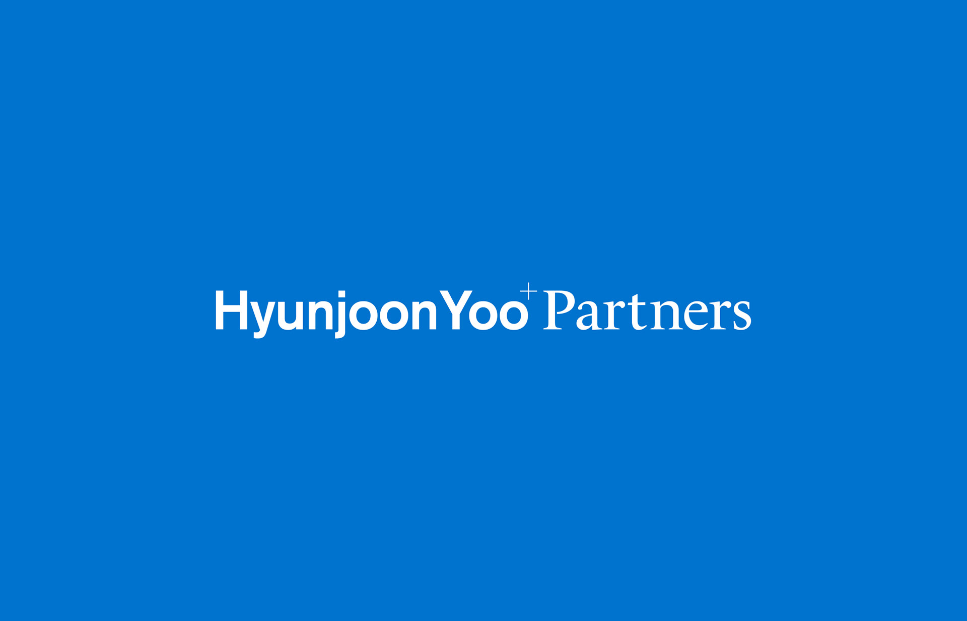
The core of the logo redesign lies in a deconstruction of uppercase typography, associated with authority and fixed image, to reveal the comprehensive and flexible brand philosophy through the lower case typography. The design is in line with diversity, openness, and relationship-oriented philosophy that modern architecture purses, and it reflects the architectural approach that prioritize the flow and connection rather than single complete form.
For a brand with a lengthy name, lowercase typography reduces visual tension and introduces natural flow. Lowercase typography continues with smoother transitions between letters and creates a continuous flow, improving legibility. It aligns with the identity of the architecture firm, which works on the complex ideas and layers.
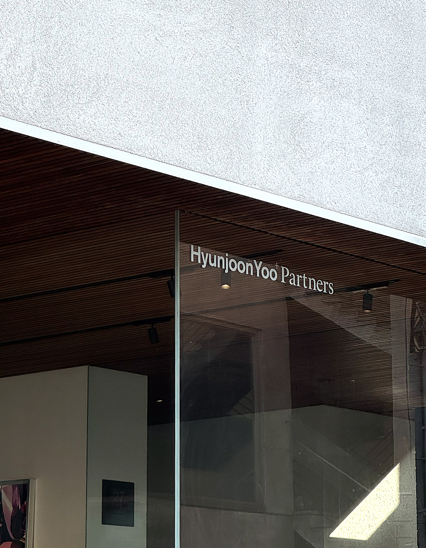
In the context of modern communication in a digital-predominant environment, lowercase typography offers a more approachable and consistent presence across screens and platforms. The lowercase typography functions as a format with a greater adaptability and expandability, representing continuously open thoughts of the architecture firm.