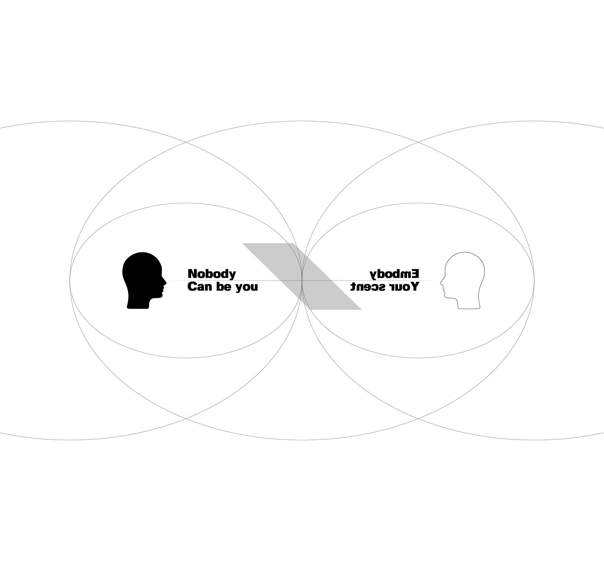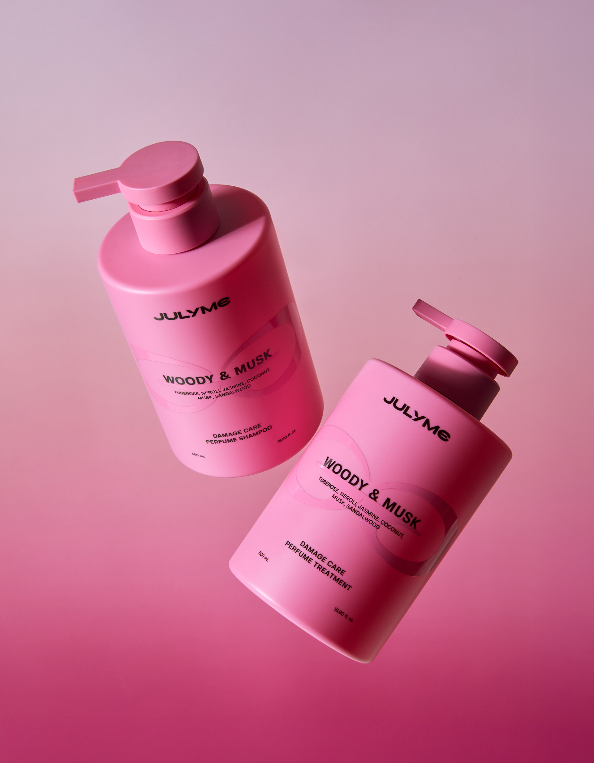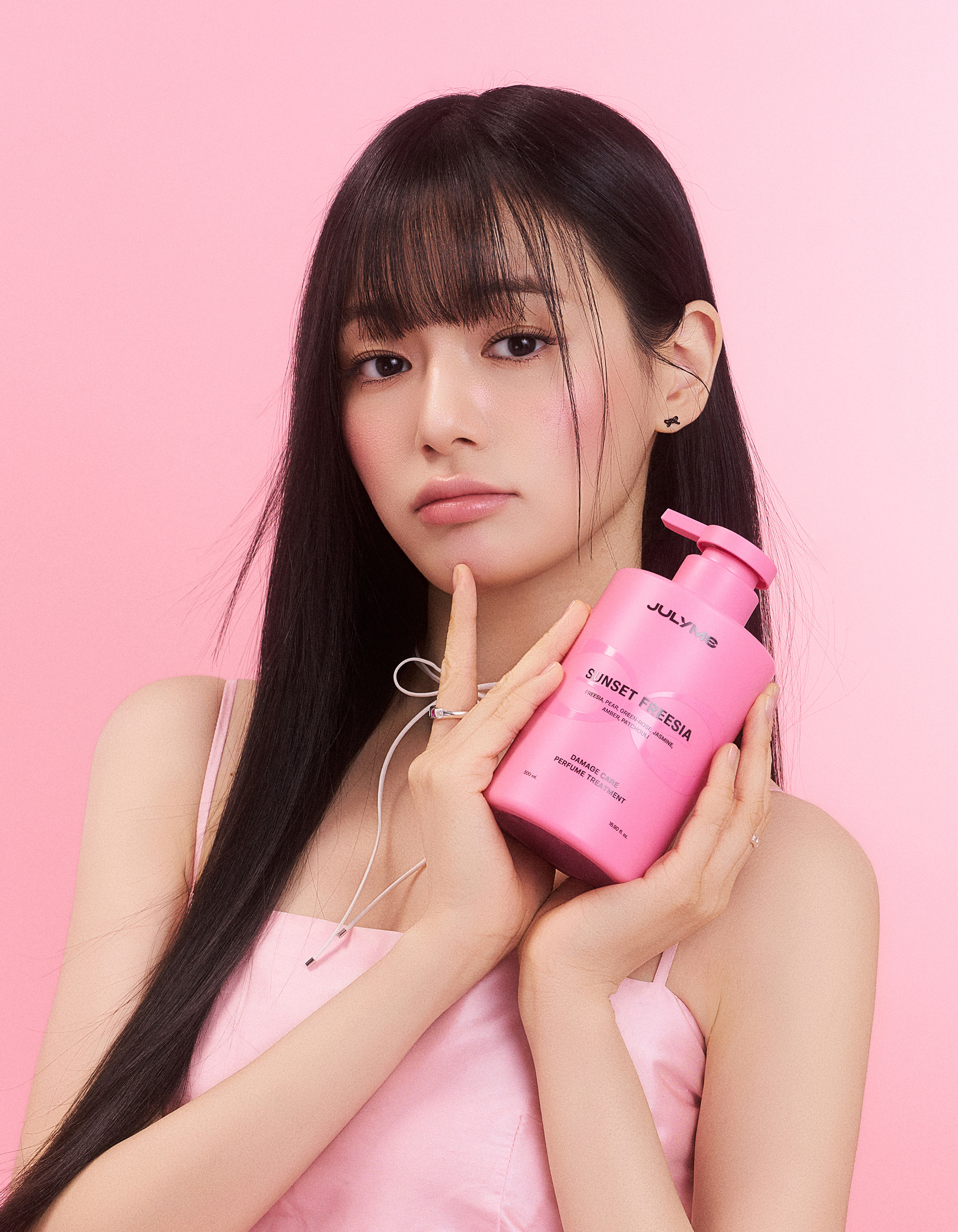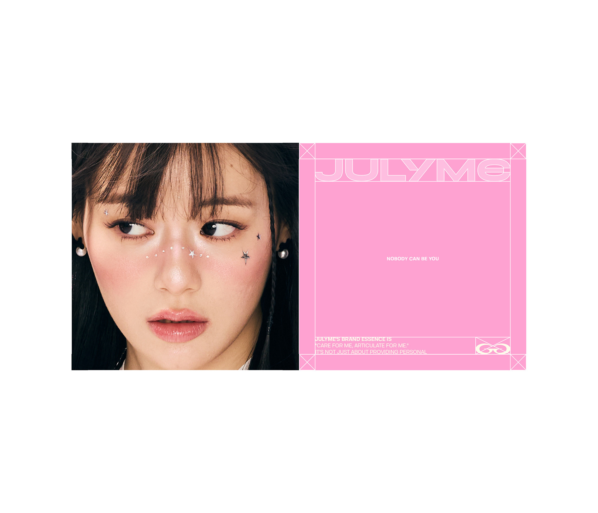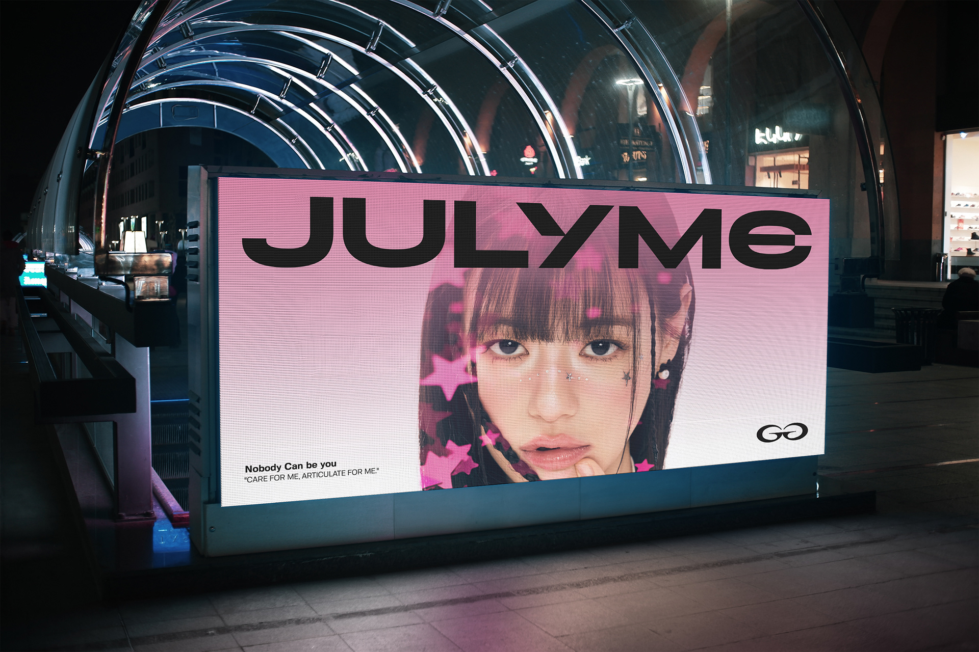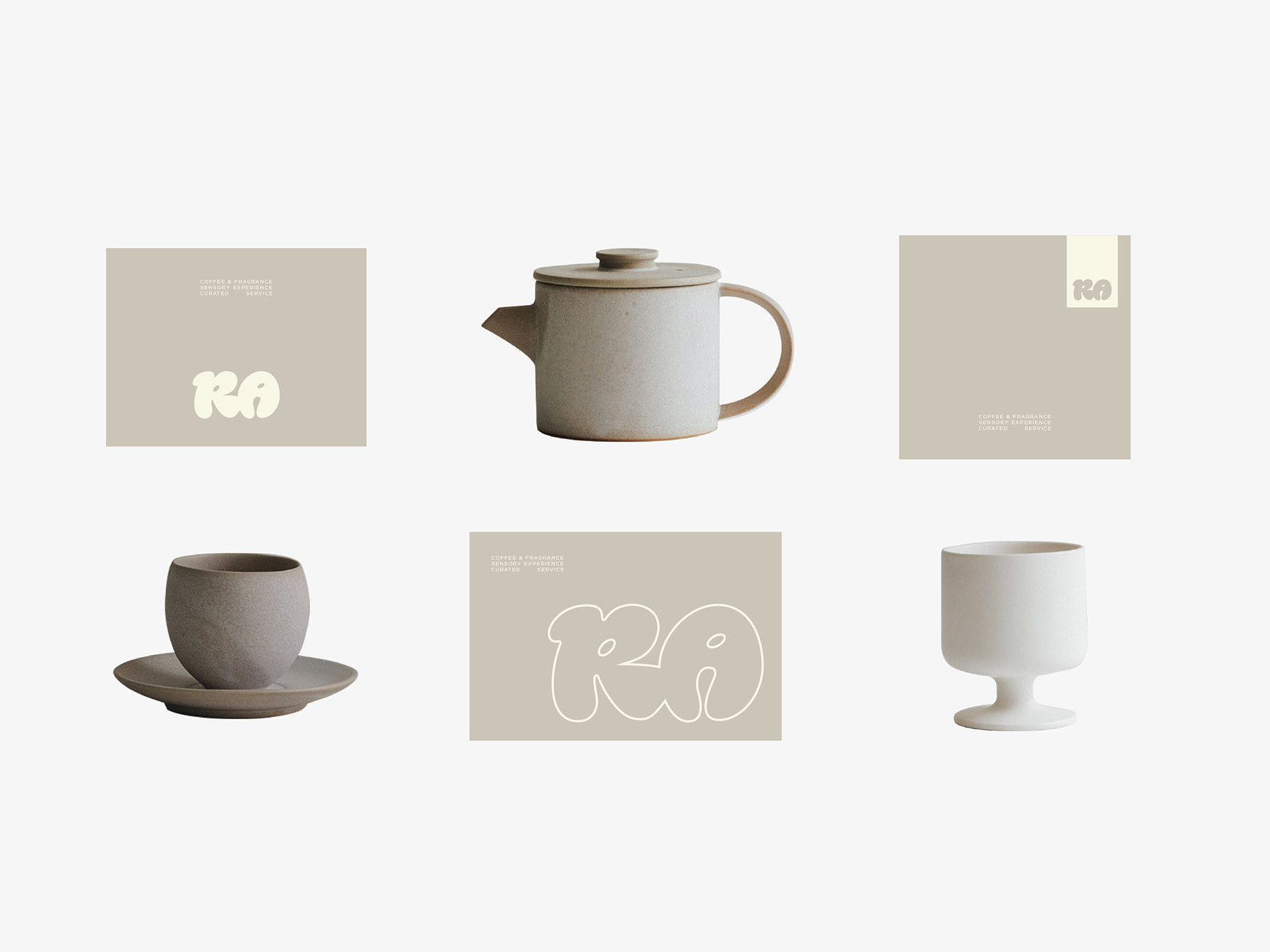
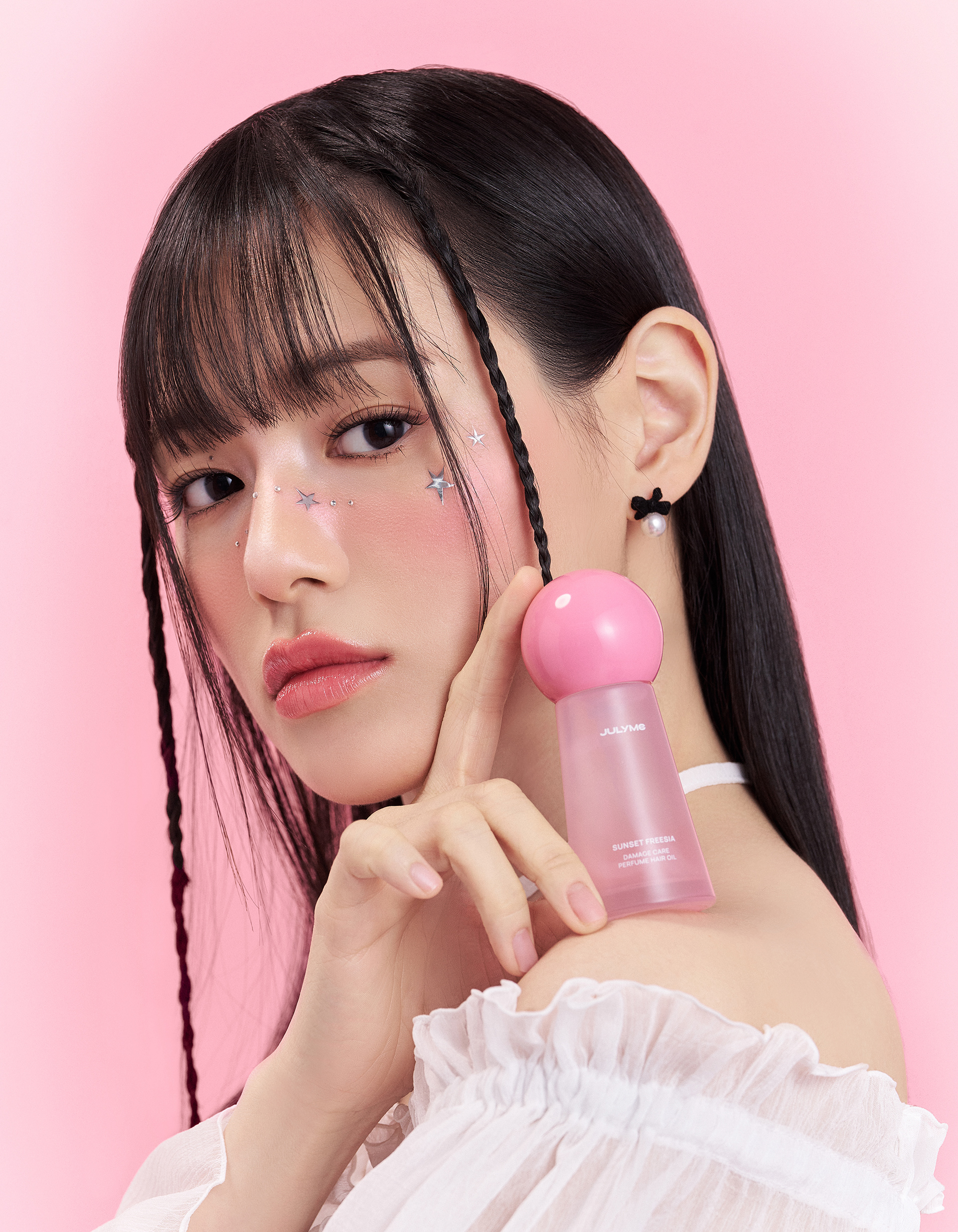
The direction of JULYME was to express unique individuals’ personalities and moods with fragrance, and it required the identity as a personal care brand focusing on the ‘personal scent’. Accordingly, we explored the concept that can visually express the sensory diversity and unpredictability of a scent.


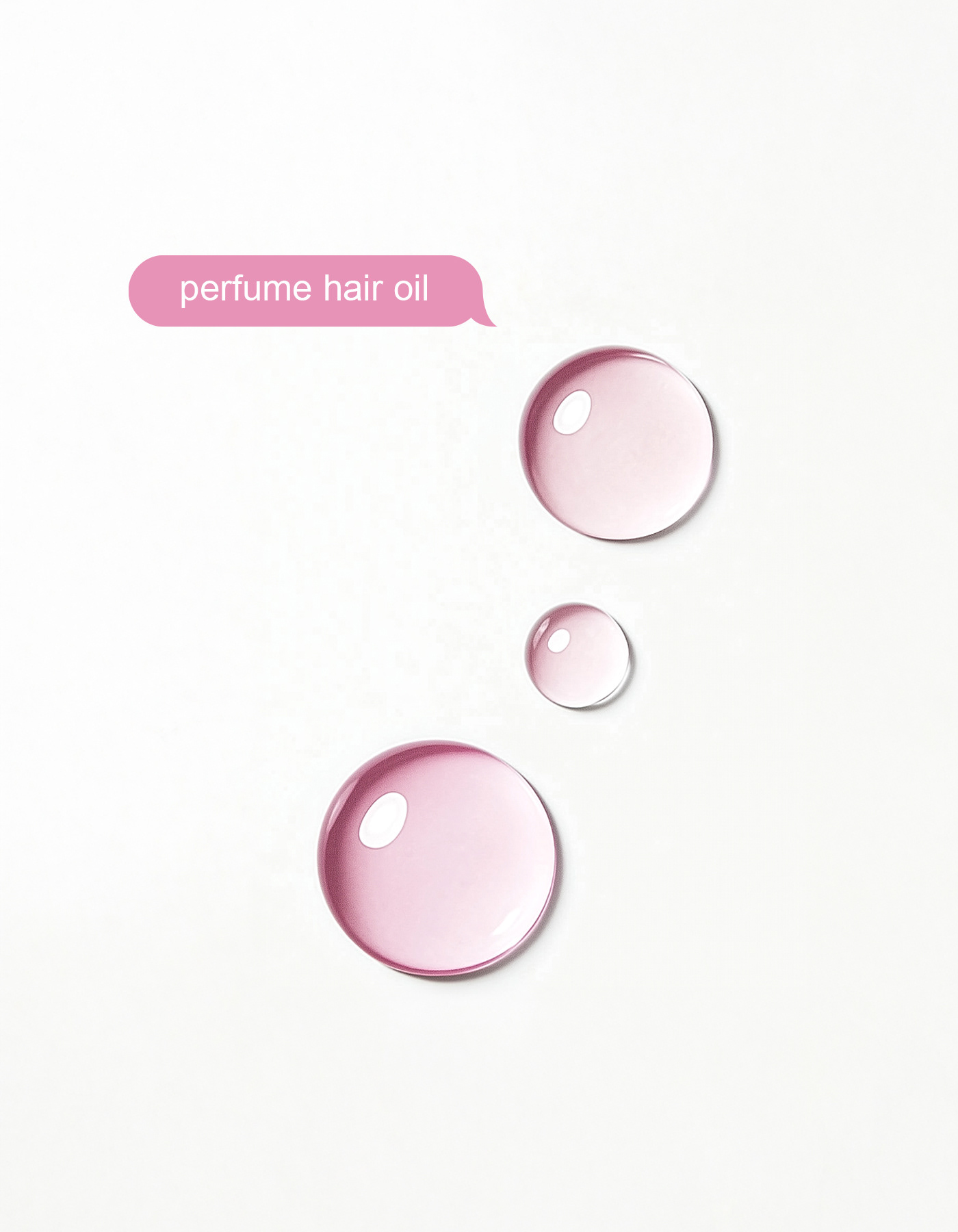
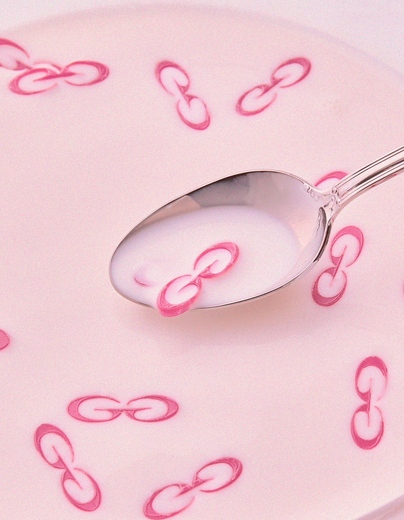
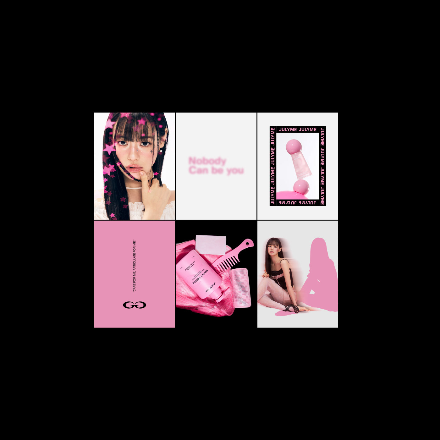
The key motif of the brand, "decalcomanie" refers to an organic shape that is coincidentally created in the process of transferring ink or patterns to other surface, and it was closely related to the unfixed interpretation of scents that JULYME pursues. Through this decalcomanie technique, we tried to express brand philosophy of "the process where the individual scent is created can be artistic" in visual language.
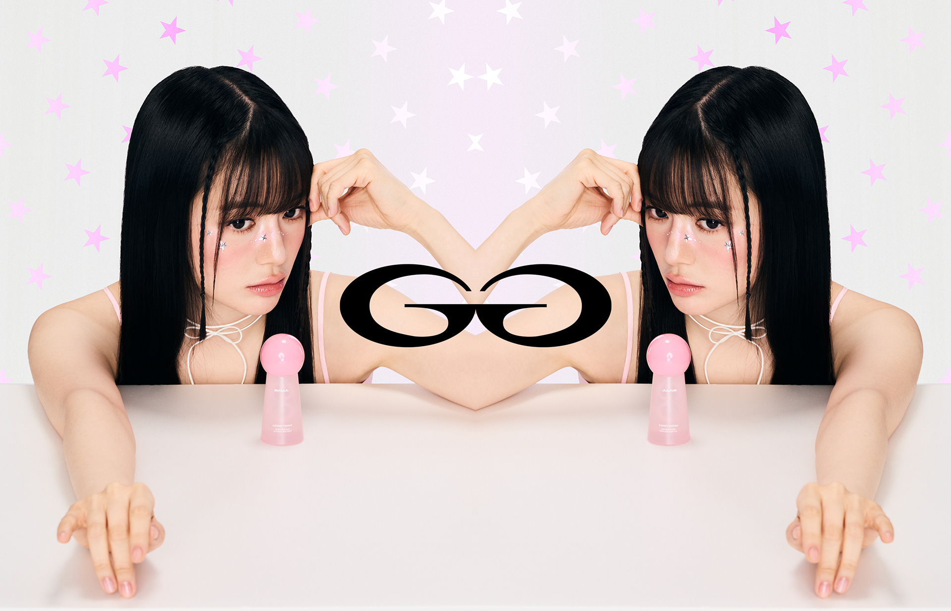
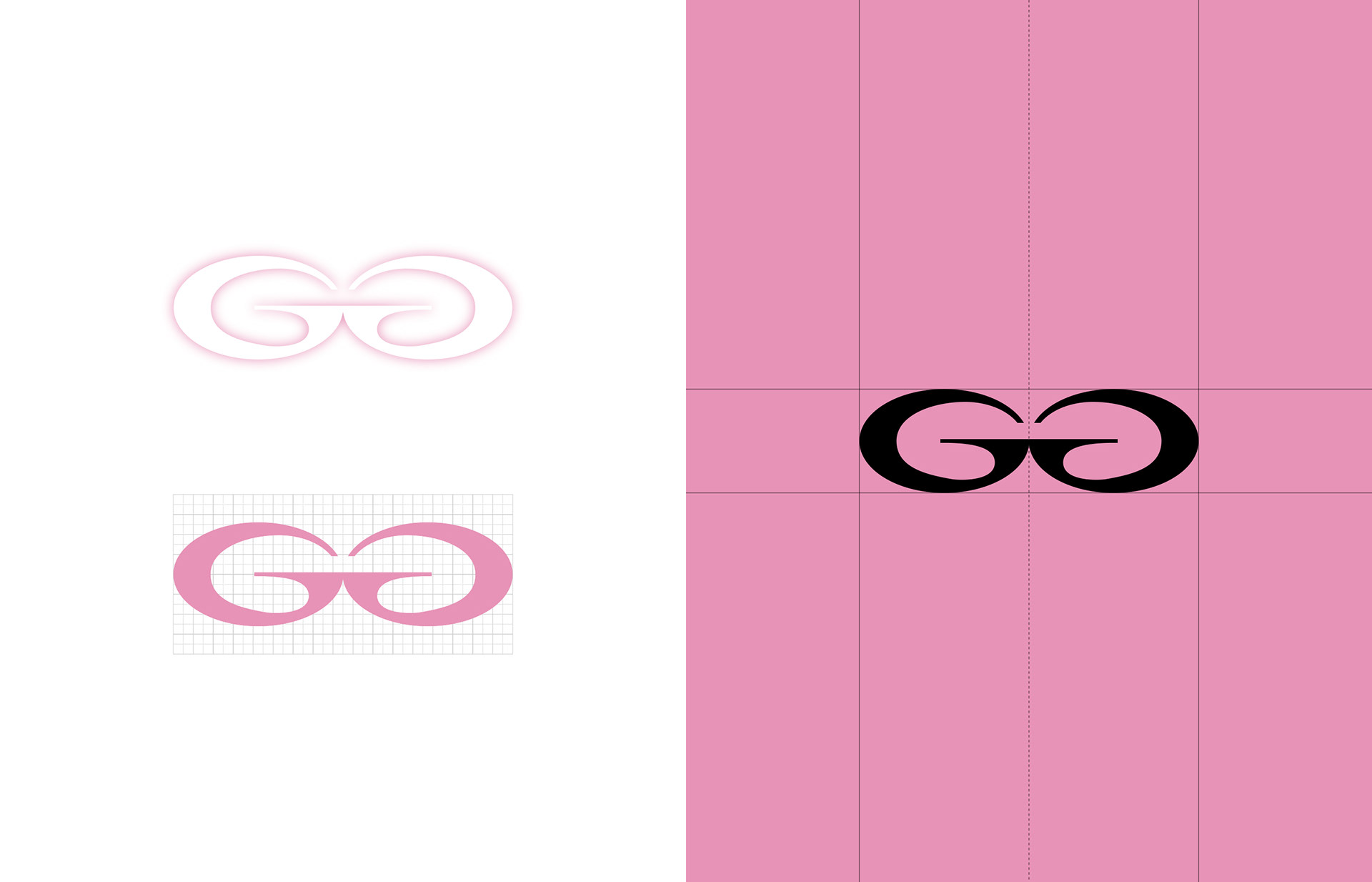
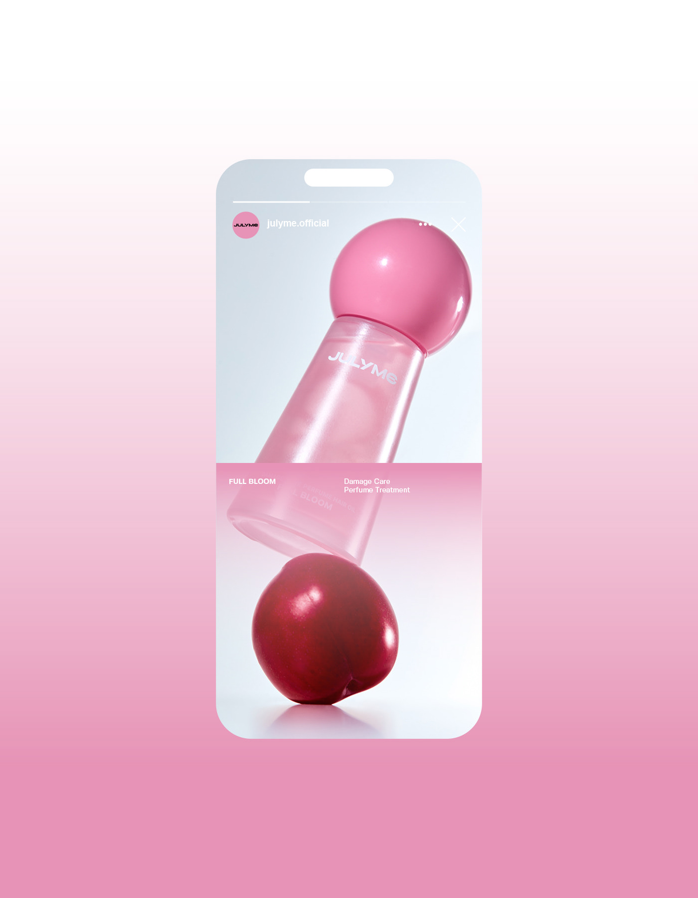
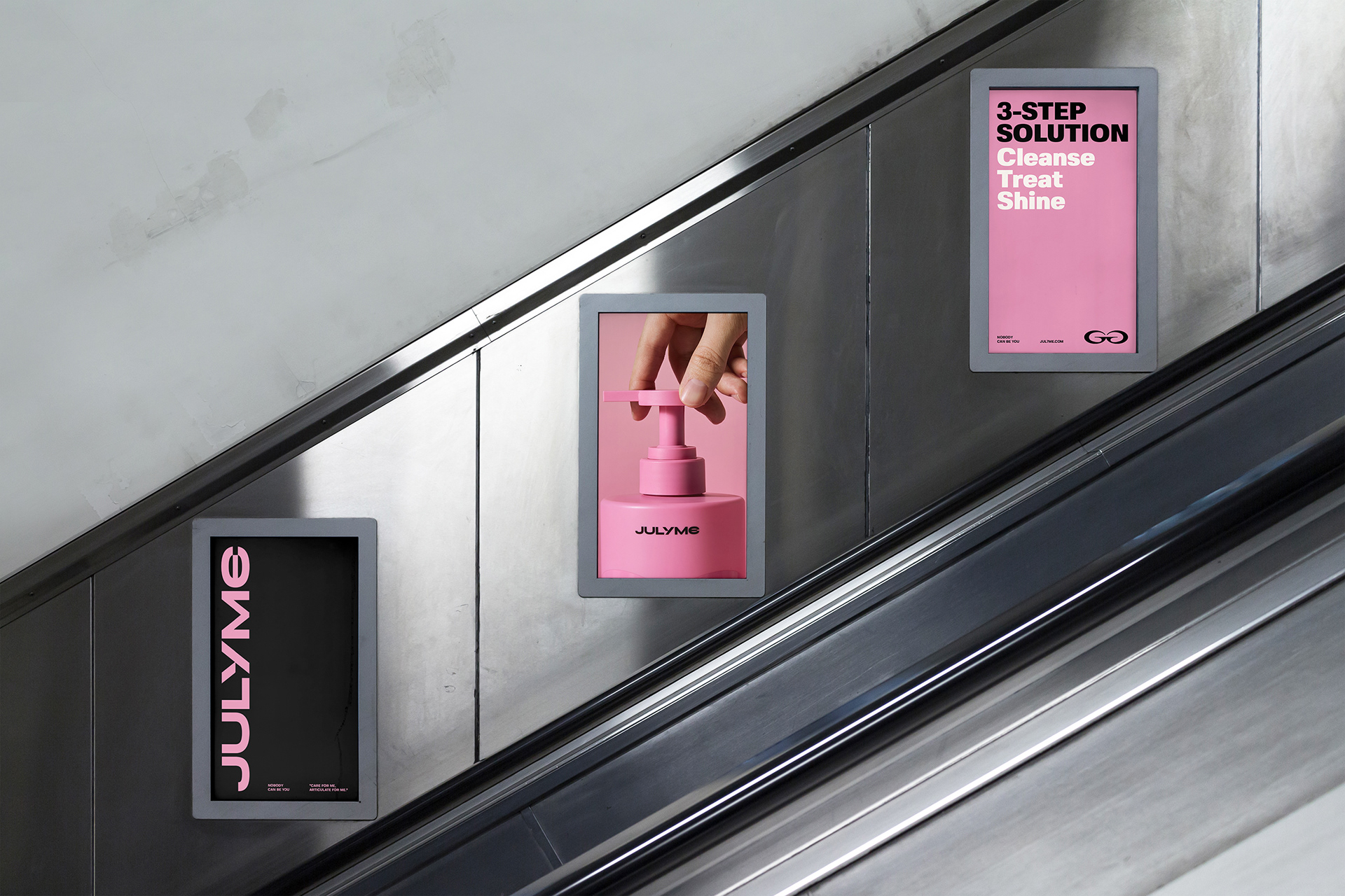
This concept was applied throughout graphic motifs and package designs of the brand, and with a visual system composed of various combinations, overlaps, and variable shapes, we established JULYME’s unique and sensual brand identity.